
'Concrete Jungle' is an informative graphic design editorial piece, on the topic of the negative effect of Brutalist architecture. A group editorial spreads consisting of typographic experiments and art forms, created to reflect the way brutalist architecture has shaped the physical environment in which we live, and has altered our associations with it within our societies. Designed to visually highlight the often unknown and hidden negative elements of the movement; Cheap construction materials, segregation social class, poor building quality within the type. Using the straight lines of the typography to reflect the hypnotic styled angles and faces of brutalism.
Front Spread
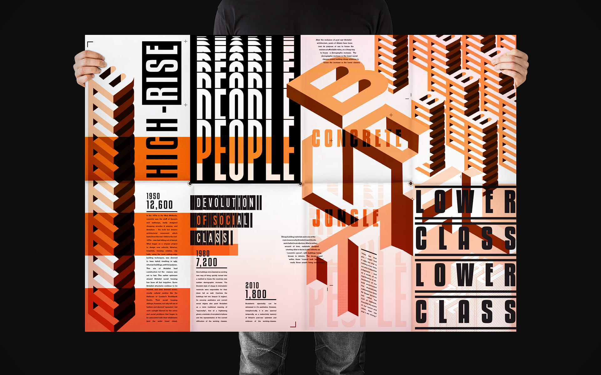
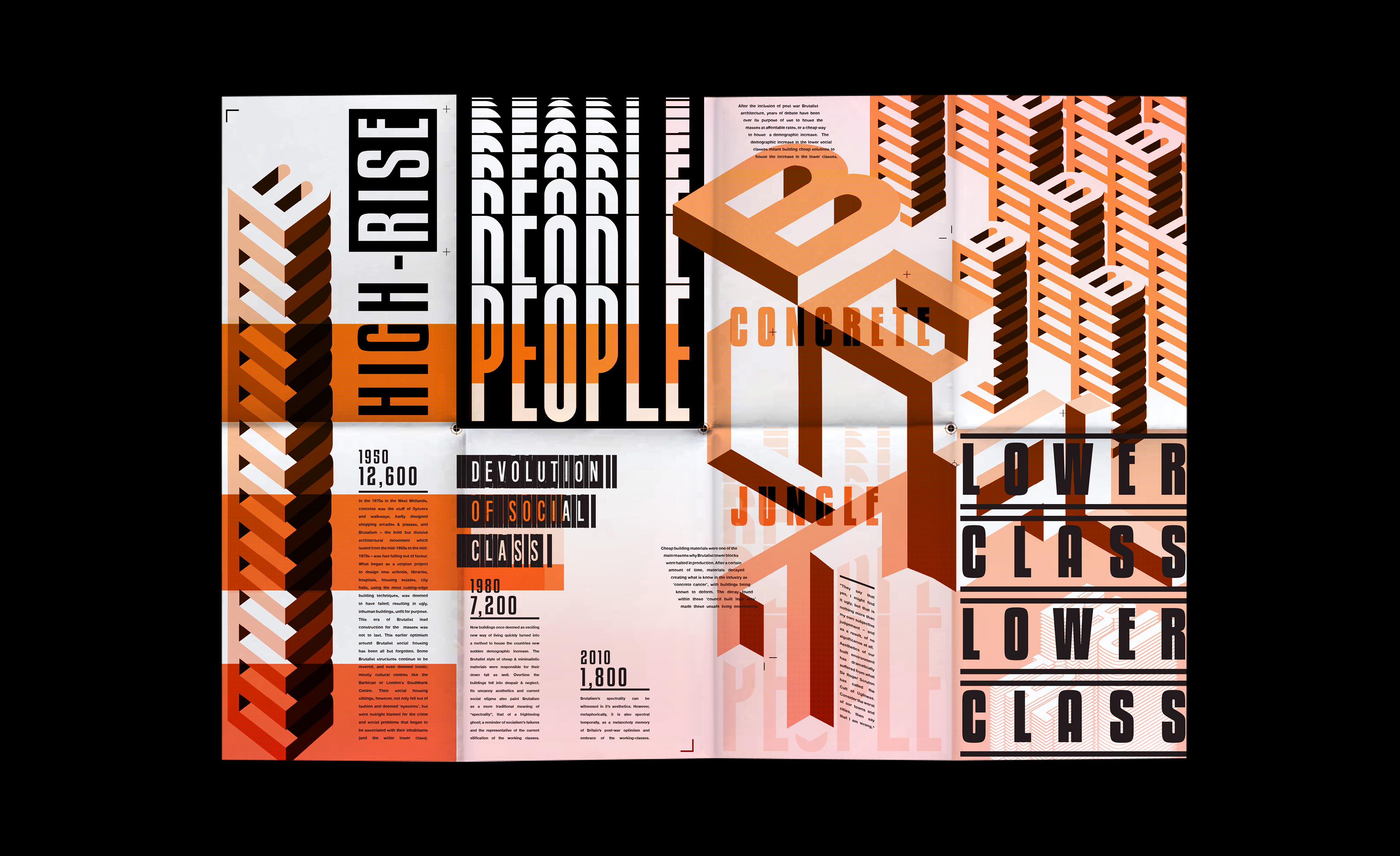
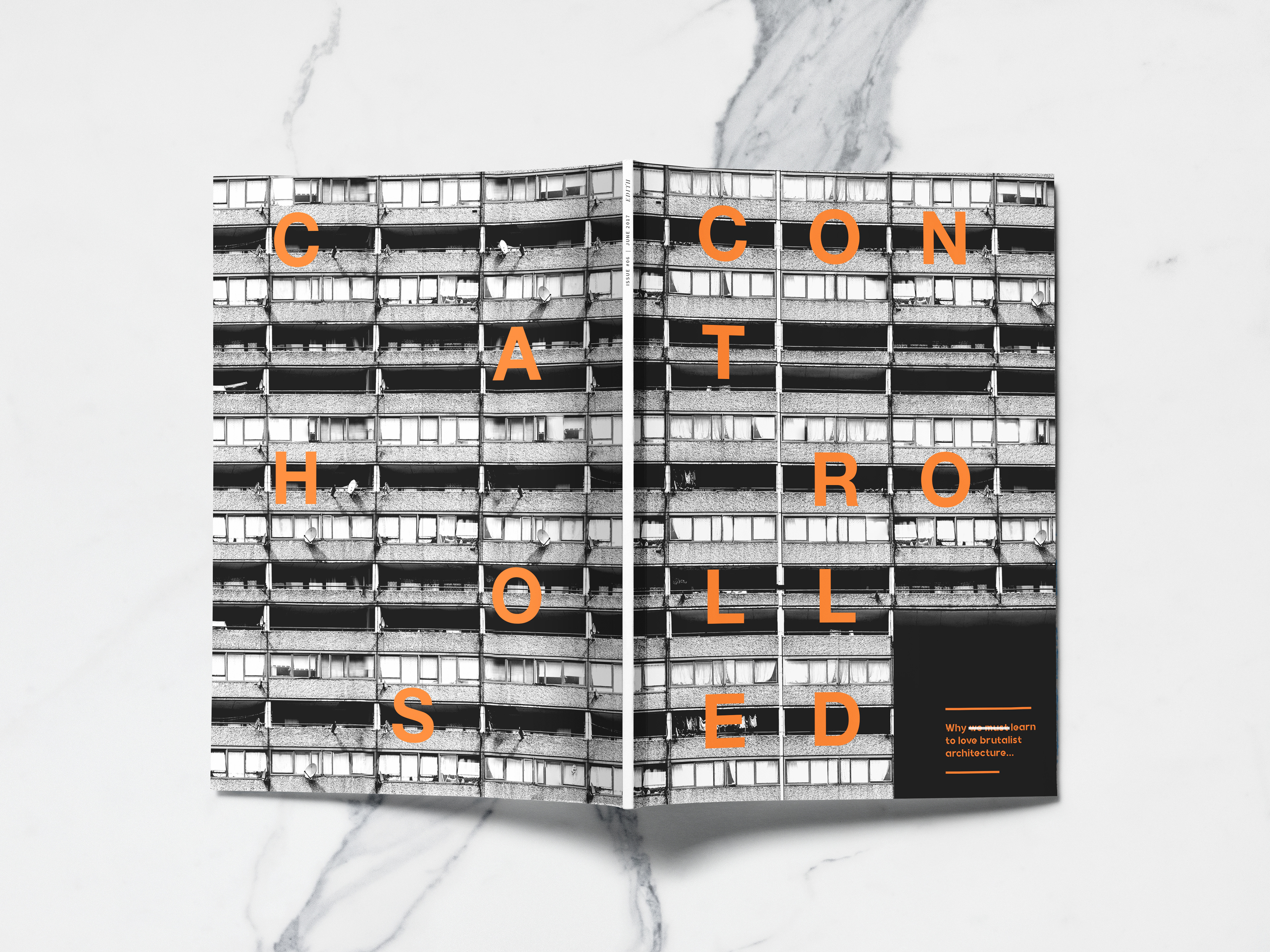
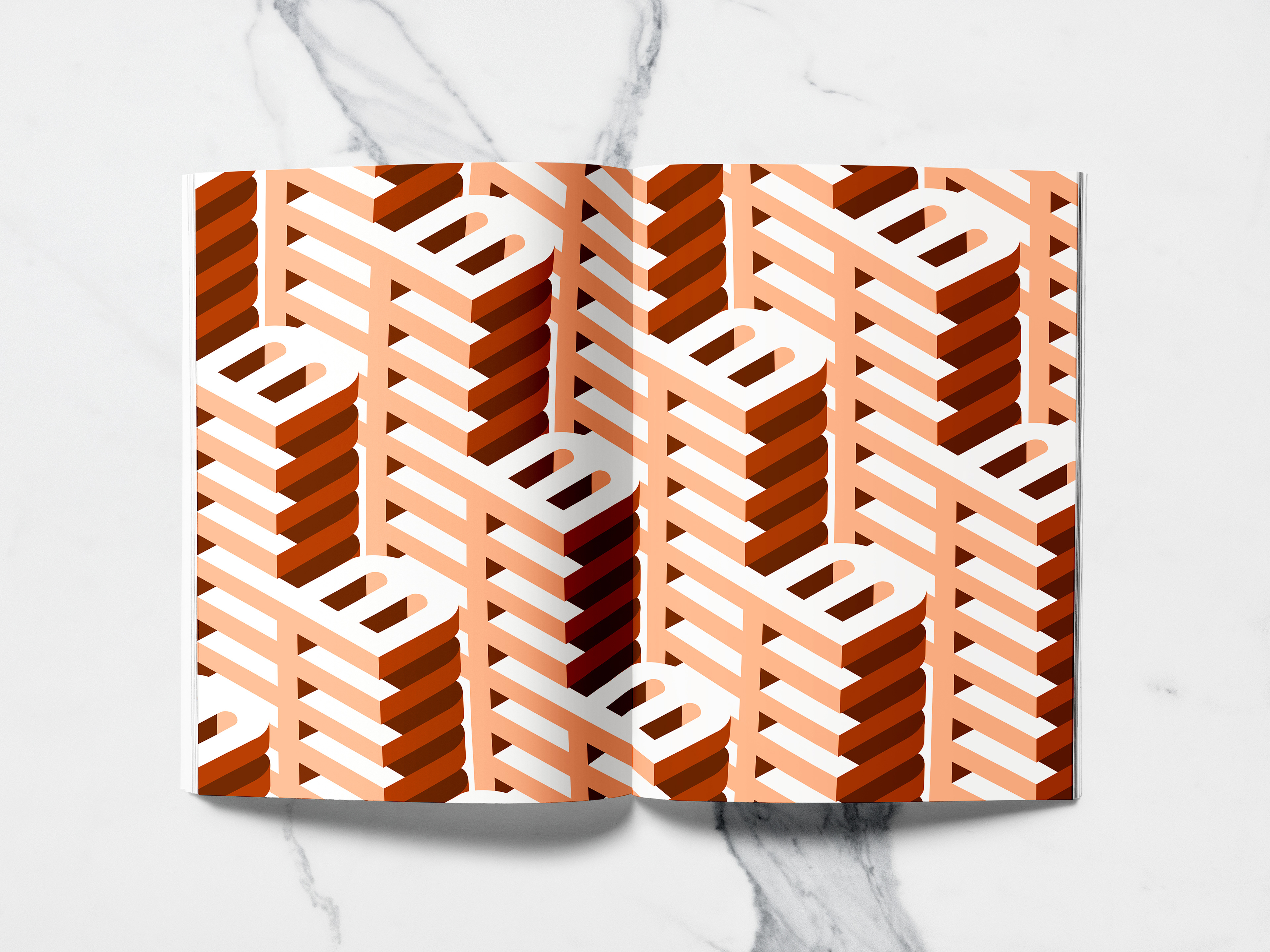
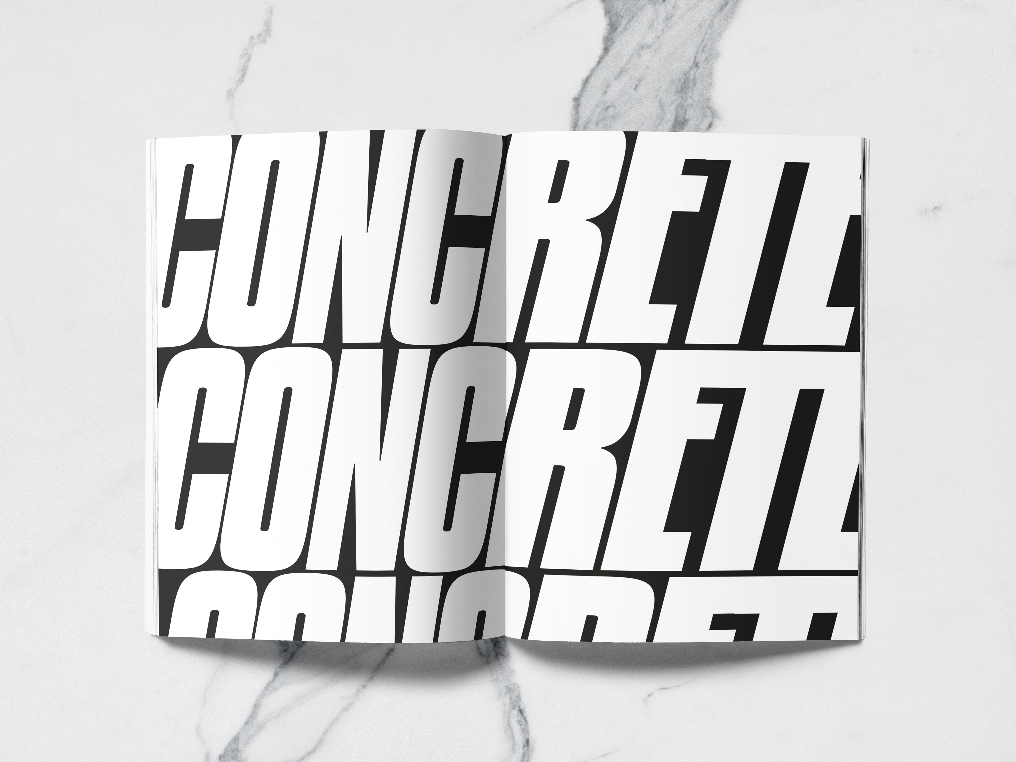
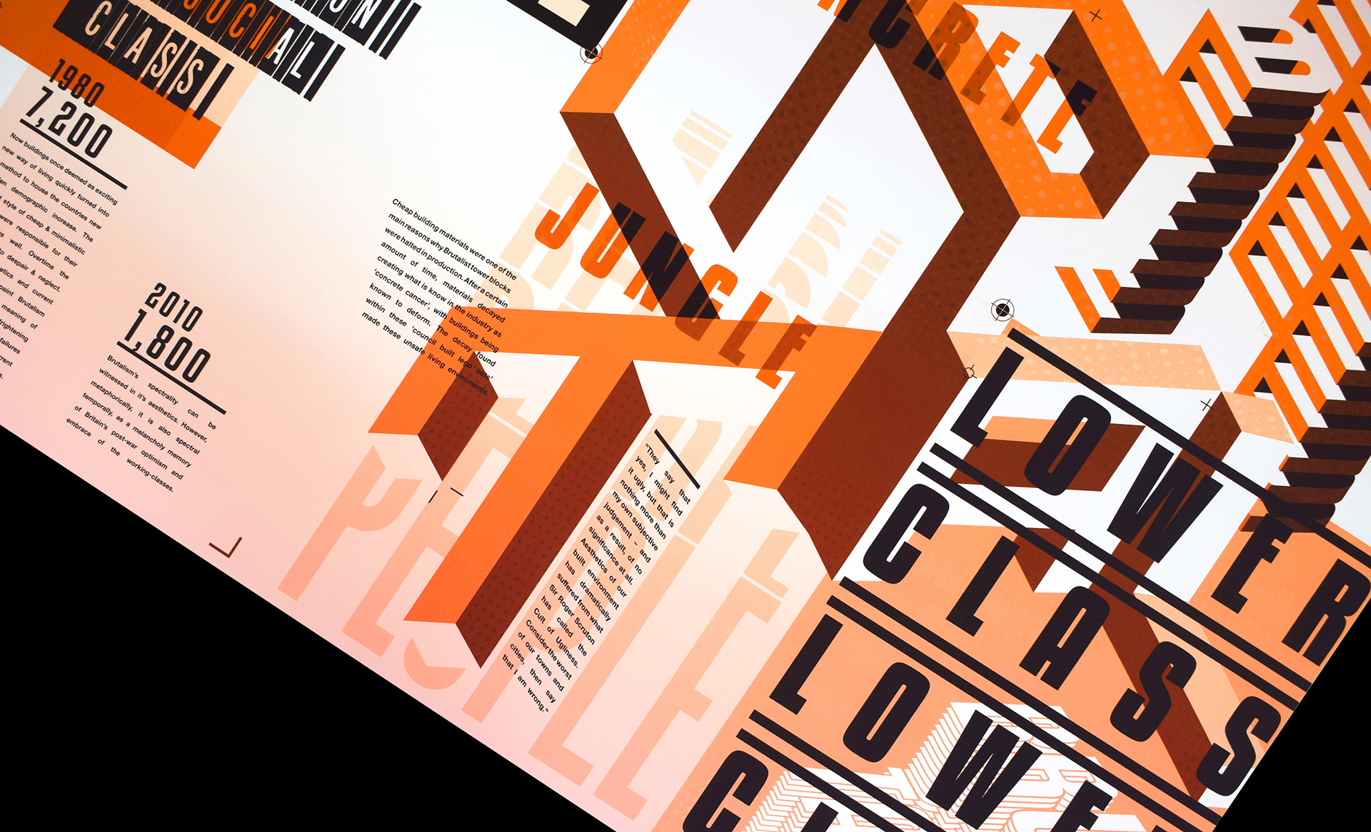
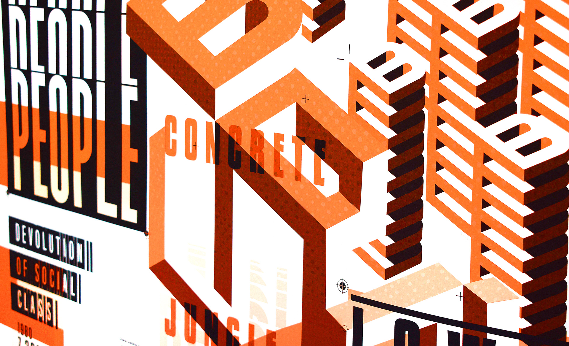
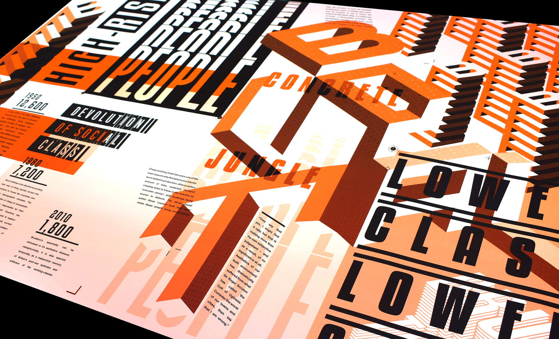
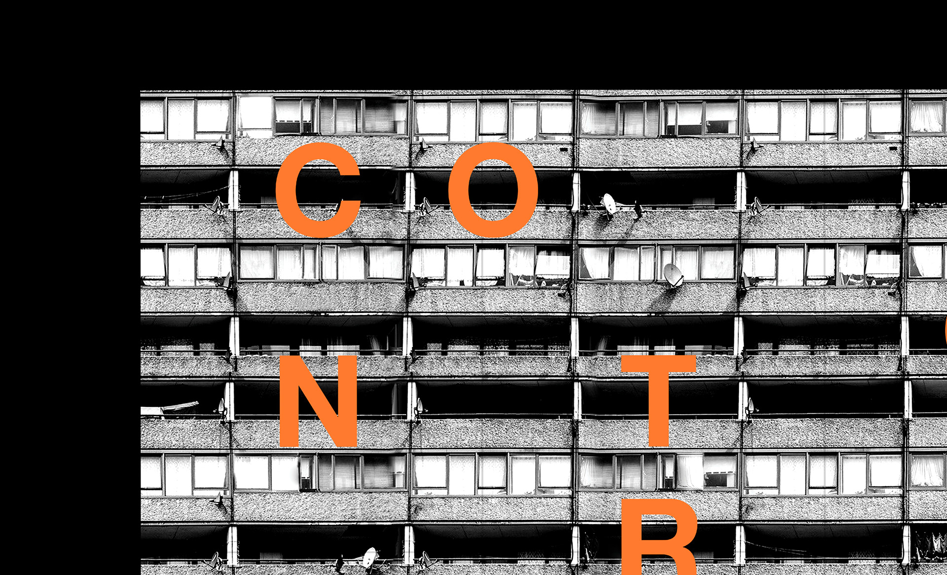
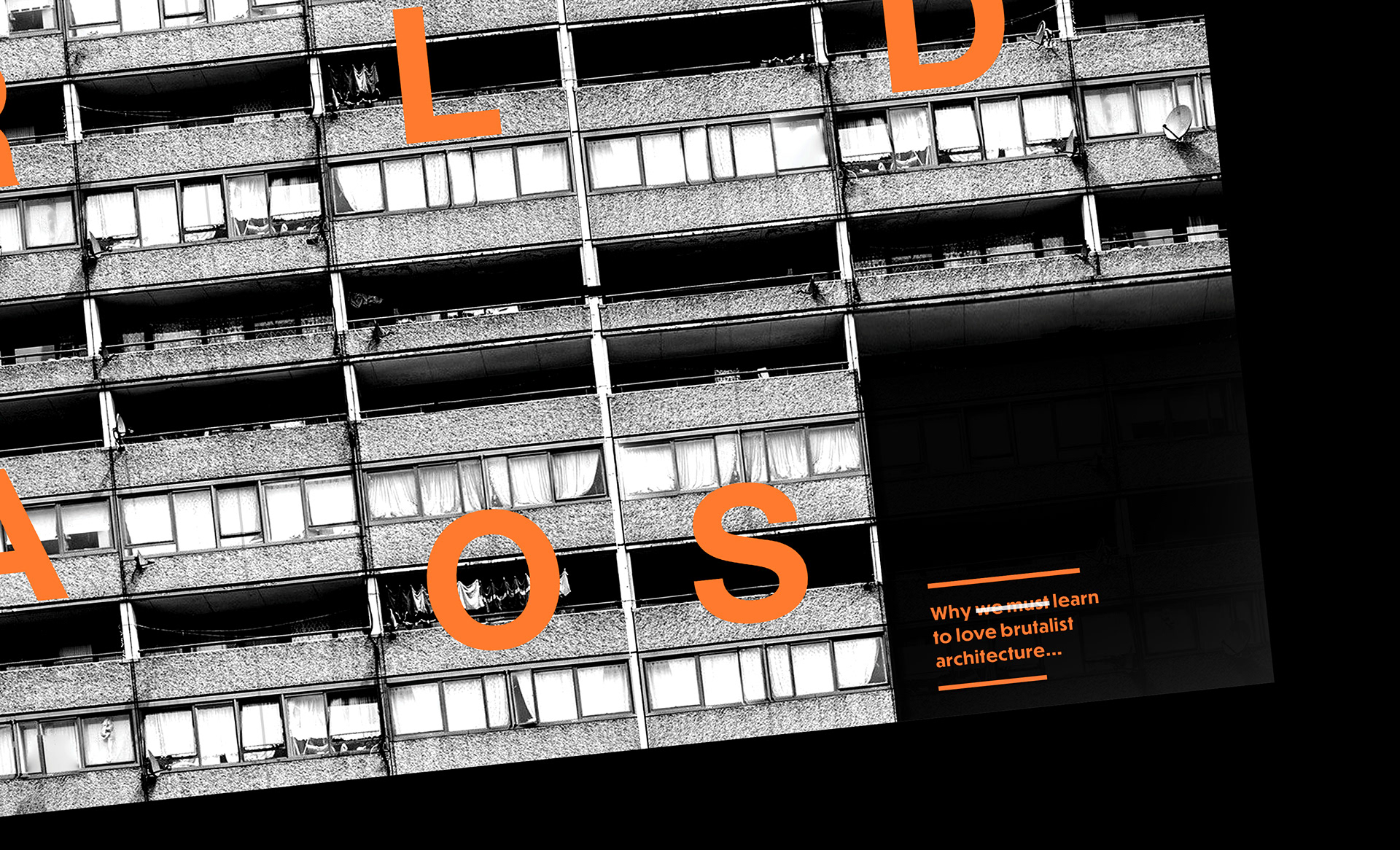
The key aspects of this design was to subtract any and all imagery and replace them with text and typography. The main typography hierarchy was based on the physical structure in which these council built tower blocks we made. Strong bold lines with sharp edges communicate across the style in which these enormous structures were built, symbolised by the large typographical experimentations featured throughout the design.
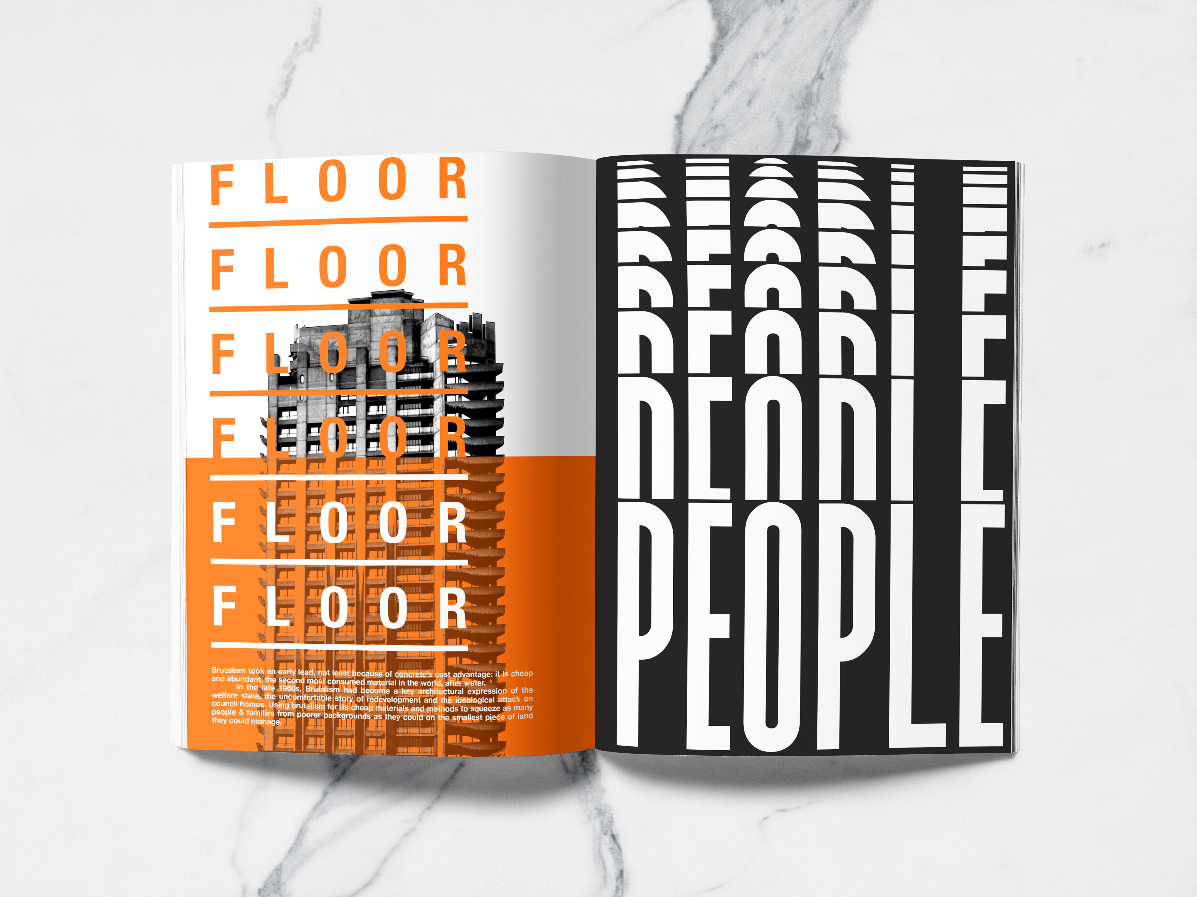
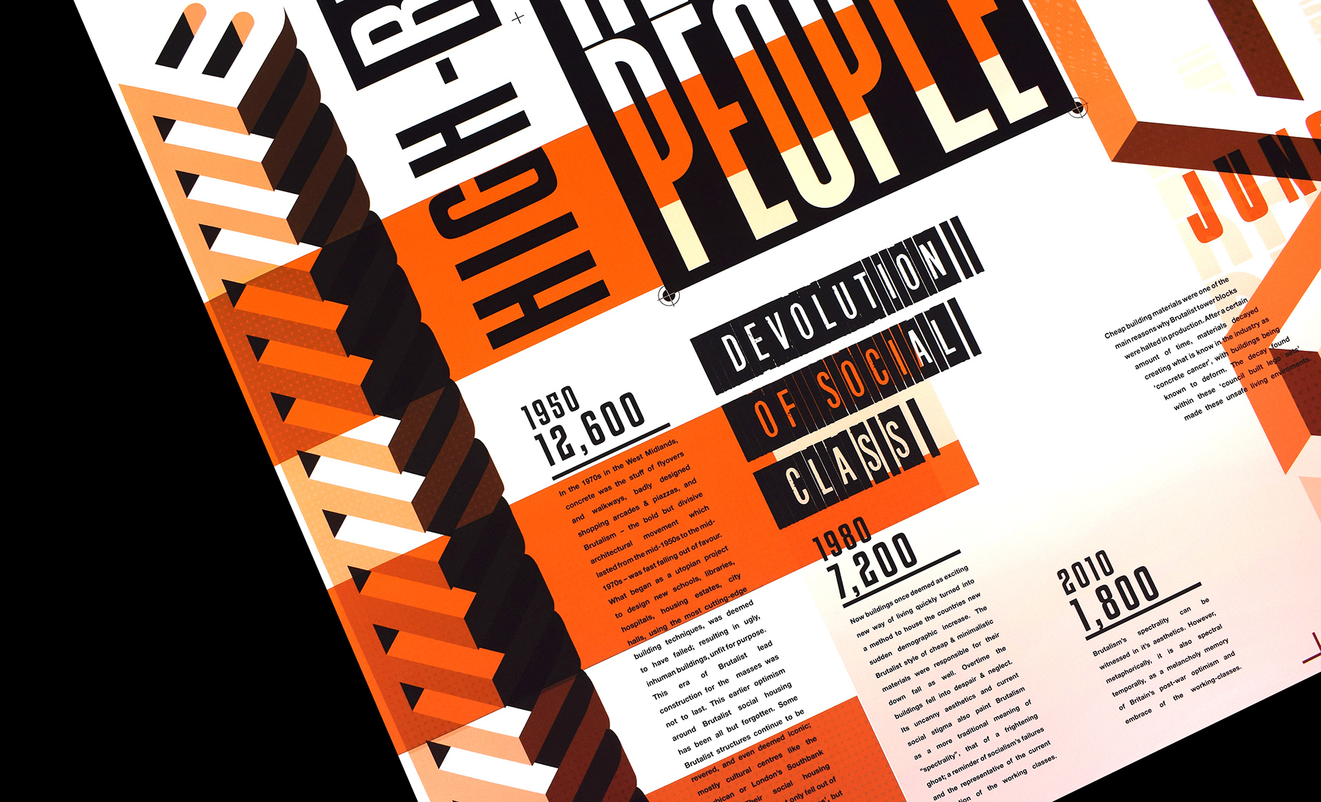
The large spread designs have been designed to fold, from a small clad publication into a large scaled publication. Visually communicating across the rapid growth of brutalist architecture from between 1920-1950, as well as its equally quick demise as it soon fell out of love with architects and the general public, symbolised by the inclusion of the bar chart styled text paragraphing interpreting not only the physical presence of brutalist high-rise tower blocks, but also referencing back as an infographic visually expressing decrease in brutalist building developments as well as the decrease in the remaining numbers of brutalist structures left standing.
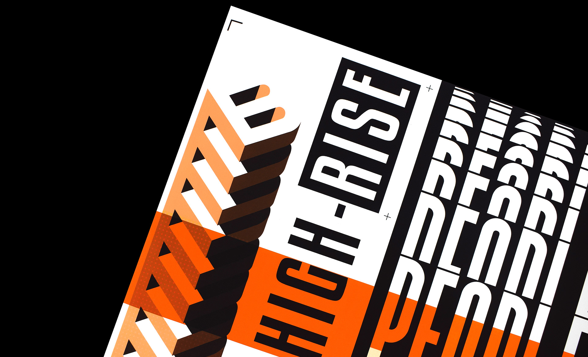
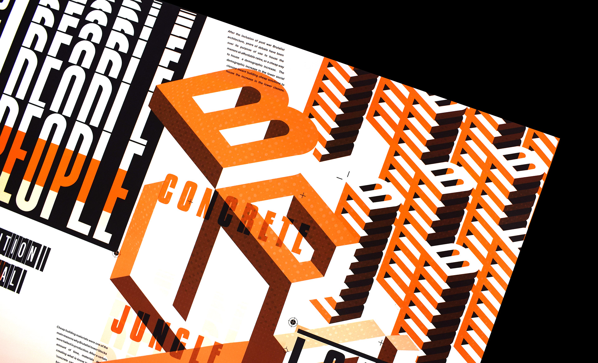
The colourings were kept consistent with the designs found within the history of brutalist architecture, the inclusion of monochromatic imagery was very important within the project to keep the realism of the brutalist style within the designs. Famous for being made out of cheap concrete meant that cold greys were commonly found within these large structures exteriors which were often referred to as 'concrete jungles' due to their shear size and hypnotic styled angles and faces.
The bright oranges which can be seen in the Barbican's new identity relates back to the buildings history as a famous brutalist landmark, standing bold and tall this new use and identity for the building shows how the brutalist style can be adapted for modern day use and interpretations, keeping hope in the spreads throughout for the development in which brutalist as a style has changed over the years.
Reverse Spread
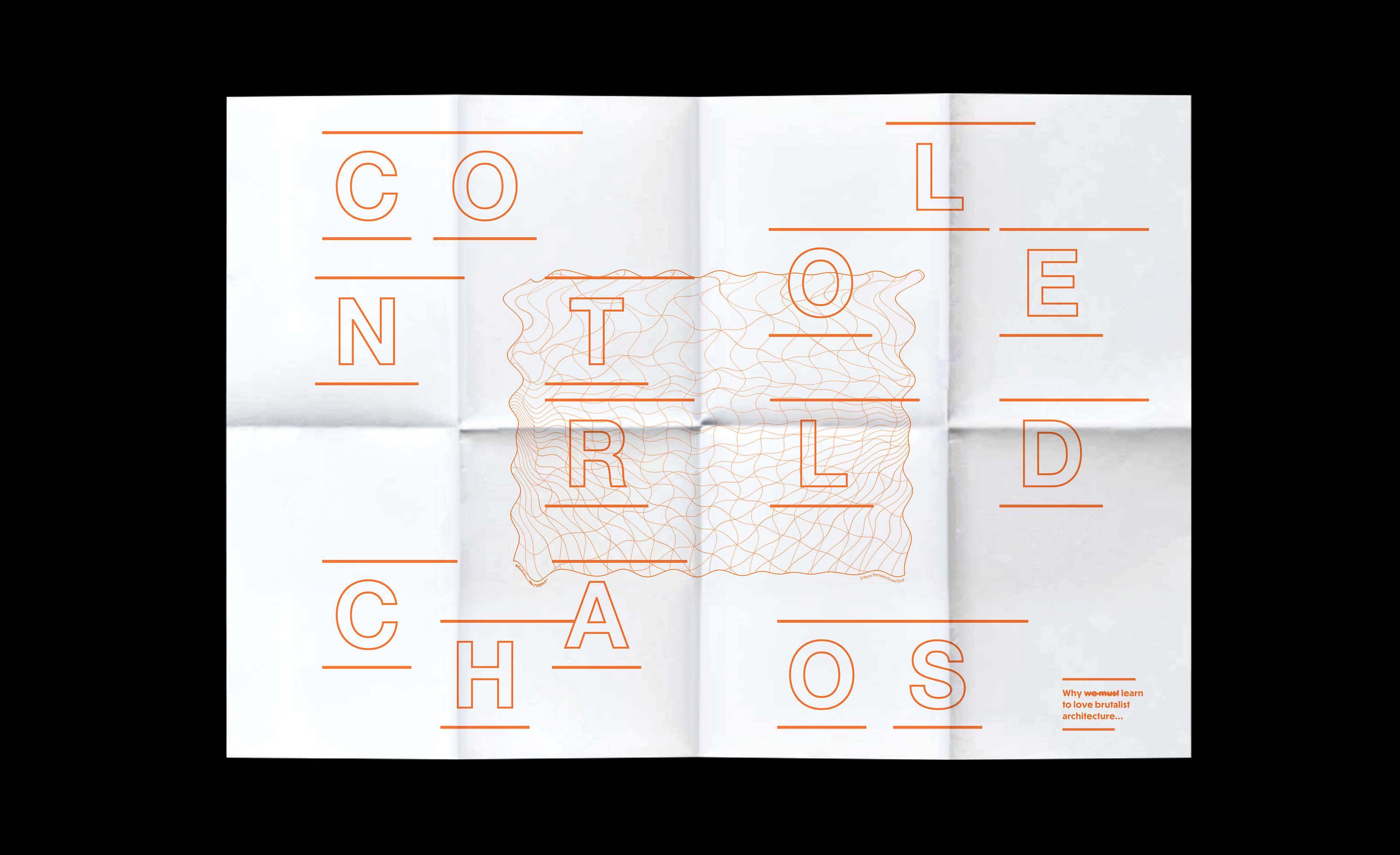
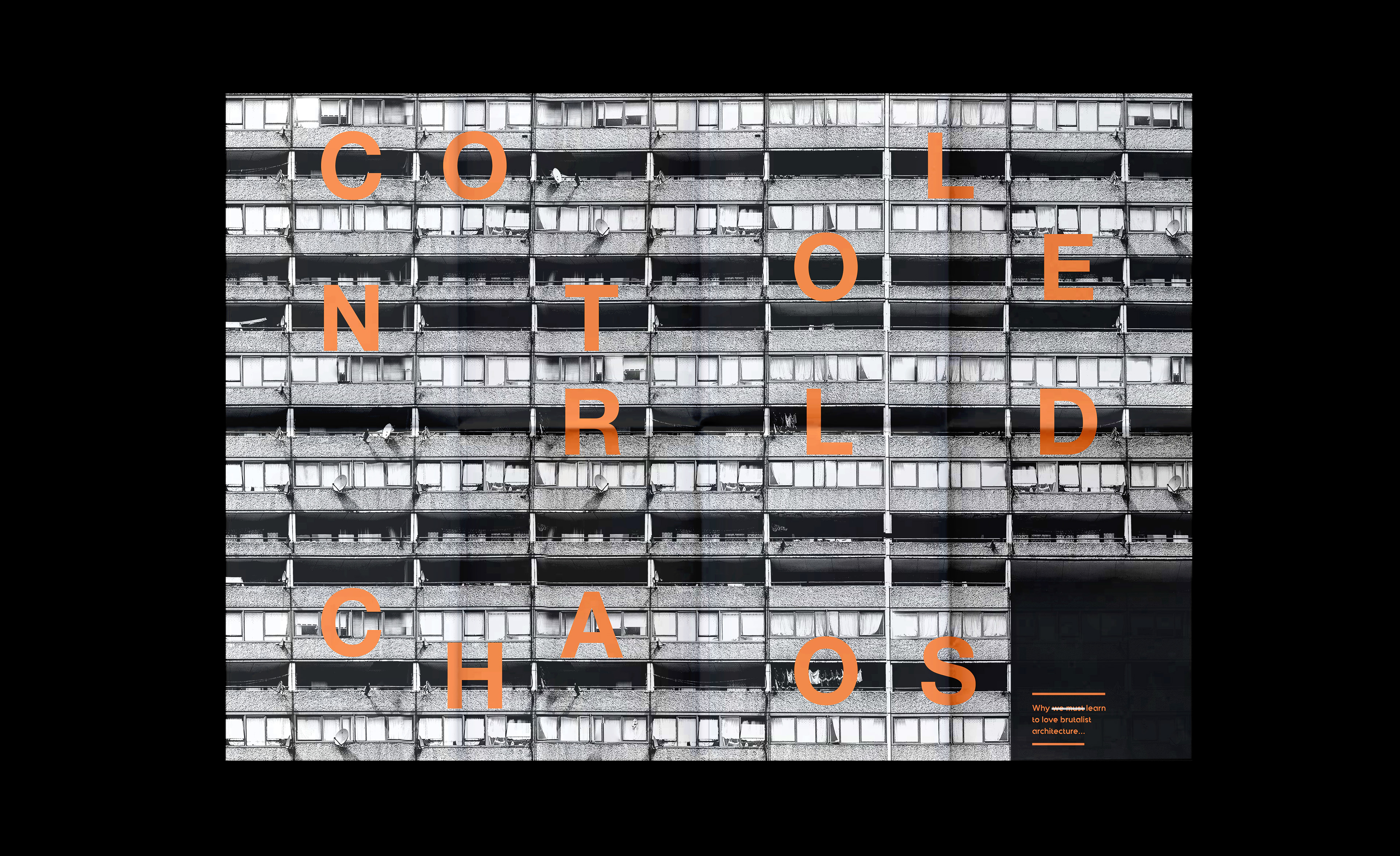
The subtitle of 'Controlled Chaos' was based on the reasoning behind the creation of brutalist styled tower blocks, the controlled and organised aesthetics behind the brutalist architecture may make these buildings seem very atheistically pleasing and well ordered in their organisation, when in actual fact many had just been created to house high numbers of people often from 'poorer classes' in tall high-rise buildings to save money by building upwards on a small patch of land instead of investing in well built housing and building the city outwards.
The paper stock the foldable spreads were printed onto was a thin newsprint material, to visually and physically represent the materials used to build these poorly built high-rise tower blocks. If handled too much or too harshly then the paper will rip and break down overtime, just like the concrete material used in the construction which often suffered from 'concrete cancer'.
Booklet Spreads