

Brand Identity
Epoch is a whisky company who celebrates the time it takes to create its product. 'Epoch' meaning - a particular period of time in history / the beginning of a period in the history, time is the key to what it takes to create a quality whisky. Epoch centres itself around its distilling process by embedding the element of time into every asset of the brand, visually communicating the level of time, care, quality and craftsmanship that goes into the brand and its products, to create a quality drinking experience.
Brand Strategy

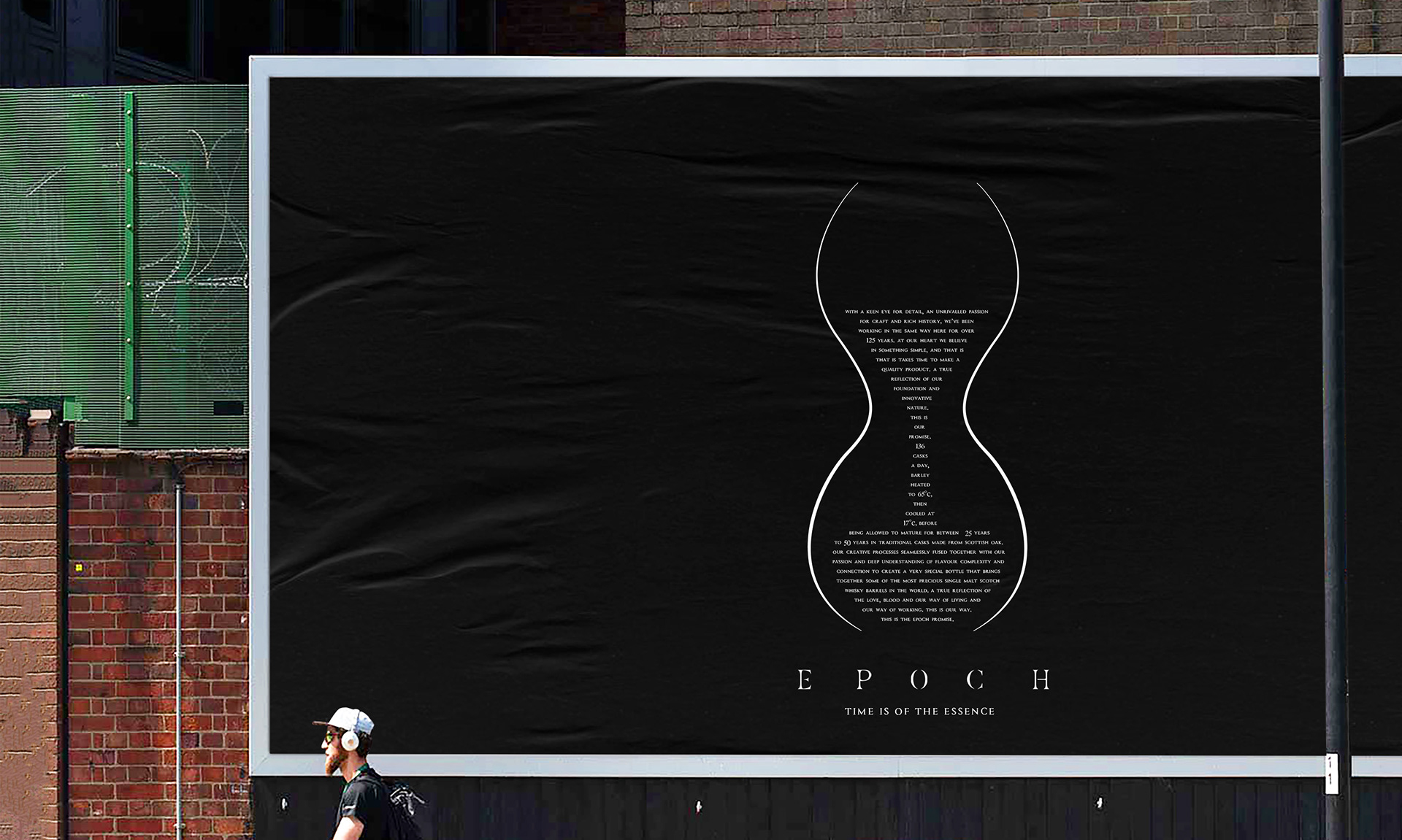
Epoch is a brand that believes in simple, and that is 'time is the essence' of everything it does, and with time comes better quality outcome. The brand crafts the element of time into all aspects, showing how time goes into everything it does.
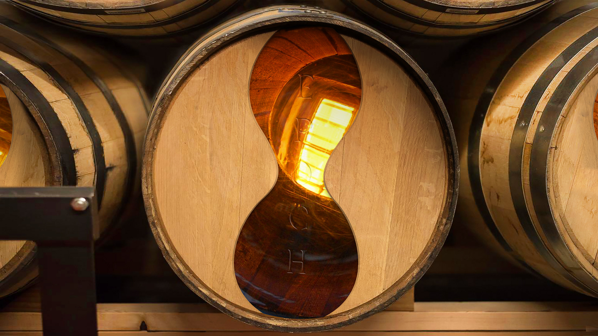
Packaging Design
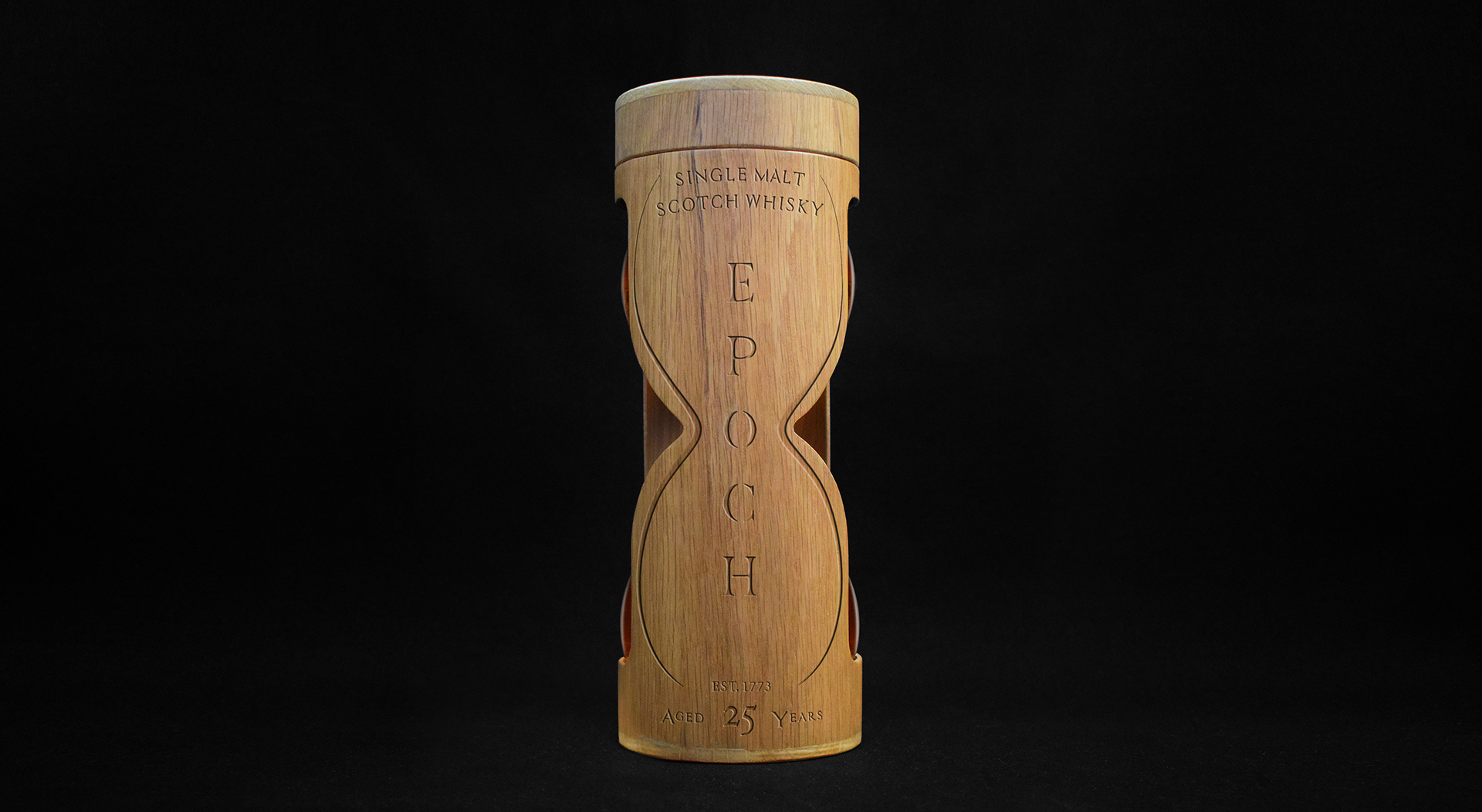
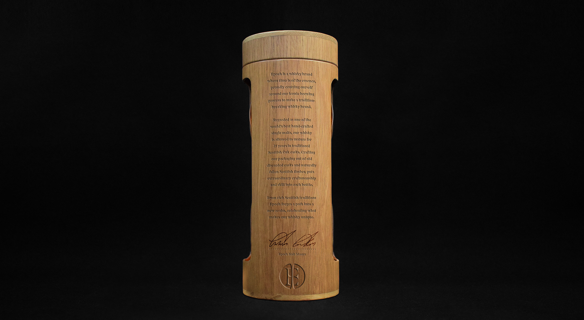
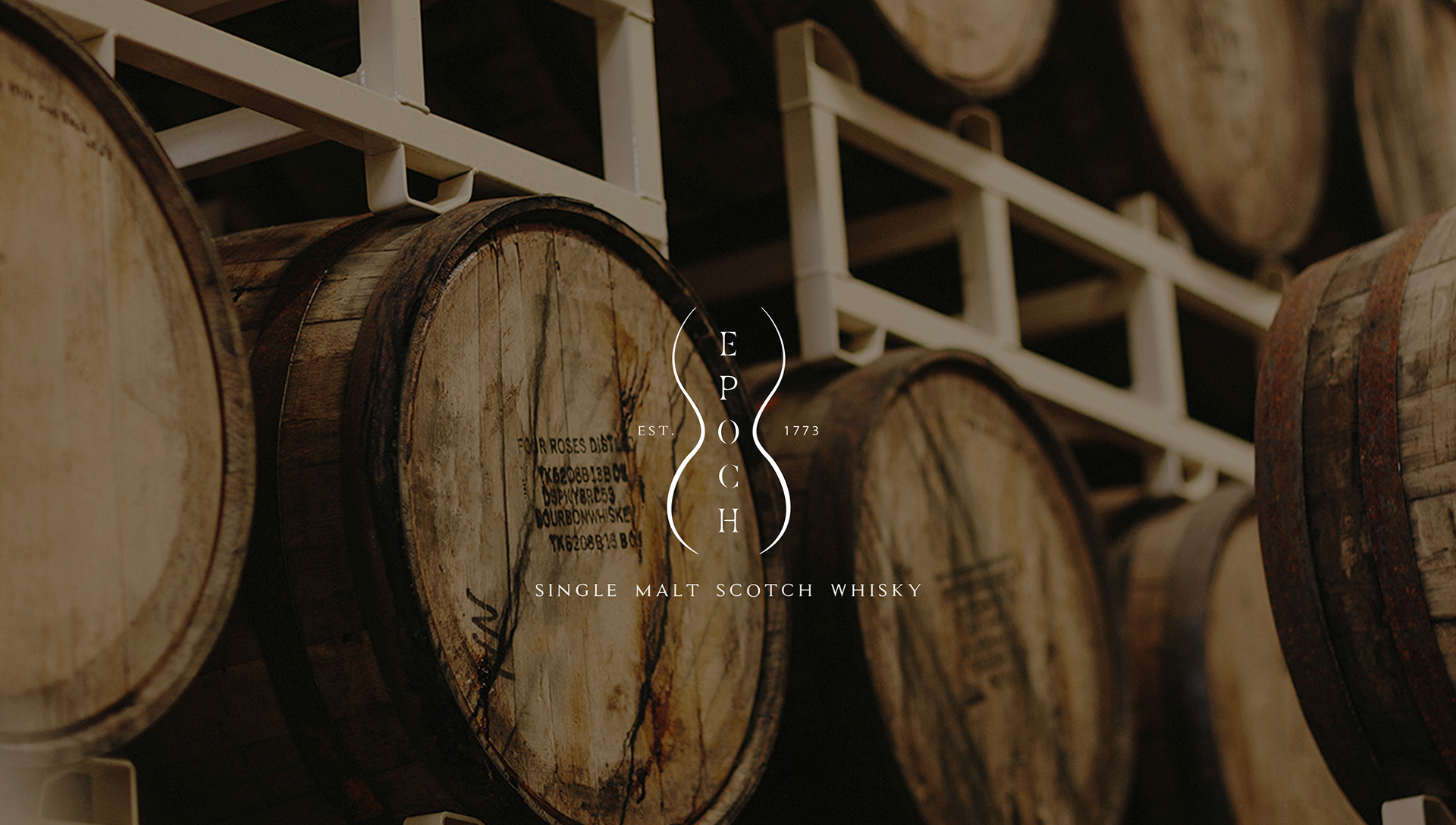
Epoch as a brand celebrates both its rich Scottish heritage and the element of time by crafting its exterior packaging out of its own old Oak whisky casks and naturally fallen Scottish timber. By enthusing the cask, the very ingredient in which the whisky gains it characterful flavour into the actual physicality of the product.
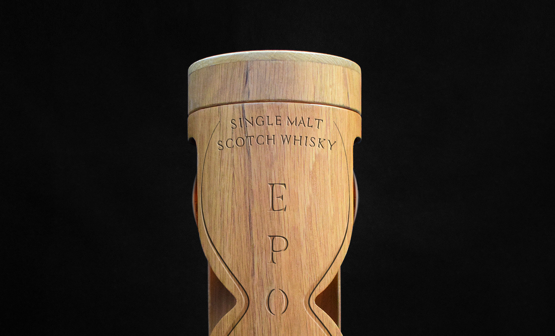
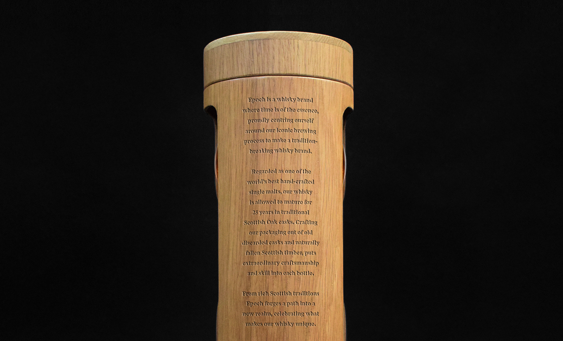
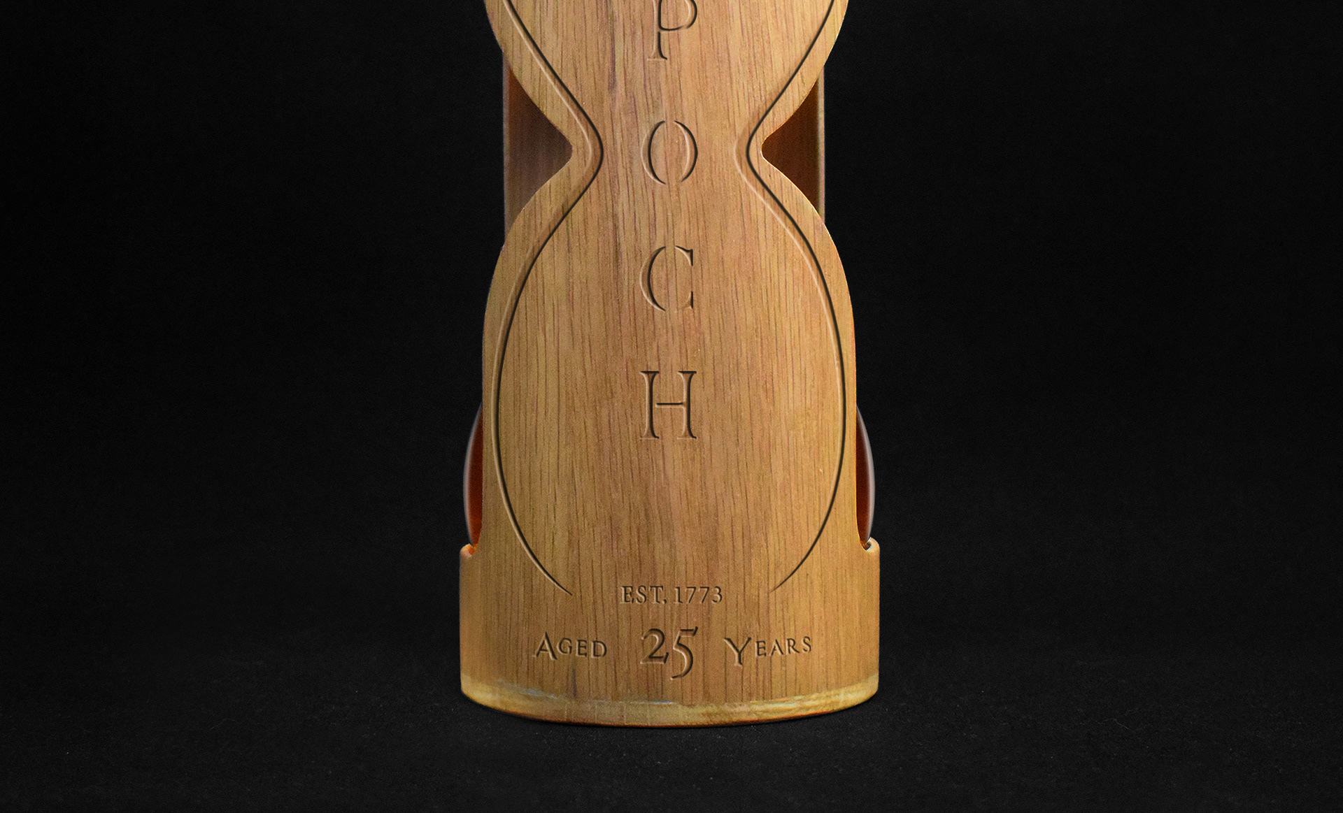
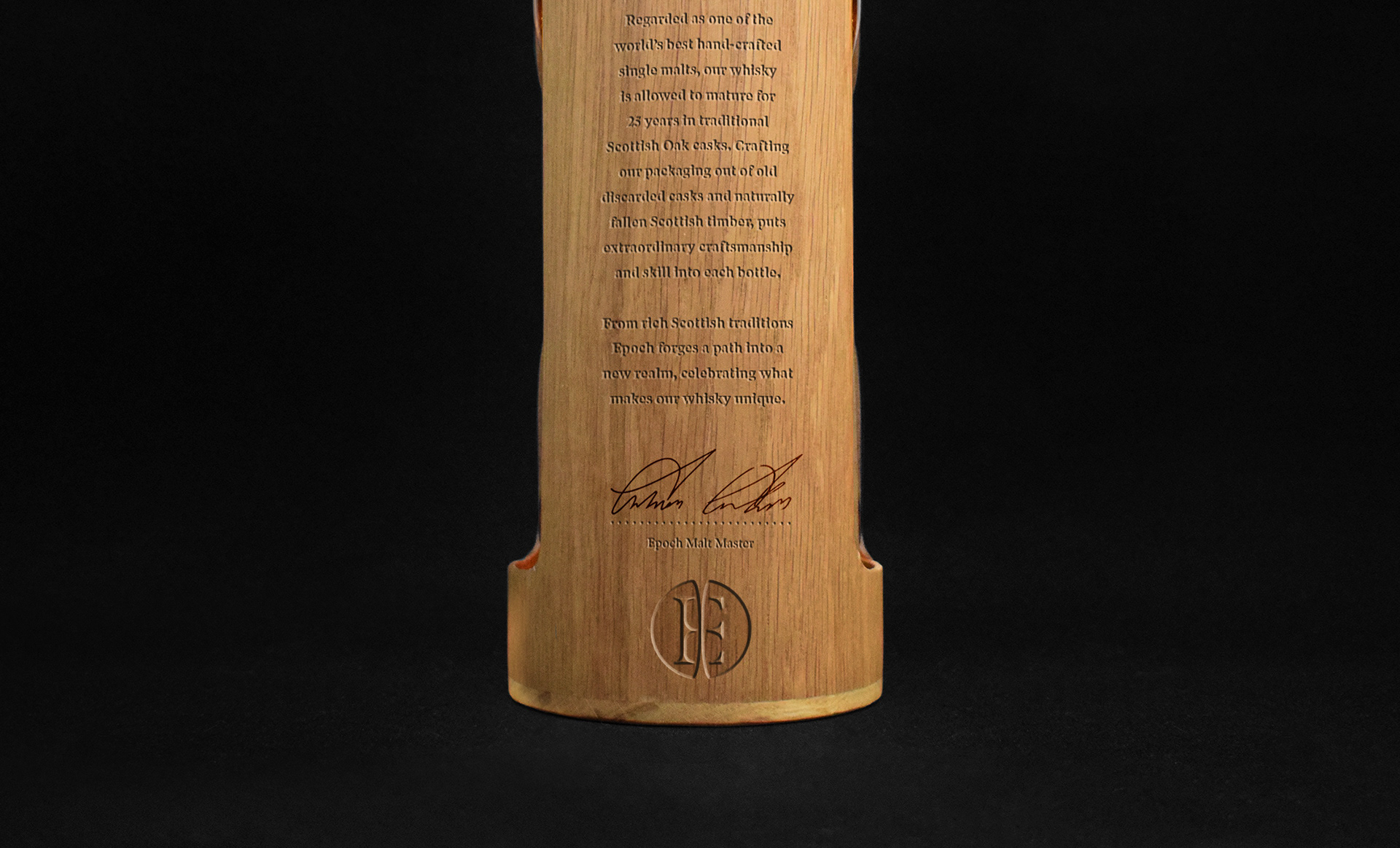
By crafting the brands exterior out of wood, teamed with the element of detailed engraving communicates a high quality standard and finish. Enthusing the element of time within the product by choosing to carving and engrave into the packaging instead to printing labels or printing directly onto the product. By taking the extra time in doing this, Epoch proves how much it cares about its product, what it does and its believe at the heart of the brand.
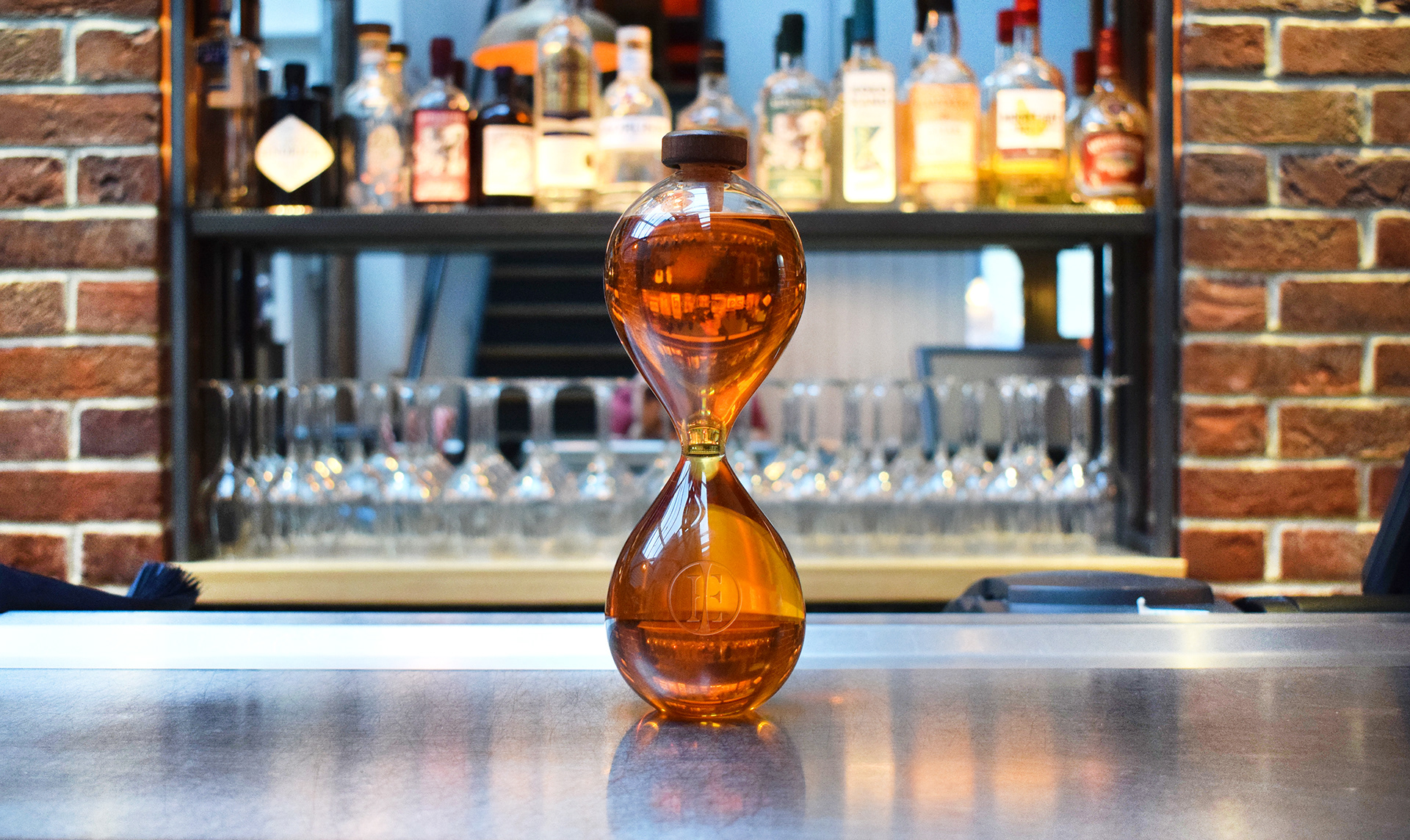
Bottle Design
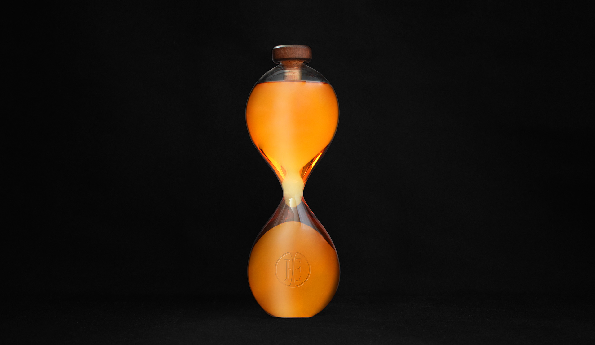
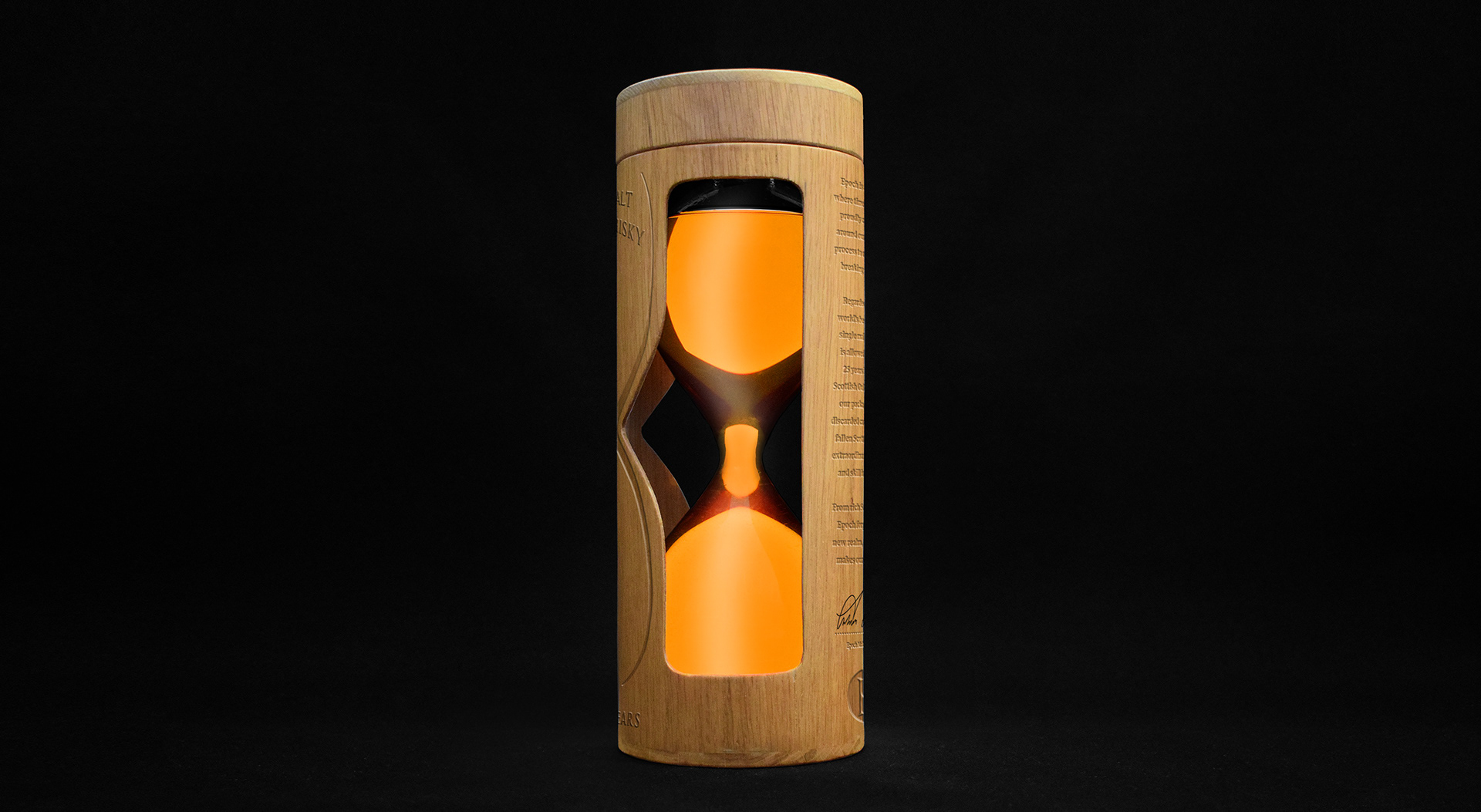
Epoch has created a unique whisky bottle designed to celebrate the time it took to create the whisky inside, created as the centre piece of the brand in which to connect all aspects of identity within the iconic shape of the hour glass time keeper.
The bottle's design makes it stand apart from every other whisky brand on the self and make it almost irresistible to hold. The very motion of the bottle when in use symbolises the brands value of time, as when the whisky is poured it flows back through the narrow centred bottle creating a unique user experience within the brand.
[Photographed at 'The Iron House' Norwich]
[Glass bottle blown by 'Hampshire (R&D) Glassware Ltd']
[Wooden packaging crafted by Dan Quanstrom 'Quanstrom Studio']
Brand Extensions

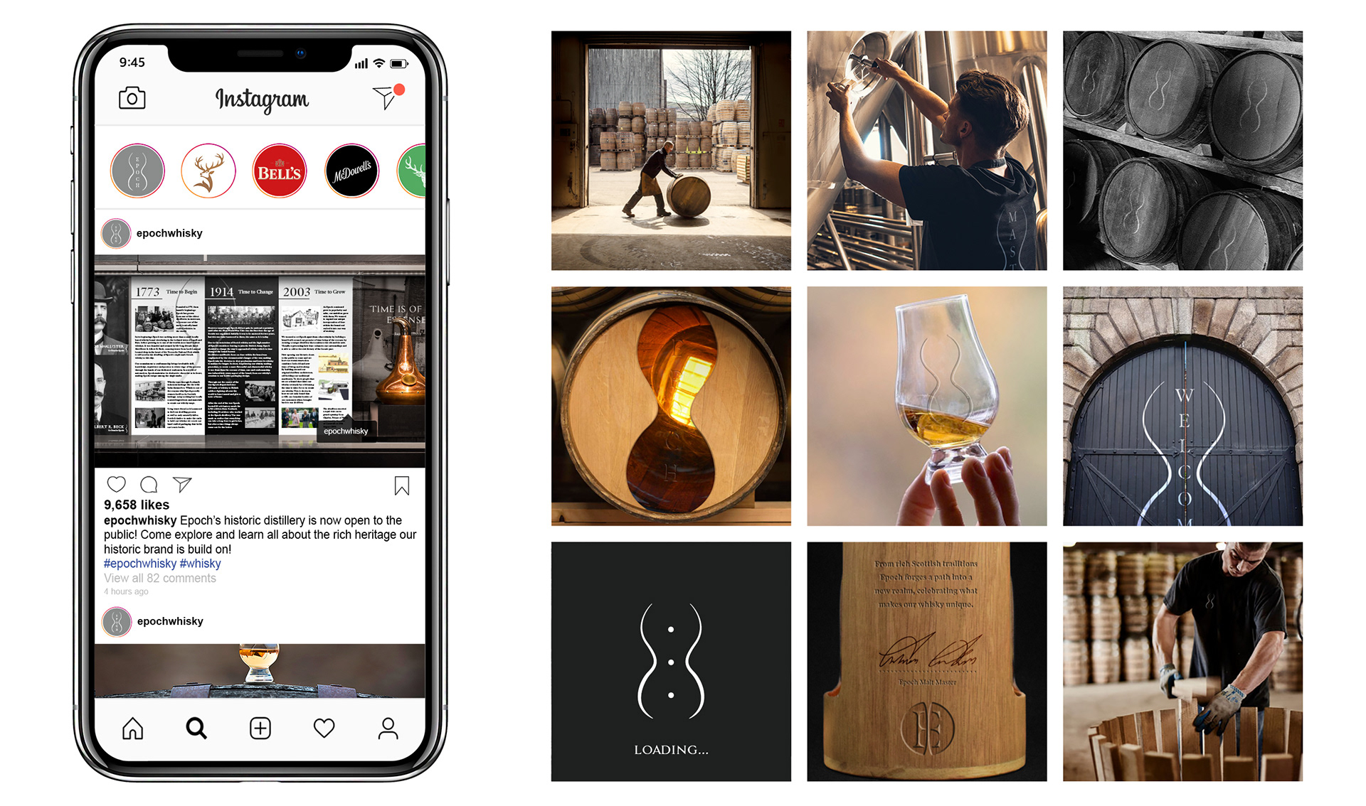
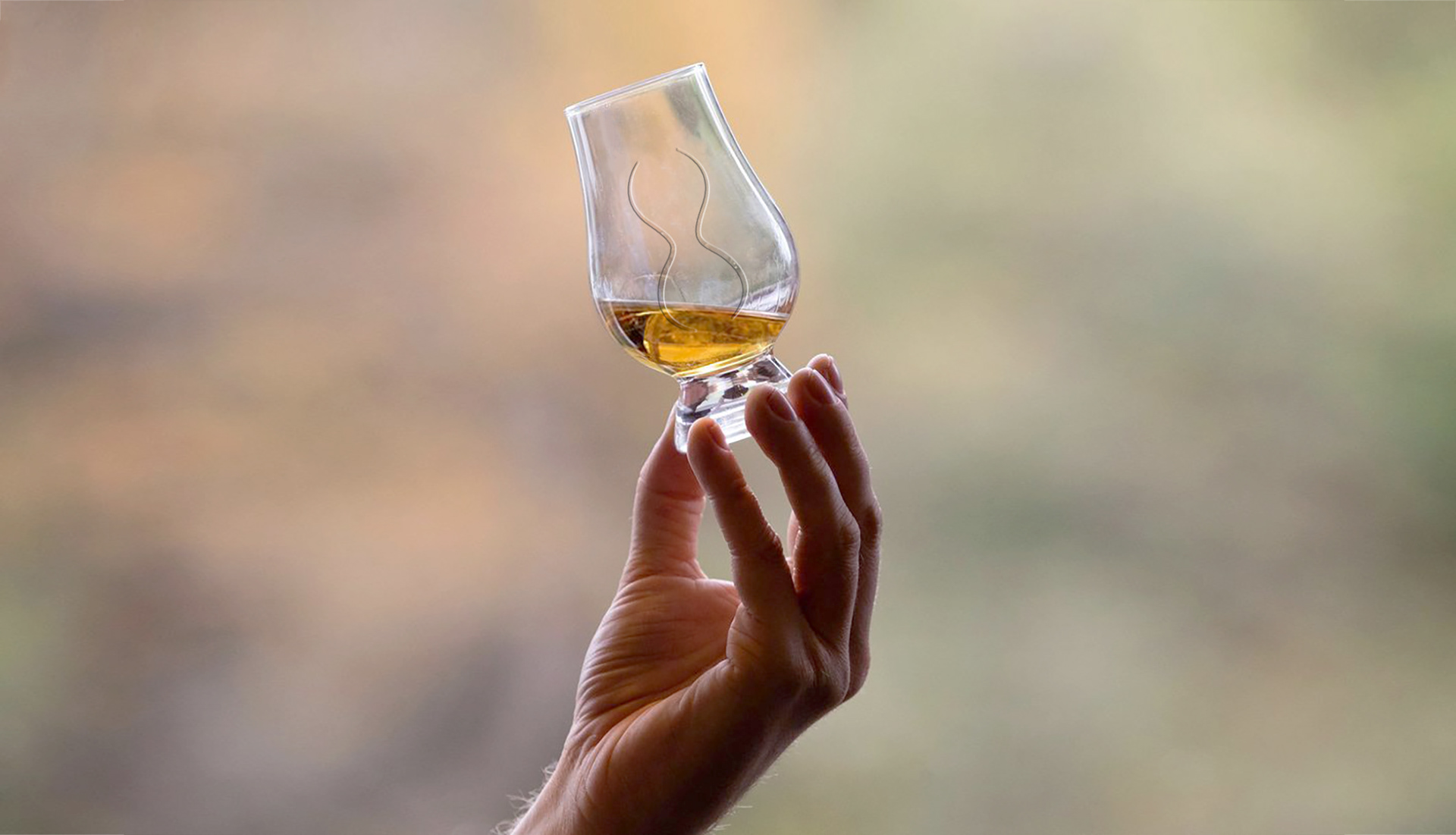
Epochs visual enthuses of time and main attribute of the bands bottle is simply reflected within the contours of the iconic hourglass device. The simplicity of the main visual device means it can work effectively across a number of platforms. Branded glasses hold the whisky level within the outline of our hour glass, of the level of whisky as a measuring device to communicate when it's near empty, and is time for a re-fill.
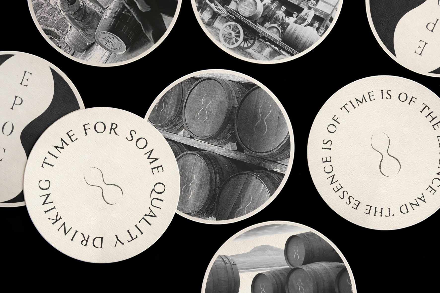
Even the brands place mats have an element of time about them. With one side containing imagery from Epoch's past, while the other features a timeless phrase (literally), with quotations designed to go around in a cycle, as seen in the example 'Time for some quality drinking time'.
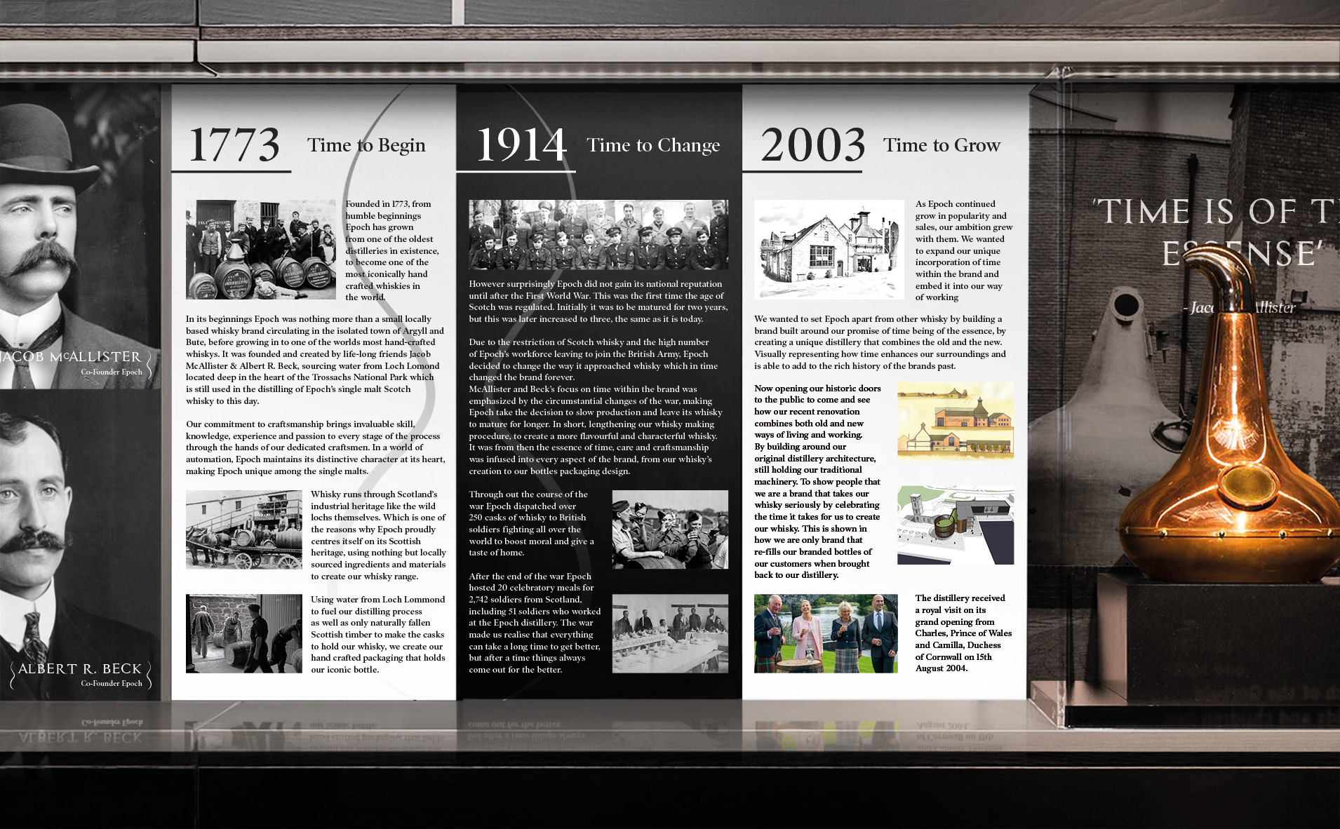
Epoch is a brand that centres itself around the time it takes to create its product and the rich history of the industry. The brand experiences stretches from the packaging and branding through to it visual identity, highlighting its key historic attributes.