
Brand Identity

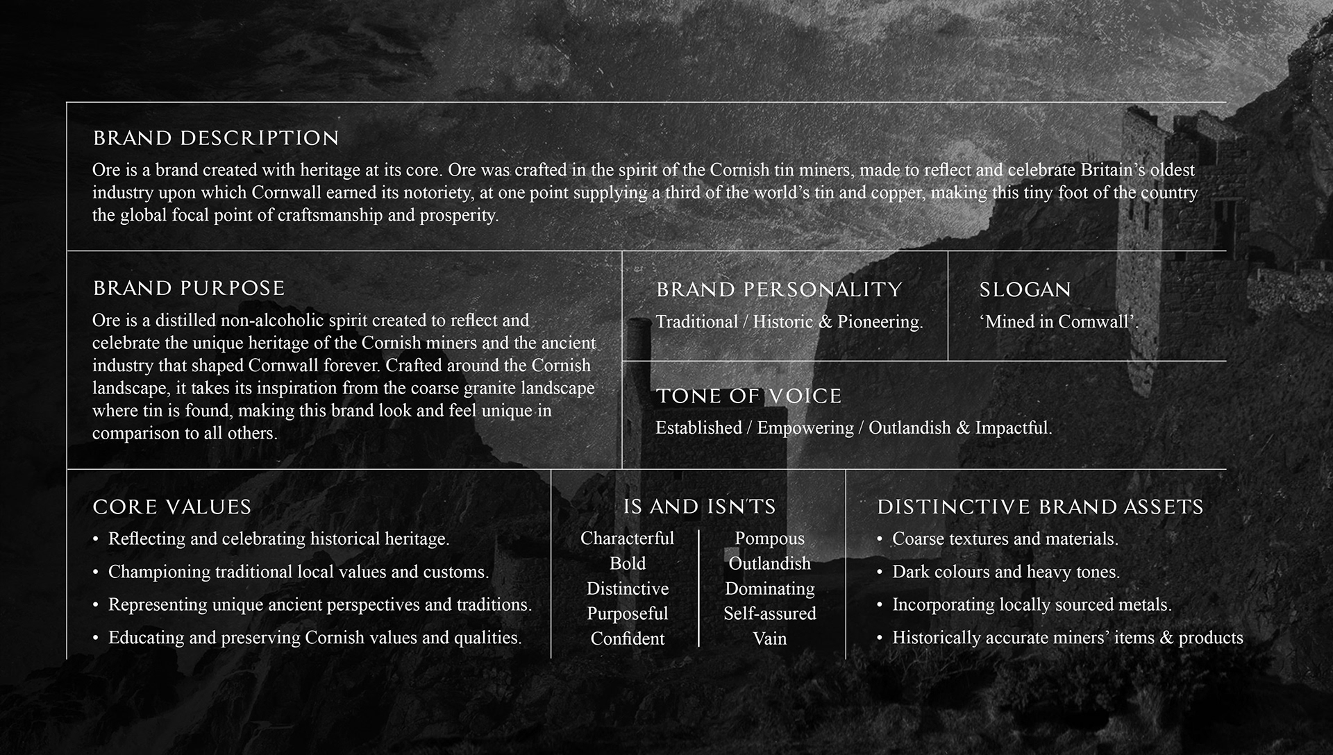
Ore is a brand created with heritage at its core. Ore was crafted in the spirit of the Cornish tin miners, made to reflect and celebrate Britains oldest industry upon which Cornwall earned its notoriety, supplying at once point 1/3 of the worlds tin and copper.
Brand Strategy
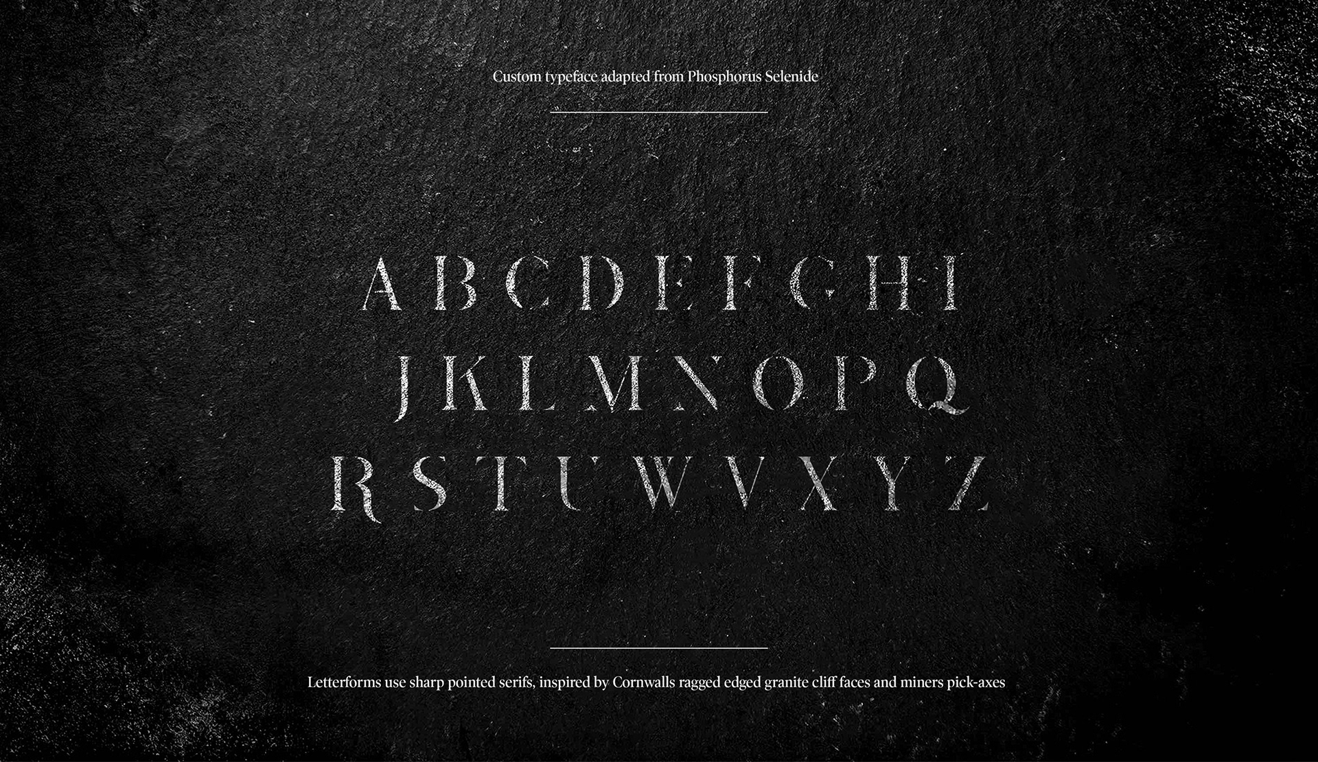
Typeface
'Created around Cornwall's 4,000 year old heritage of tin mining, getting its name from the precious metal extracted from deep within the granite rock that makes up the iconic Cornish landscape where tin mining took place.
Inspired by the Cornish tin miners Methodist roots, Ore is a distilled non-alcoholic spirit created to reflect and celebrate the unique heritage of the Cornish miners and the ancient industry that shaped Cornwall.'
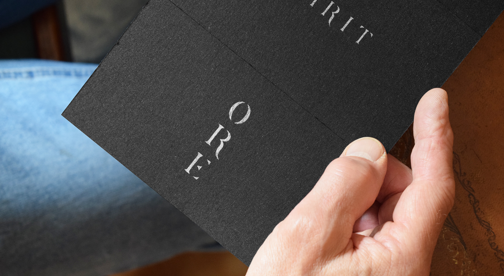
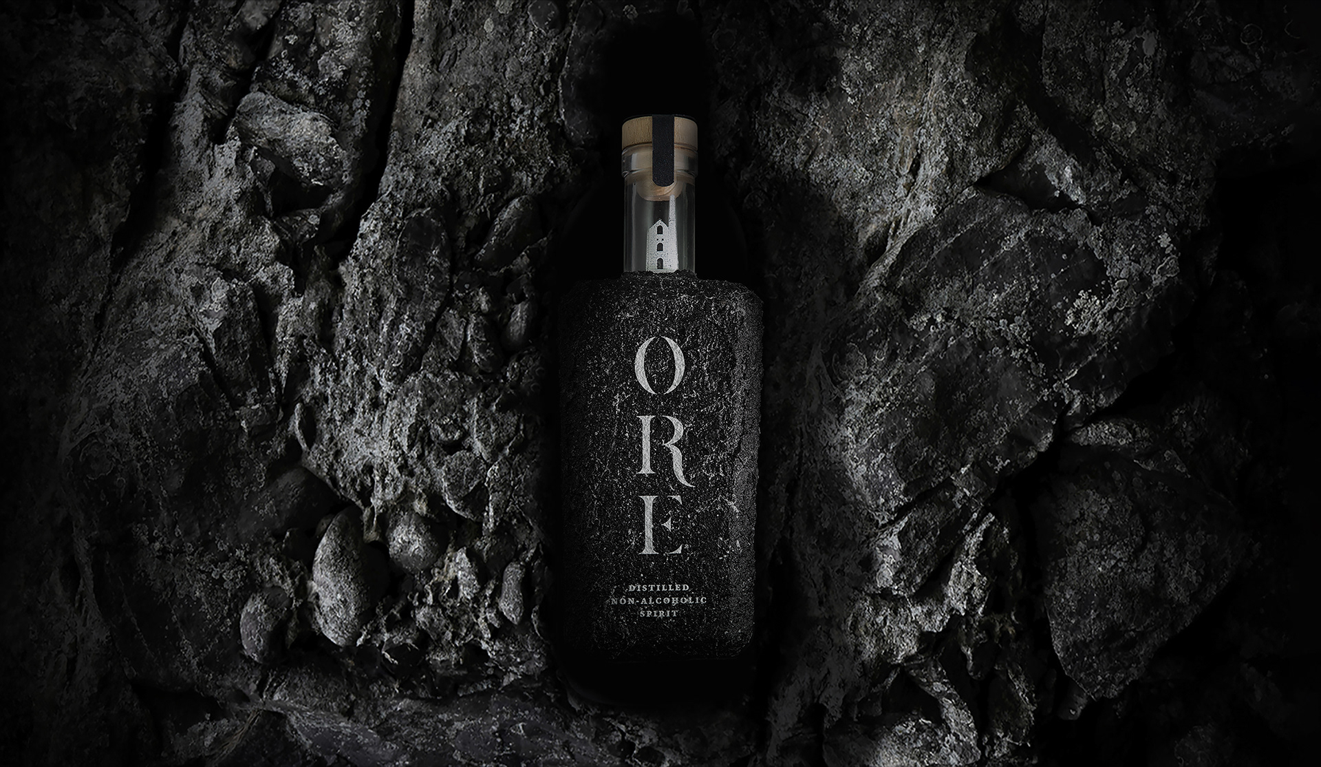
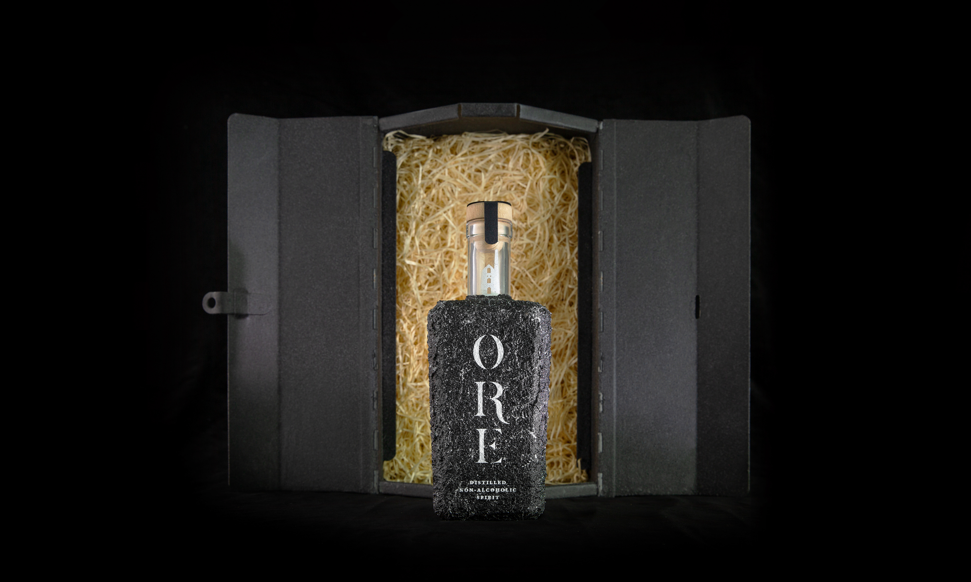
Bottle Design
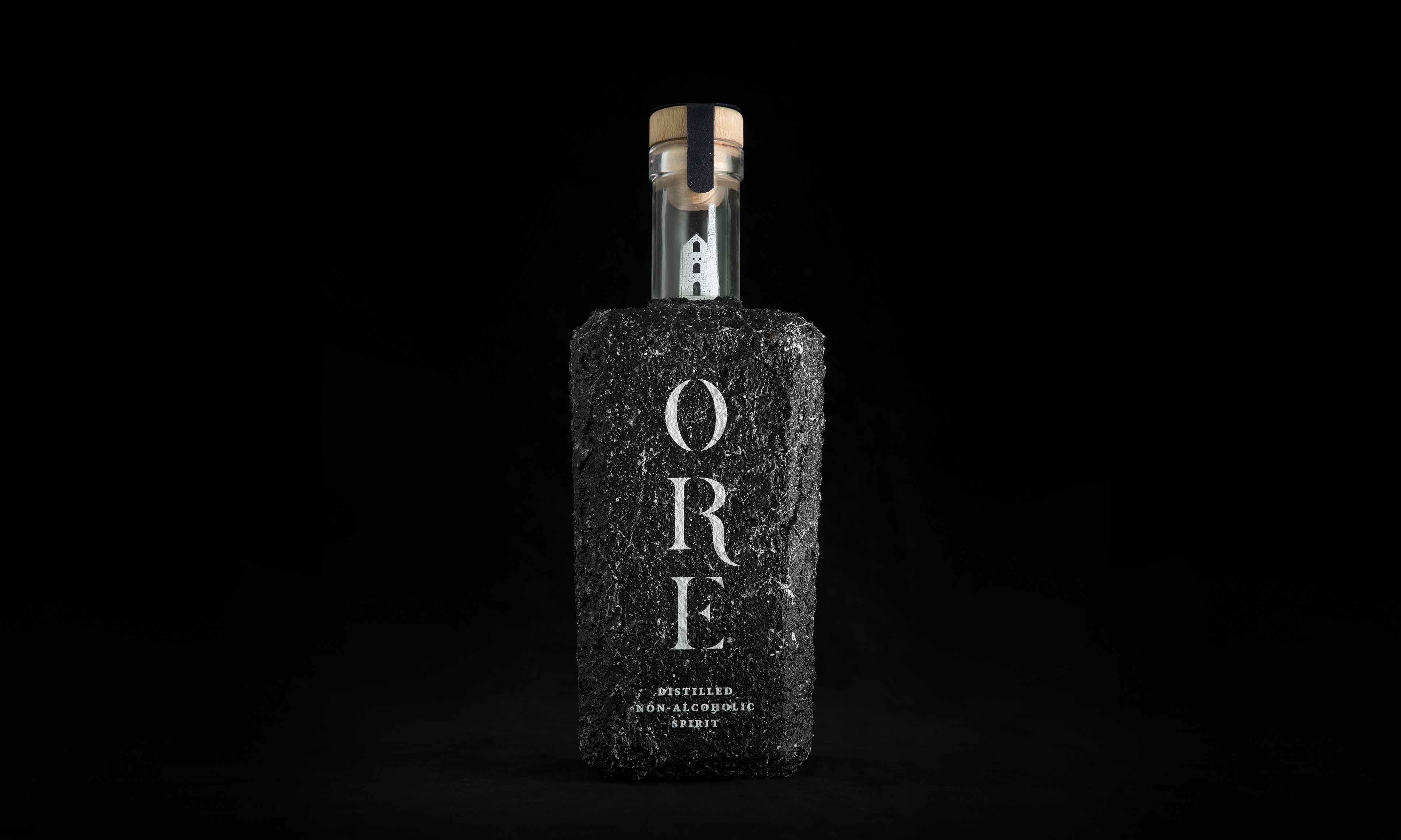
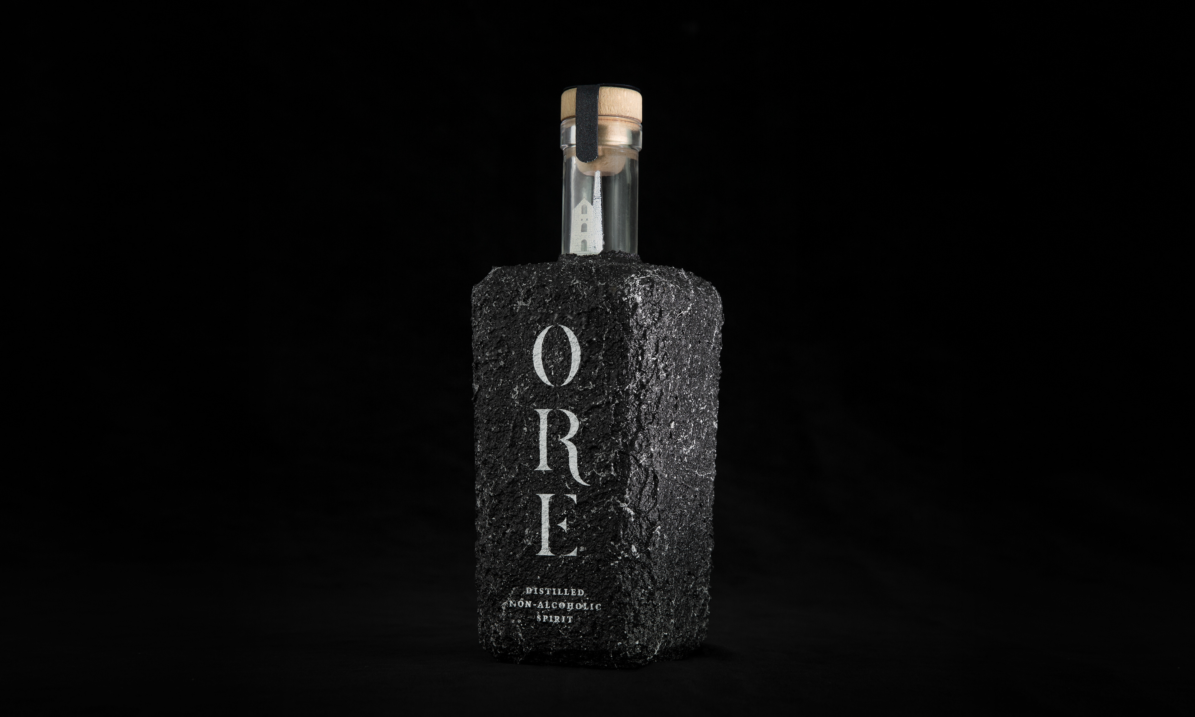
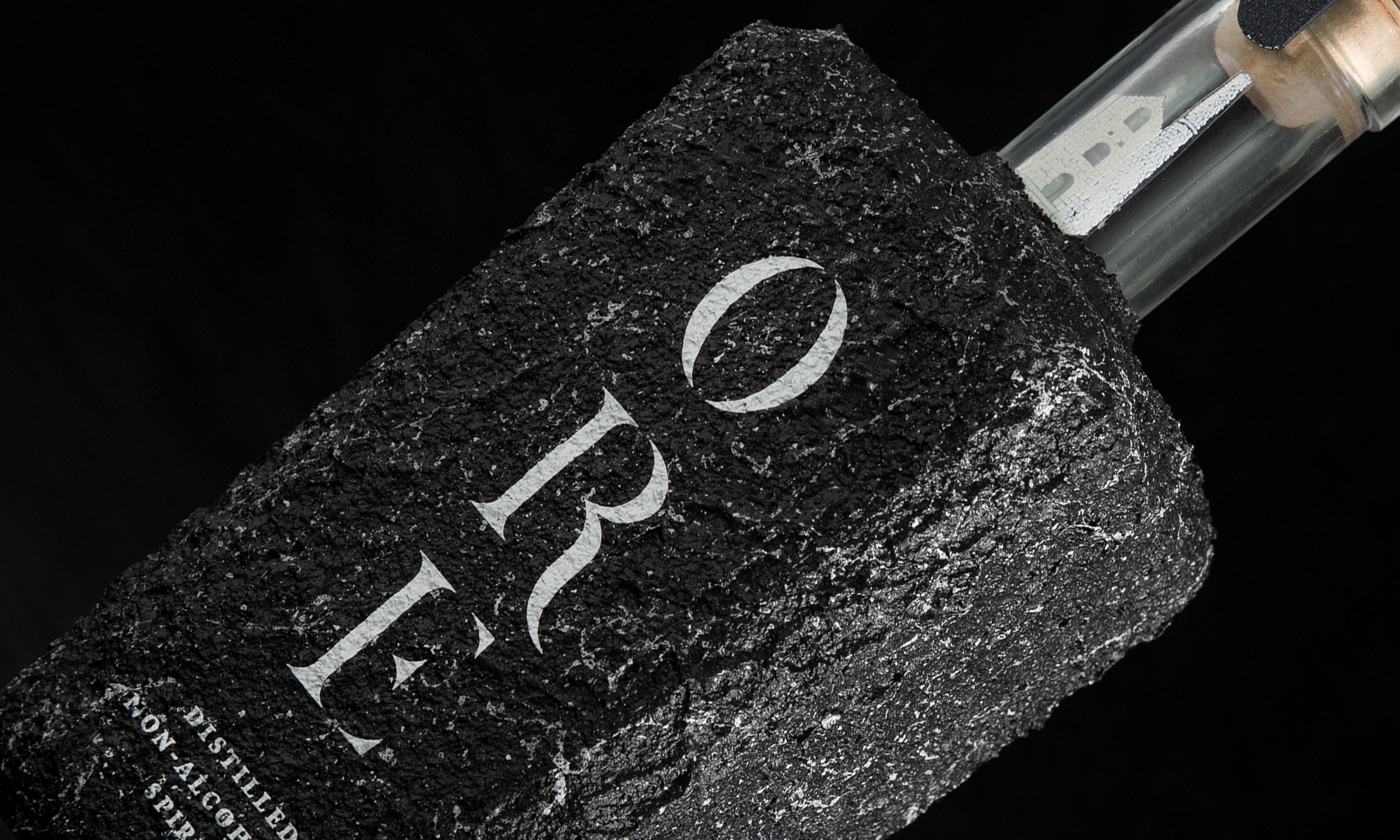
The bottle was crafted around the Cornish landscape, taking inspiration from the coarse granite landscape where tin is found. Embedding a unique textured effect to the bottle to reflect the spirit of Cornwall simply from touch, making it a memorable and interactive experience.

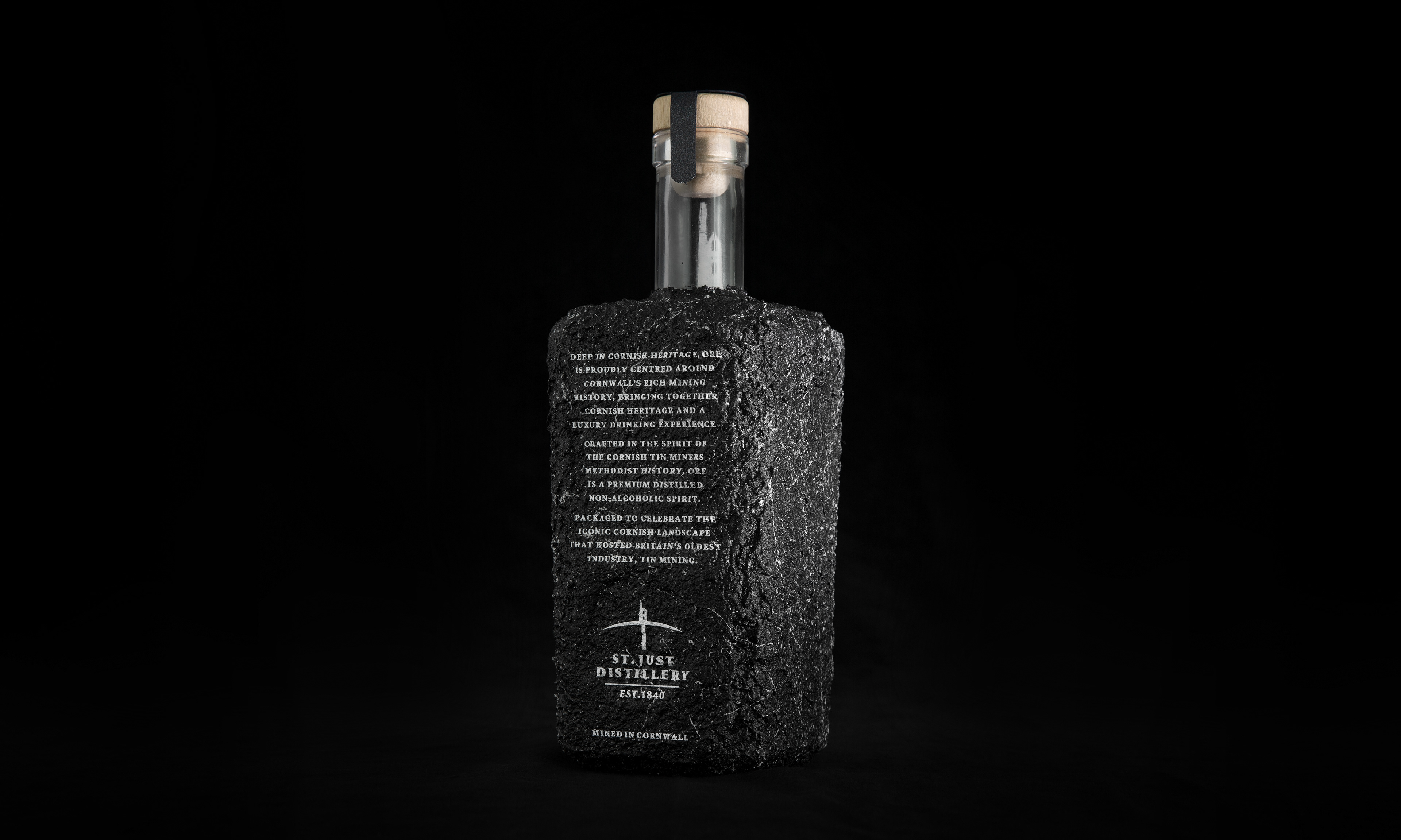
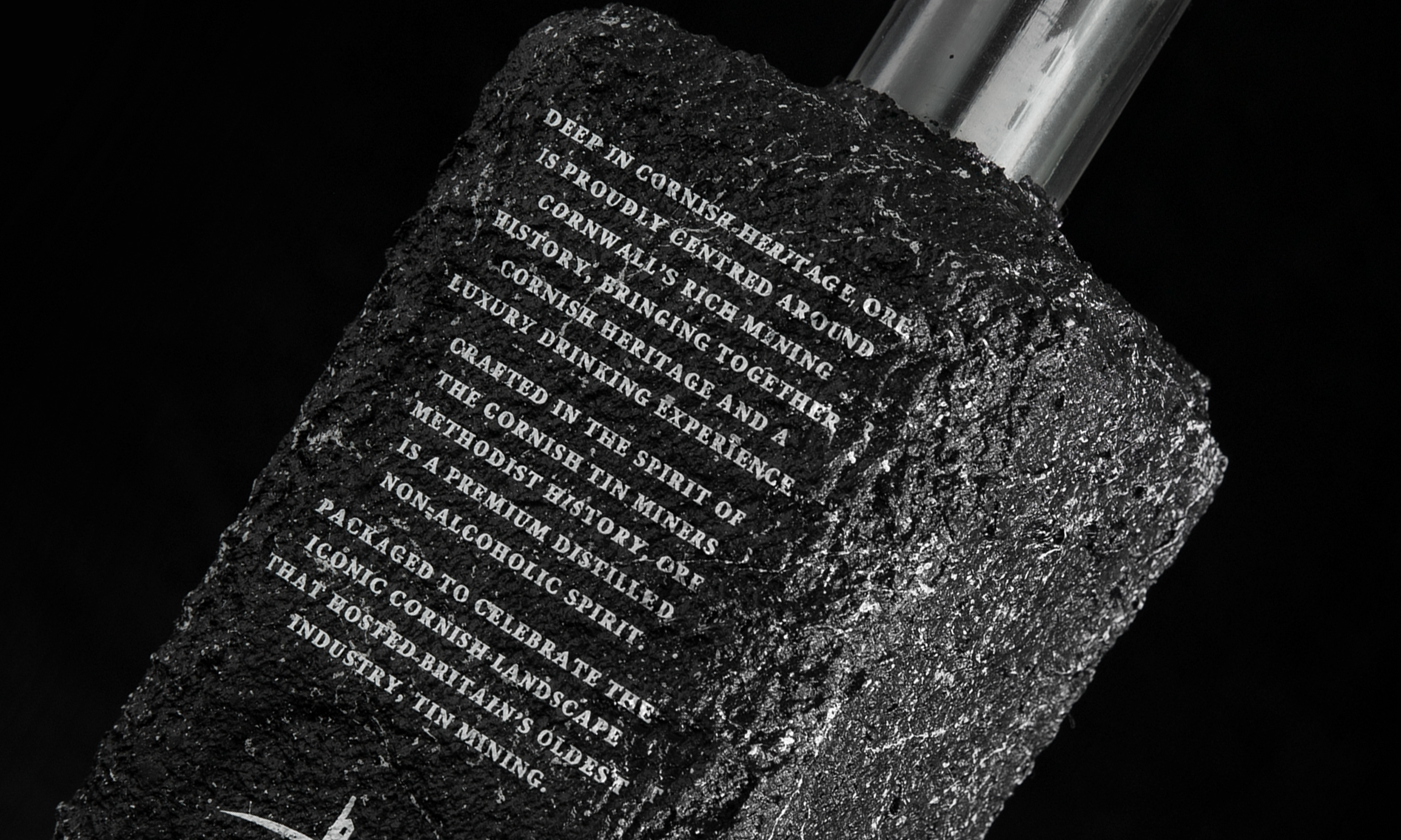
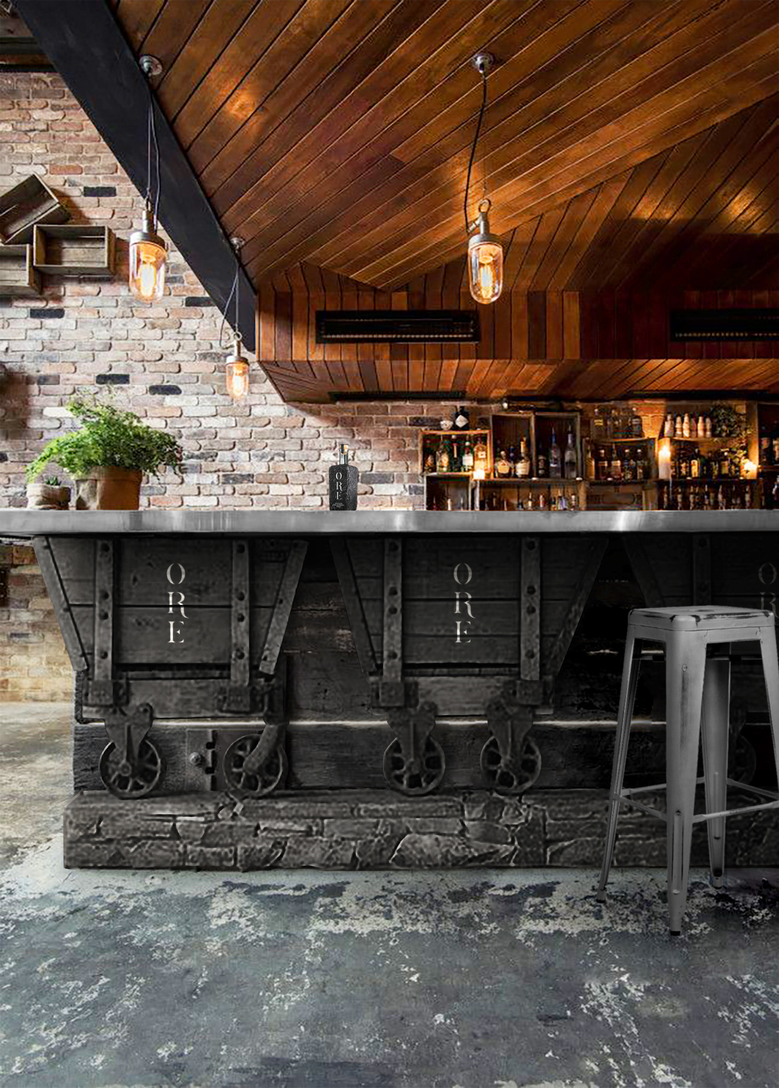
A brand based on local values of history and heritage, Ore was created in 'St. Just Distillery', a reimagined Cornish distillery named after one of the most iconic mining regions in Cornwall. The textured bottle and the utilising of the iconic mining region of Cornwall, creates the feeling that the bottle as actually been taken from the ground, and mined into the famous granite block shape. Literally 'Mined in Cornwall'.
Special Edition Case
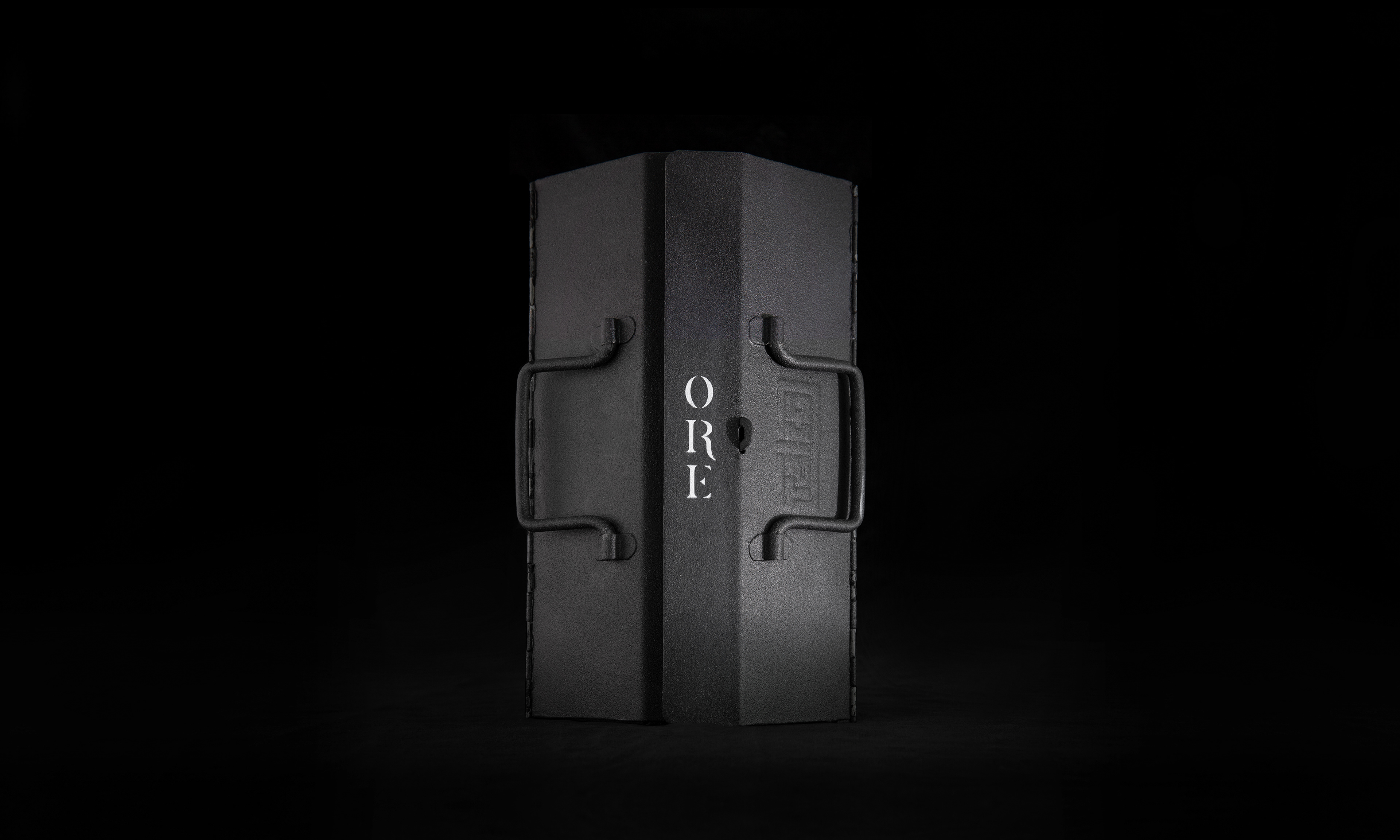
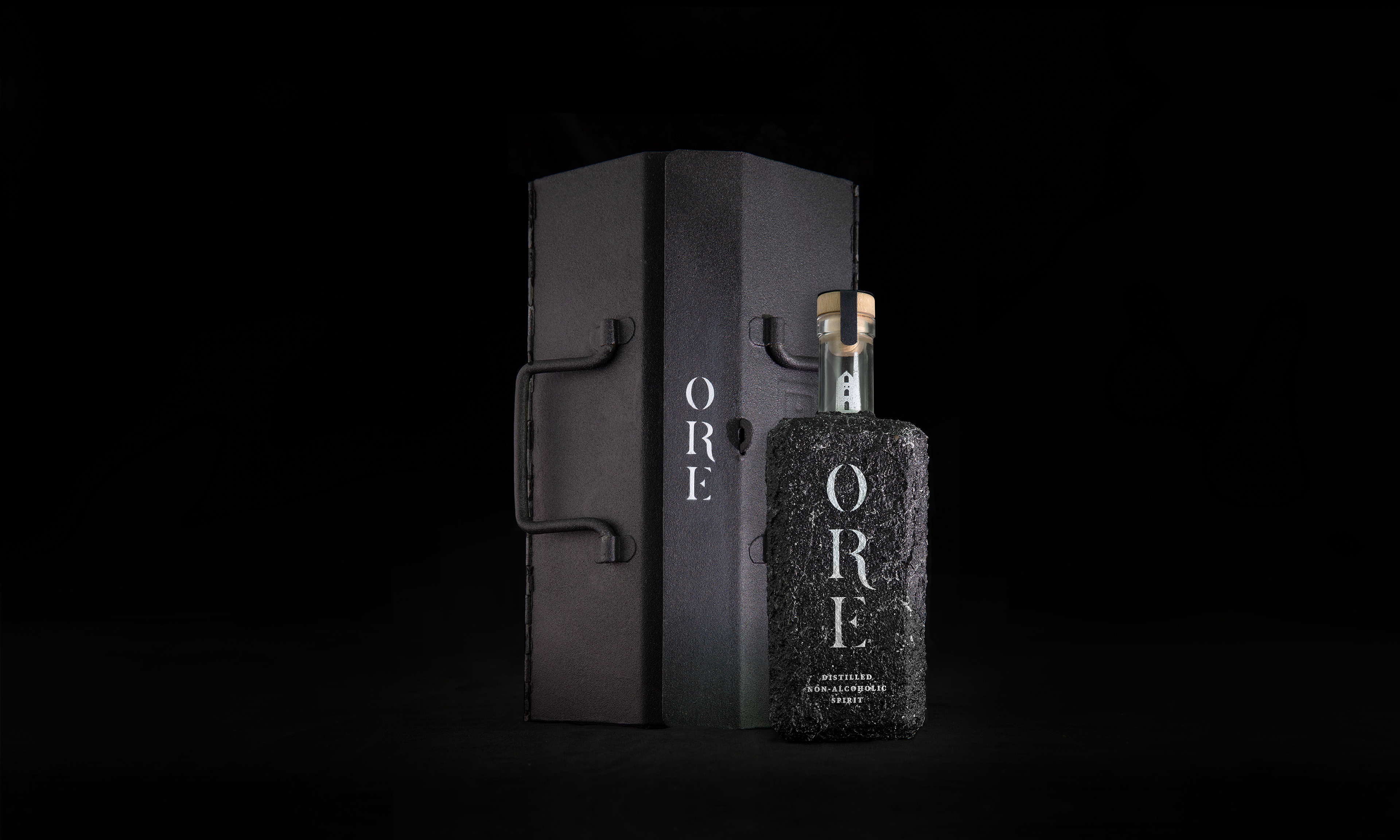
The special edition drinks case comes in the form of an old styled miners box, typical of the type the miners would have taken down the mines. Overall creating a wholesome connected identity with an element of Cornwall and mining within every aspect of the brand.
Brand Collection

Ore's additional brand assets all feature a bright silver element (reminiscent of the streams of Cornish tin) to connect all aspects together with a luxury feel and finish to the brand.
Includes: Ore bottle / bottle casing / tin shot glasses / granite placemats / brand editorial / tin tankards & cocktail cups
Brand Extensions
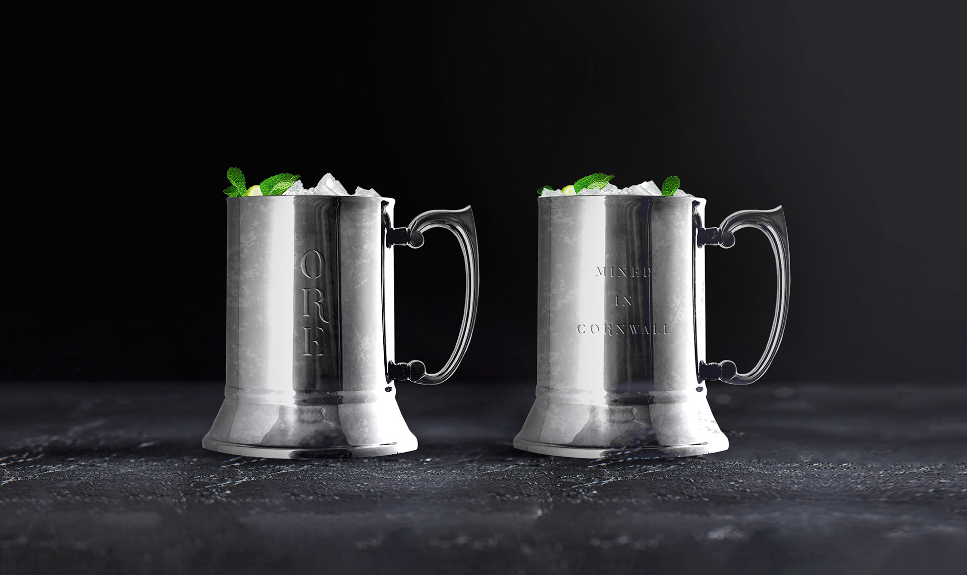
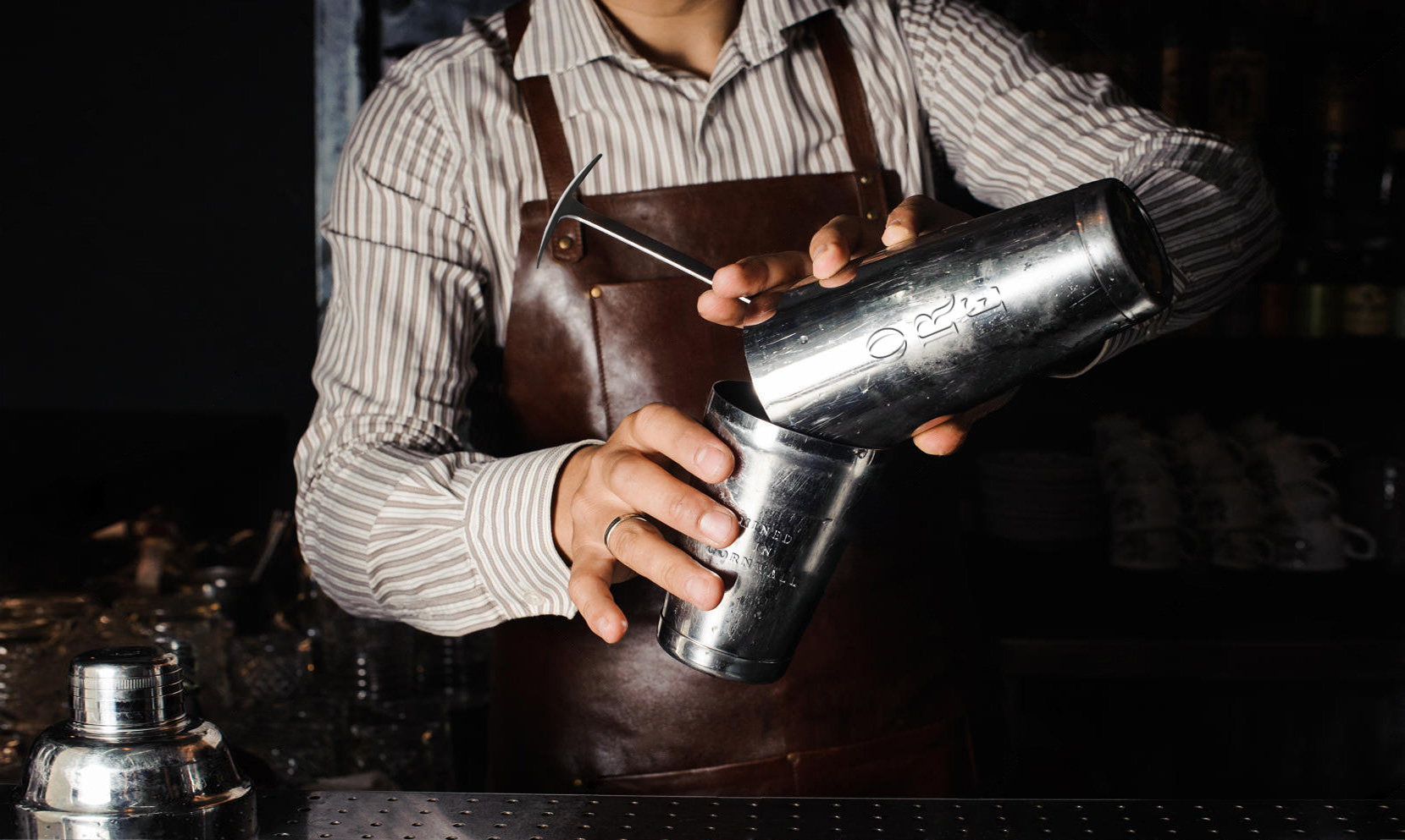
Ore drinks containers come in the form of tankards, famously used by miners before, during and after their days work. Made out of sourced from the Cornish mines.
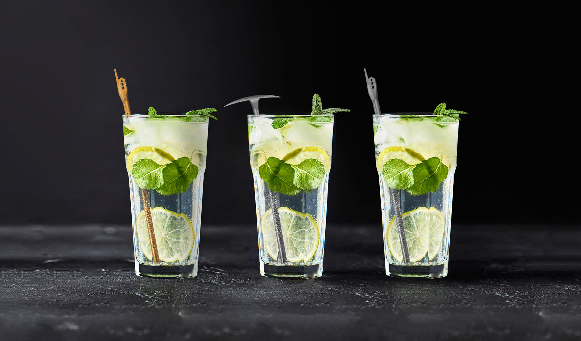
Ore drink stirs are made from a range of different locally sourced metals, mined from Cornwall including copper, tin and zinc. Crafted into the iconic pick-axe shape used by the miners to extract the streams of tin from the granite. Designs incorporating the iconic engine-house shape (that is only found within Cornish mining) and tall stack structures create a perfect top piece for the stirrer, representing the downward tunnelling of the mining process.
Brand Promotion & Advertising
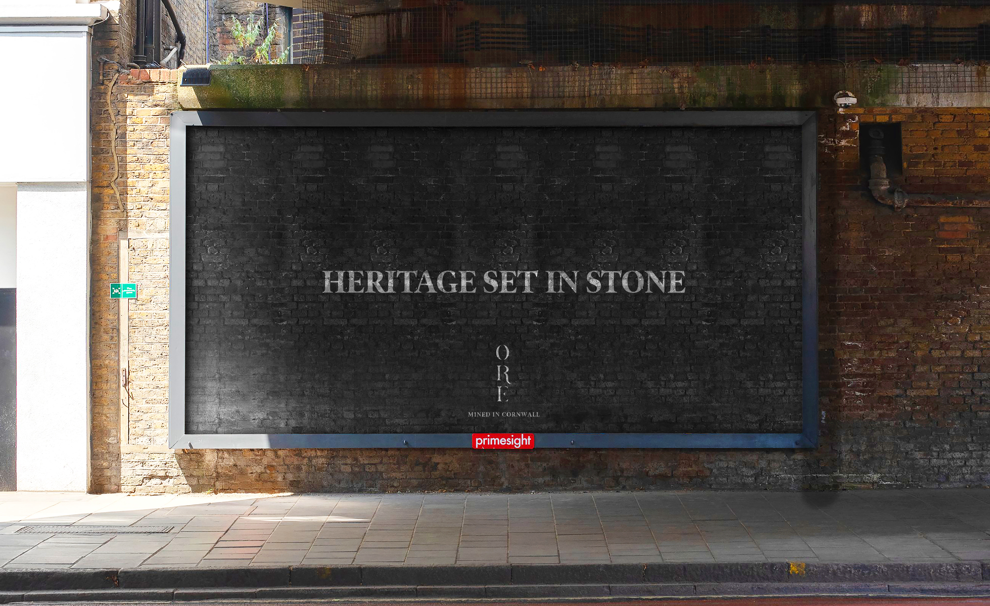
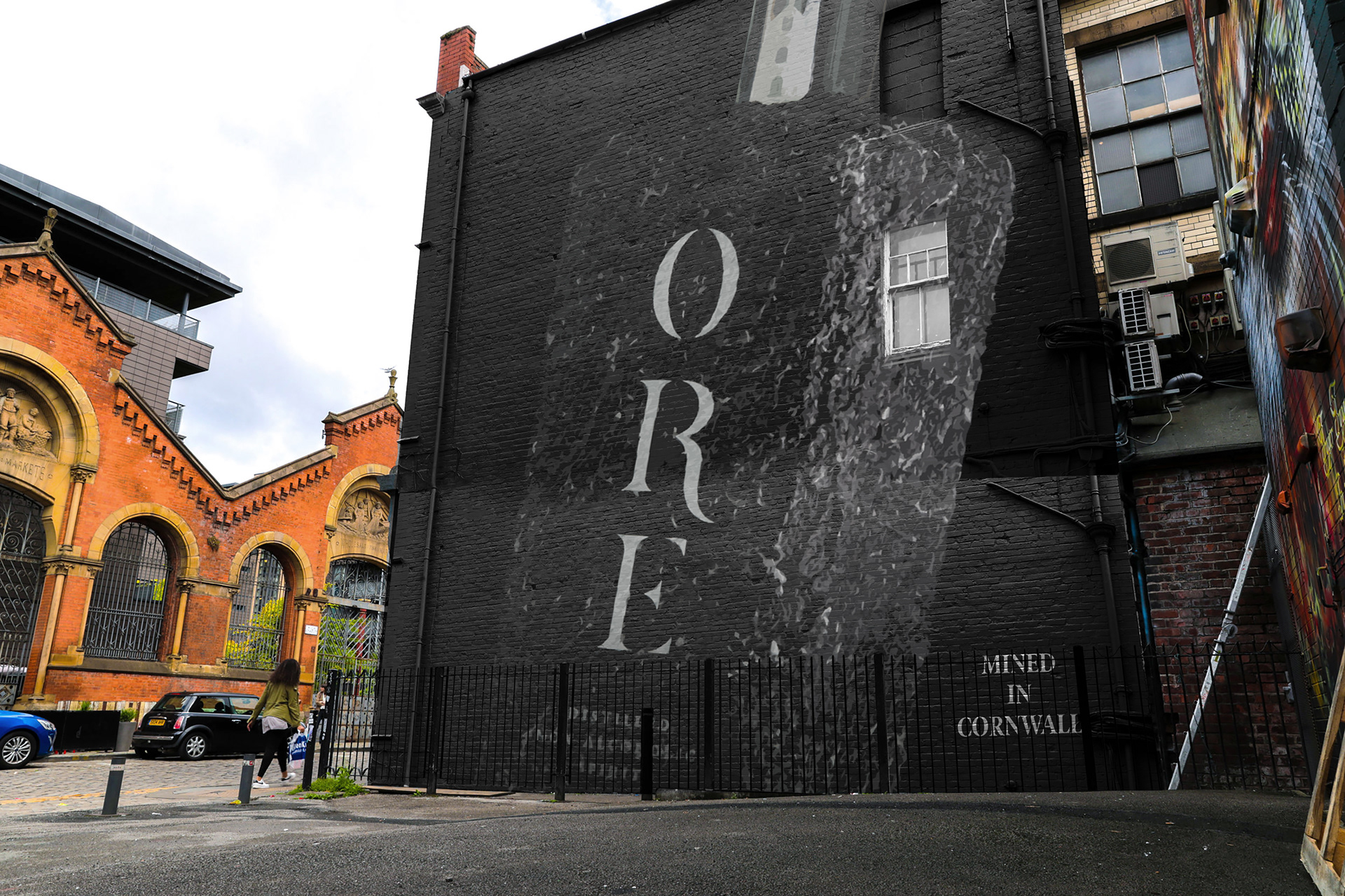
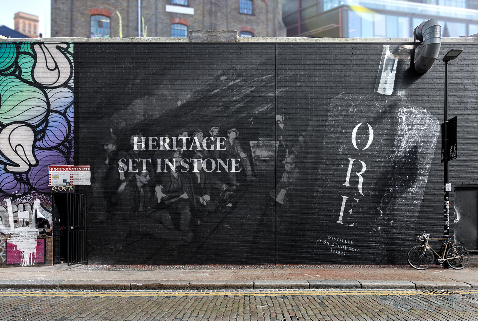
Ore's advertising takes place on textured surfaces, including rocks, walls and buildings to reflect the nature of the brand. By incorporating the impactful texture of the brand packaging into the additional promotional assets, this creates an impactful upon audiences, setting Ore's brand values and promises in stone.
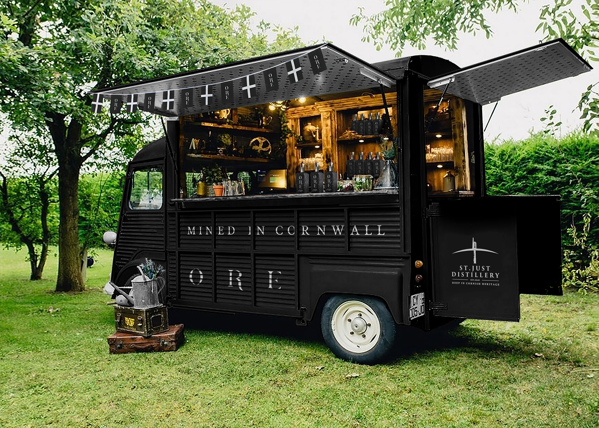
Ore's promotional vans are designed around the old fashioned mining vehicles that used to carry produce to and from the mines. Completed in Ore's brand colours and a old fashioned rugged interior.
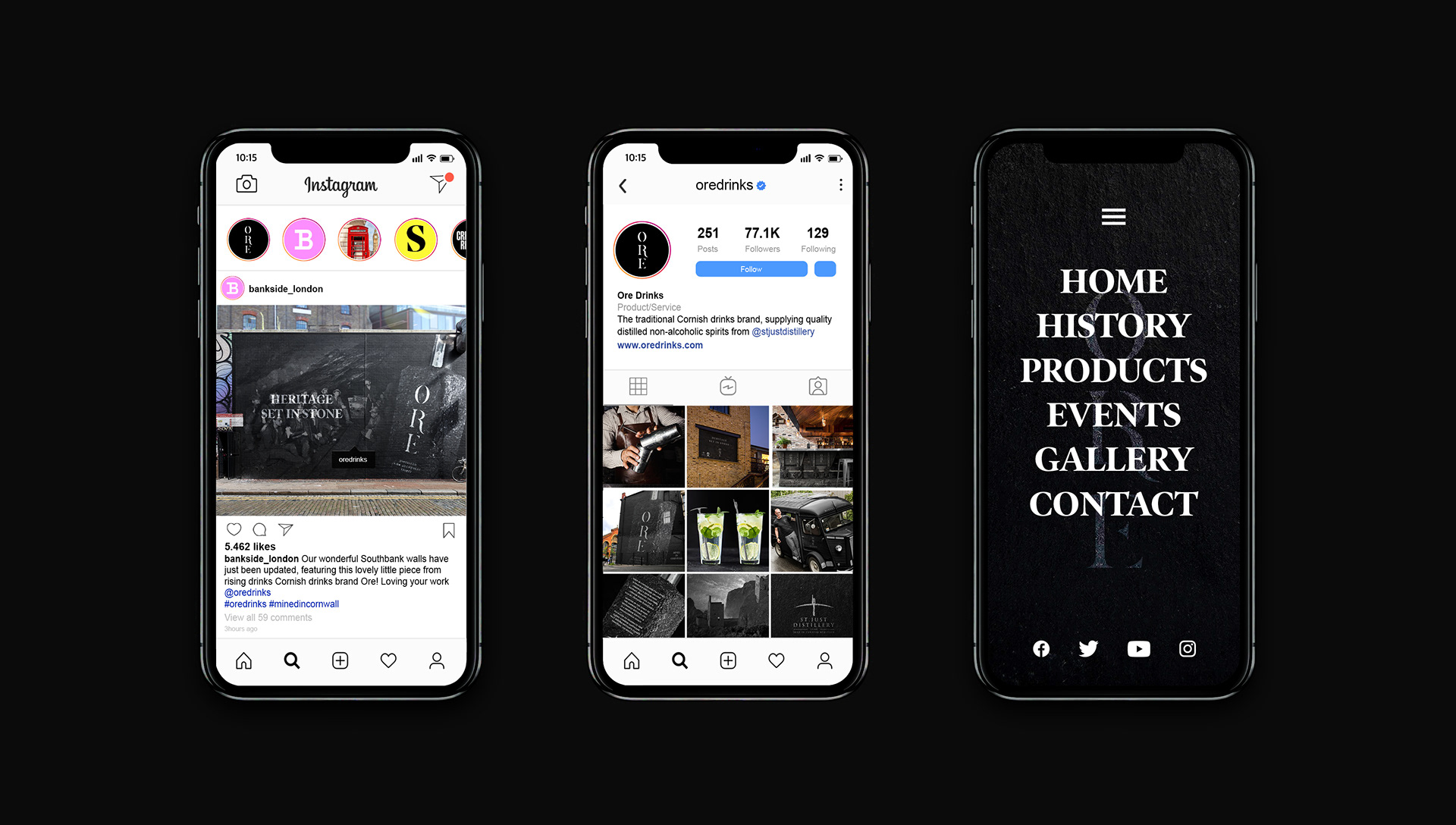
Social Media
Creating a unity of Cornish elements within the brand to create a consistent strong identity was completed by incorporating the famous words of David Penhaligon, a landmark Liberal MP for Truro & Cornwall. Who fought for the rights of the Cornish miners' during the industry's sudden decline.
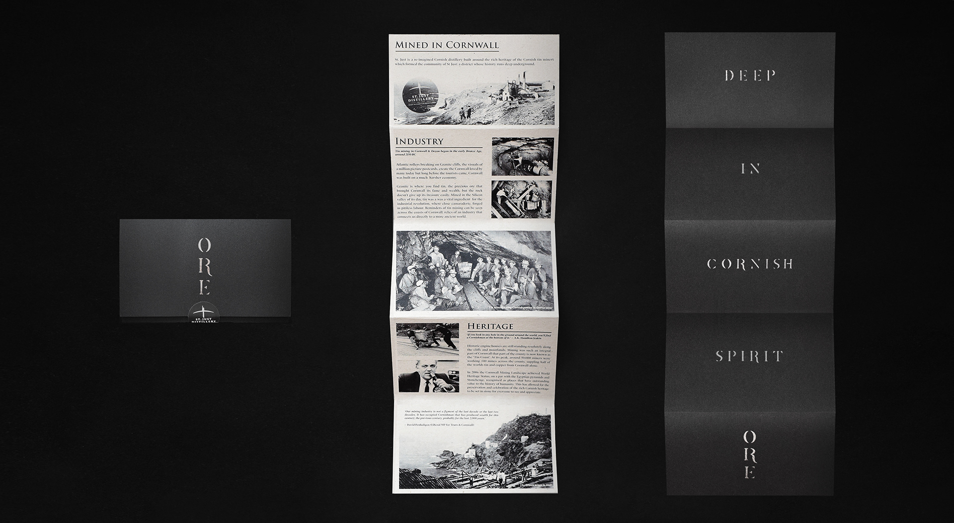
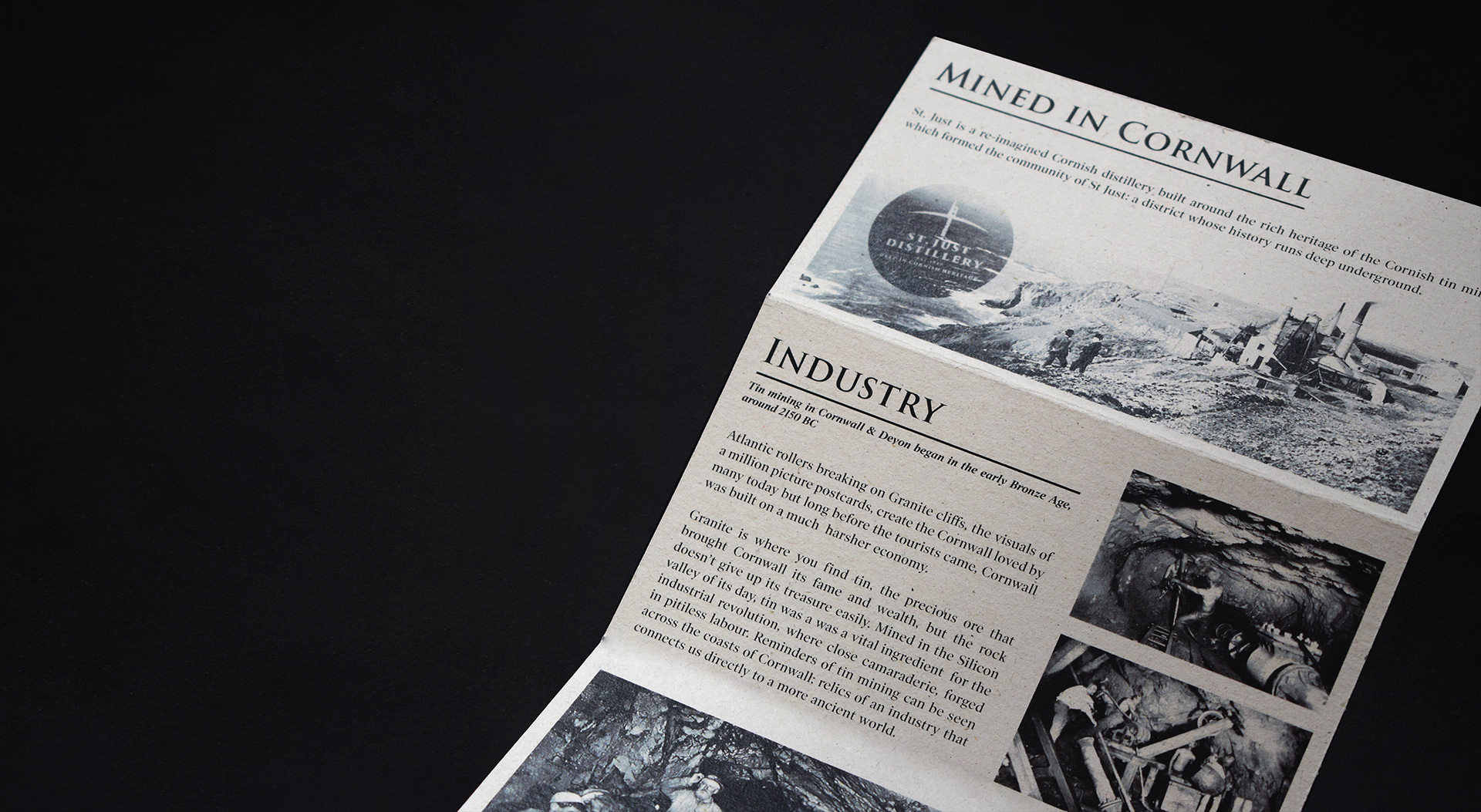
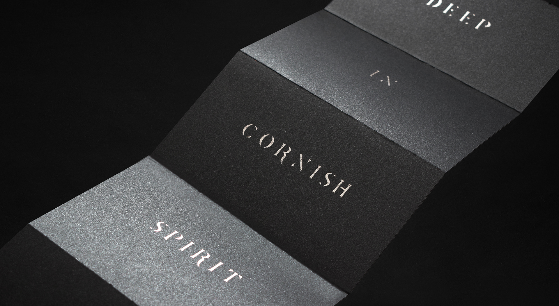
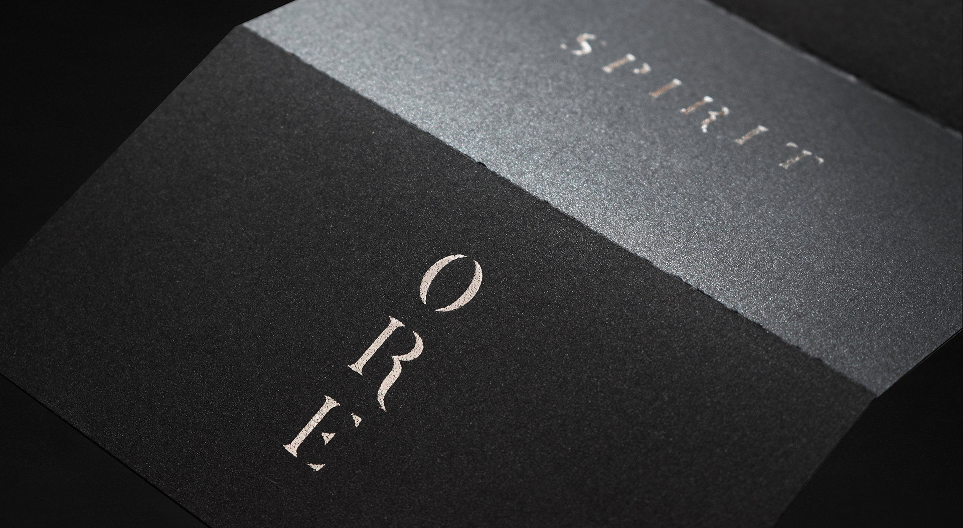
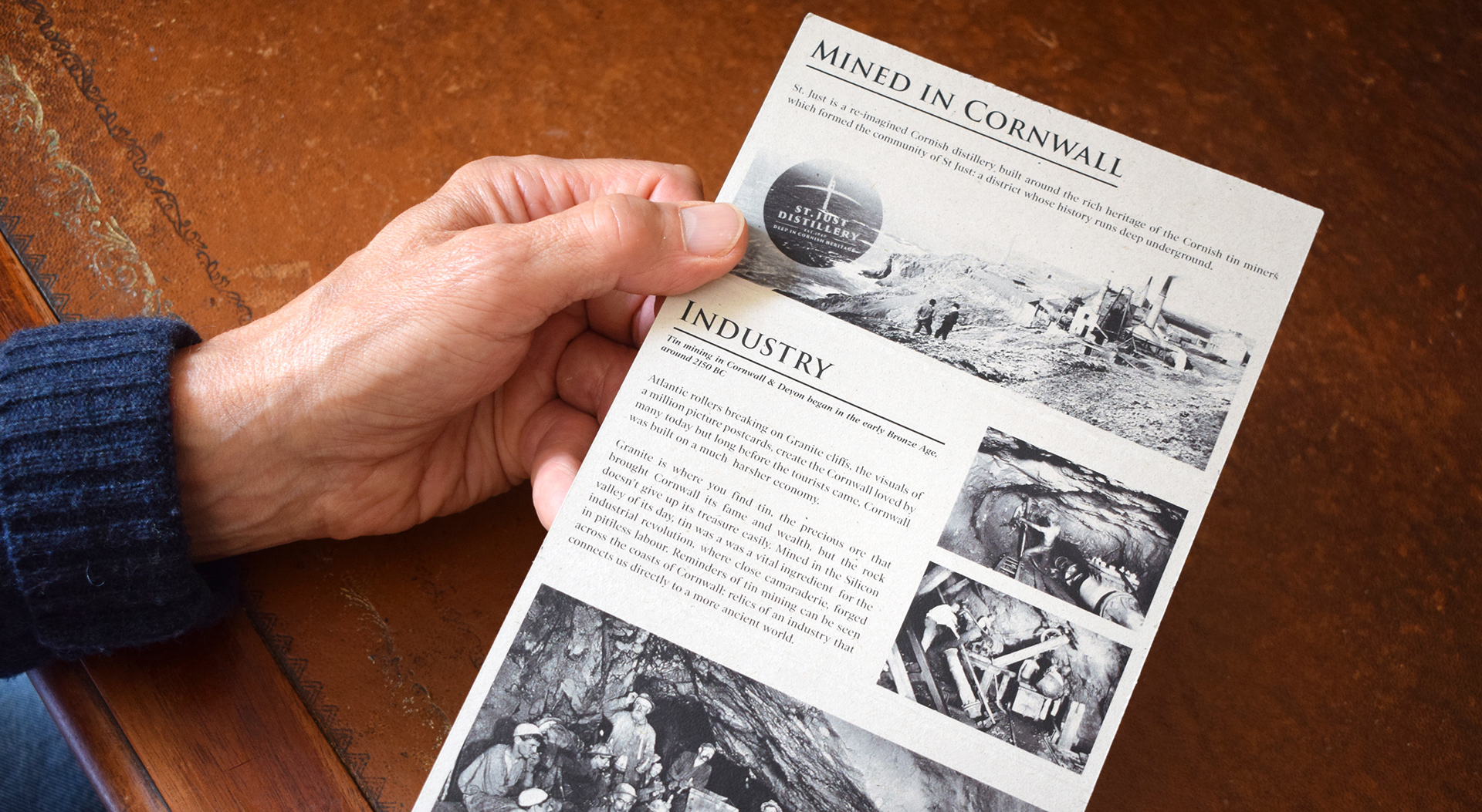
Editorial Design

Ore's editorial contains information about the history of the St. Just distillery, the brand and the industry of tin mining that shaped Cornwall. Designed in a format that requires the reader to open the editorial lengthways, moving downwards as each section is unfolded, just how the mines tunnel vertically downwards deep underground.
Printed onto 'Sand eco-paper' paper stock the font side gives a subtle rough feeling to the touch, designed to reflect the age of which the tin mining industry was at as peak.
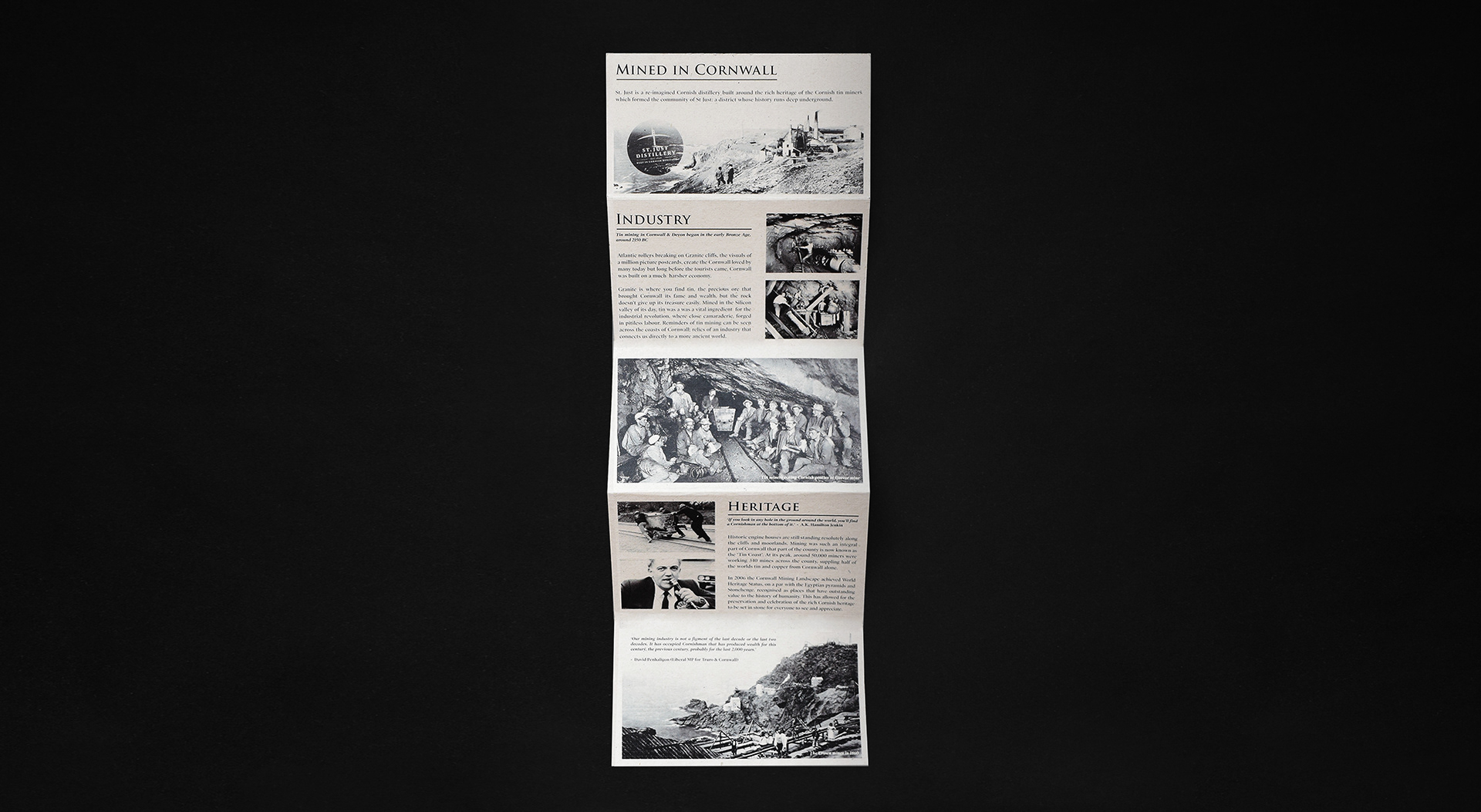
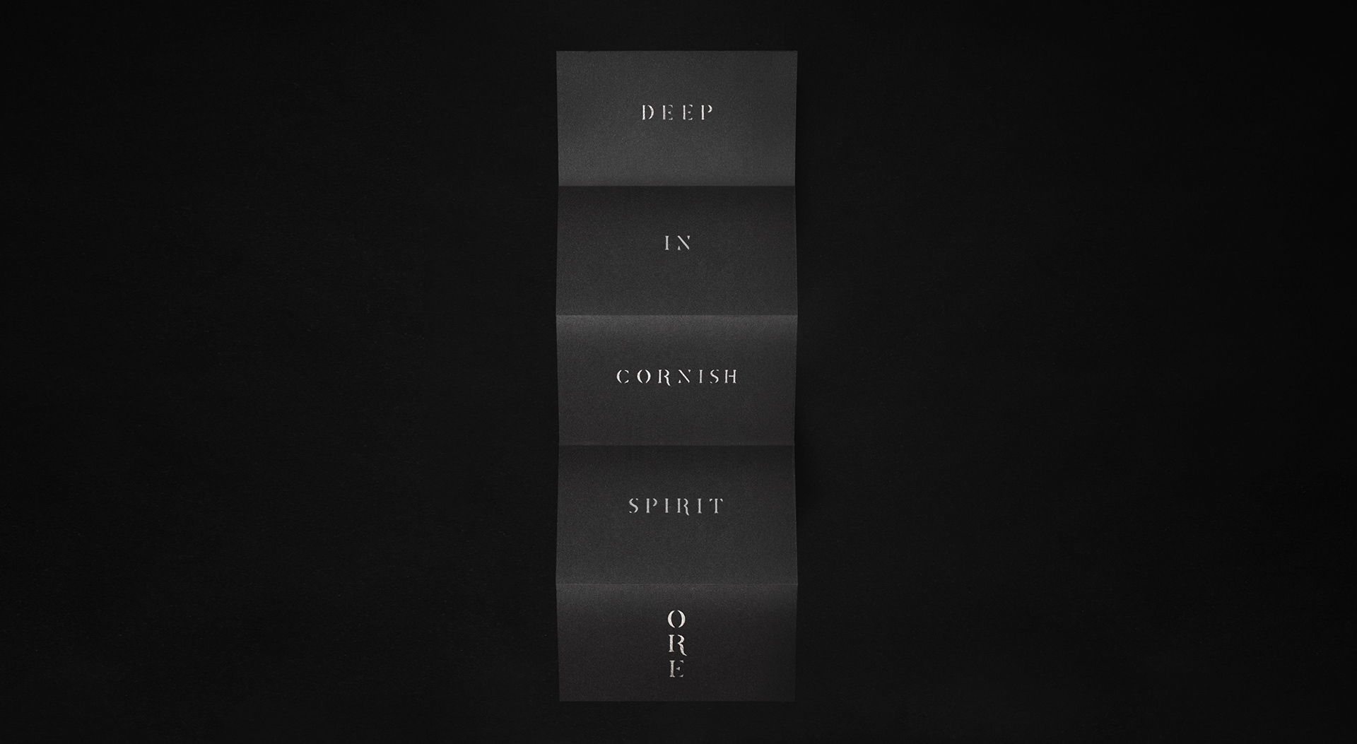
Special paper stock was used on the reverse side, containing an embedded shimmer effect to reflect the bright steams of tin embedded within the Cornish coast, inside its iconic dark cliff faces. Emphasised with silver foiled lettering written in the brands custom font, printed vertically to reveal each word as each section is unfolded downwards.