
Brand Identity
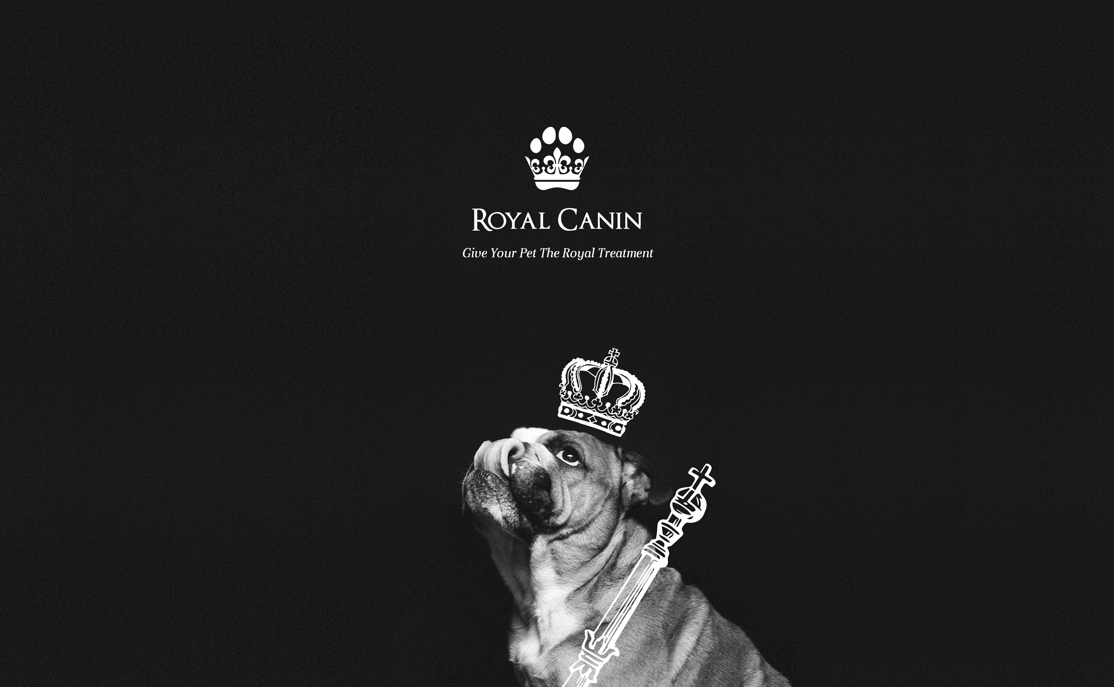
The Royal Canin Rebrand was centred around the element of luxury. By incorporating a paw and crown within the brands logo to communicate a luxurious brand, with a high quality aspect, related through royal elements. Completed with personal touches such as the body copy and hand illustrated elements within the packaging designs.
Brand Strategy

Packaging
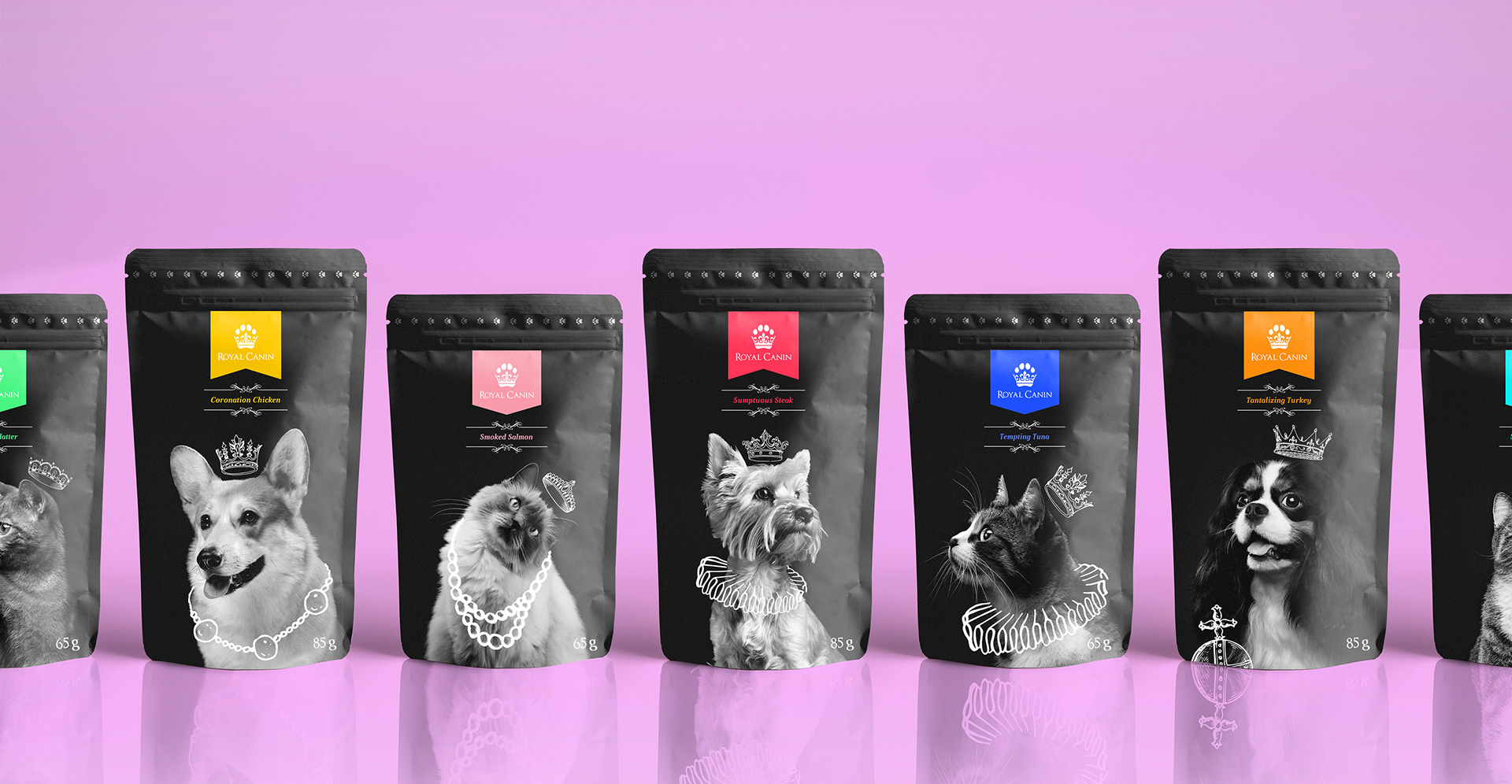
Dog Food Packaging
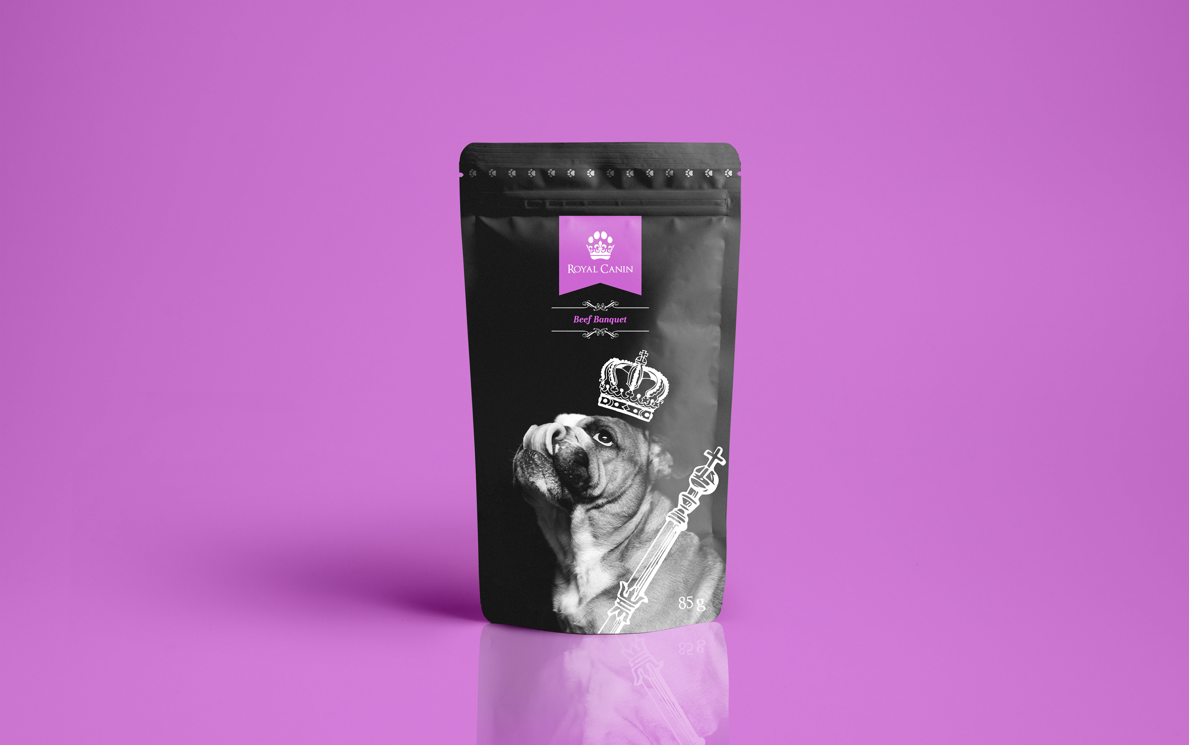
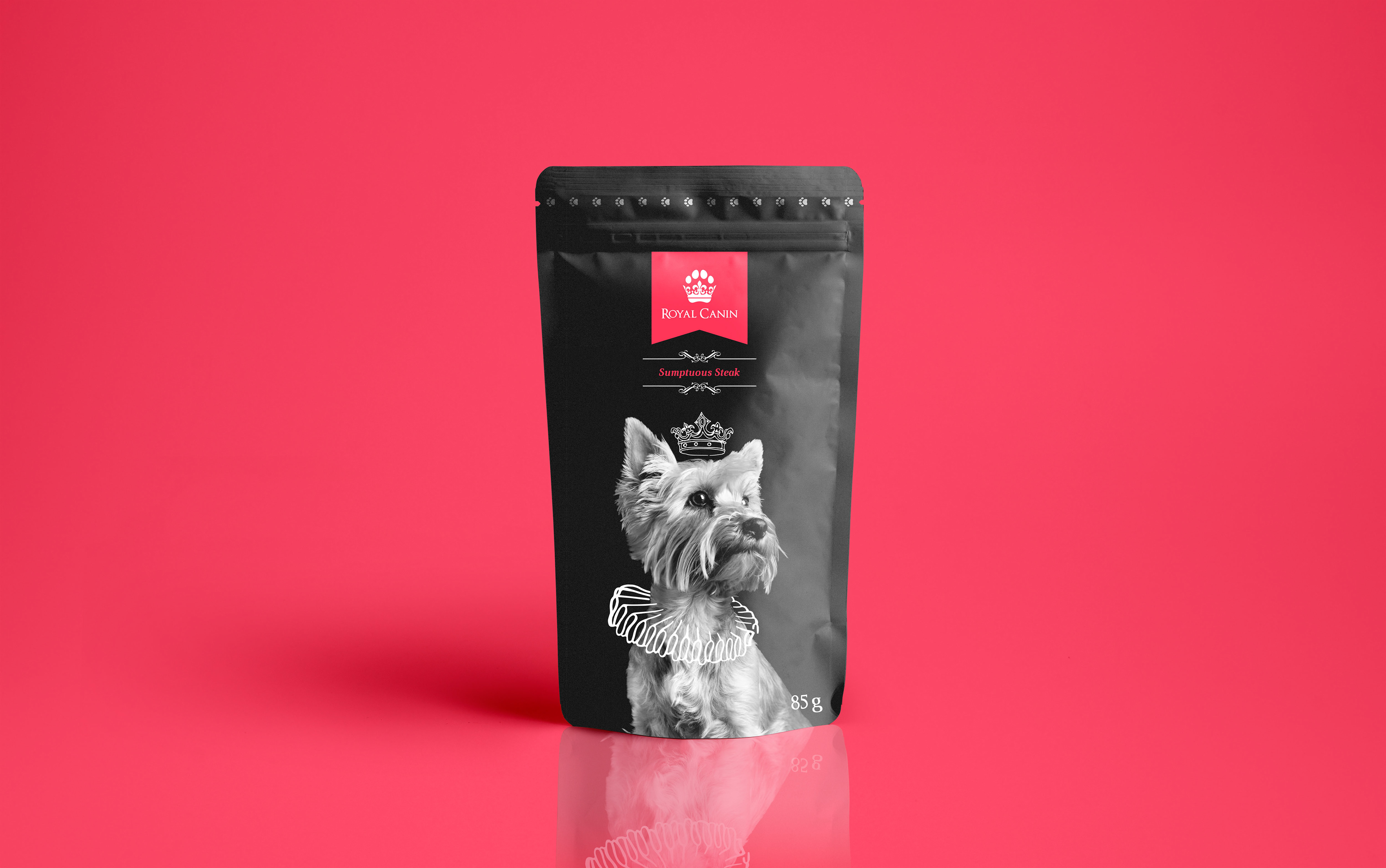
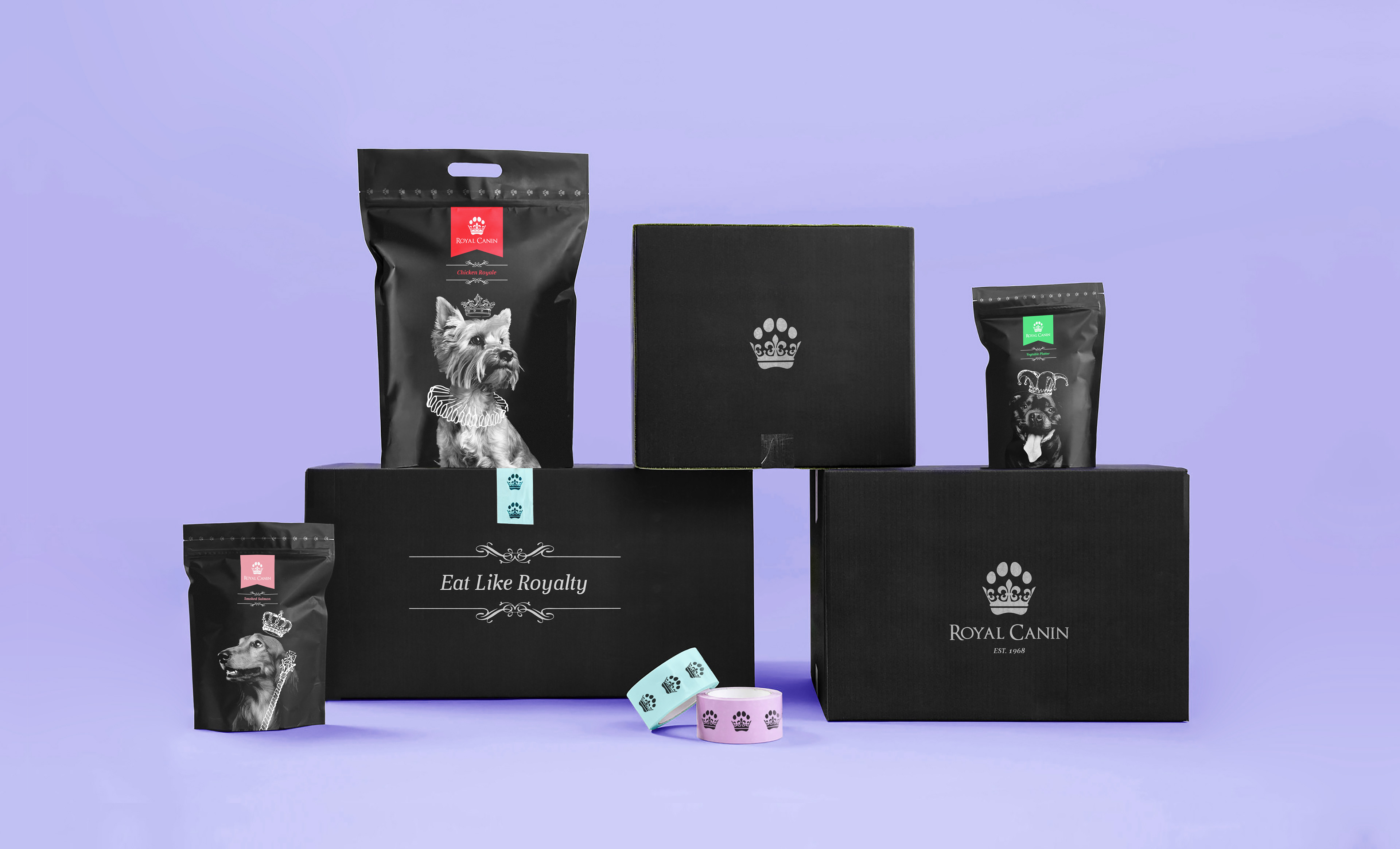
The illustrated royal elements included within the packaging design features crowns, tiaras, staffs, orbs and ruffs. This hadn't drawn elements creates a personal feel to the brand, a unique feature in contrast to other animal food brands. With imagery of dogs featured in a portrait manor, relating back to the element of 'Royal' found within the brand name and luxury aspect which the rebrand was created around.
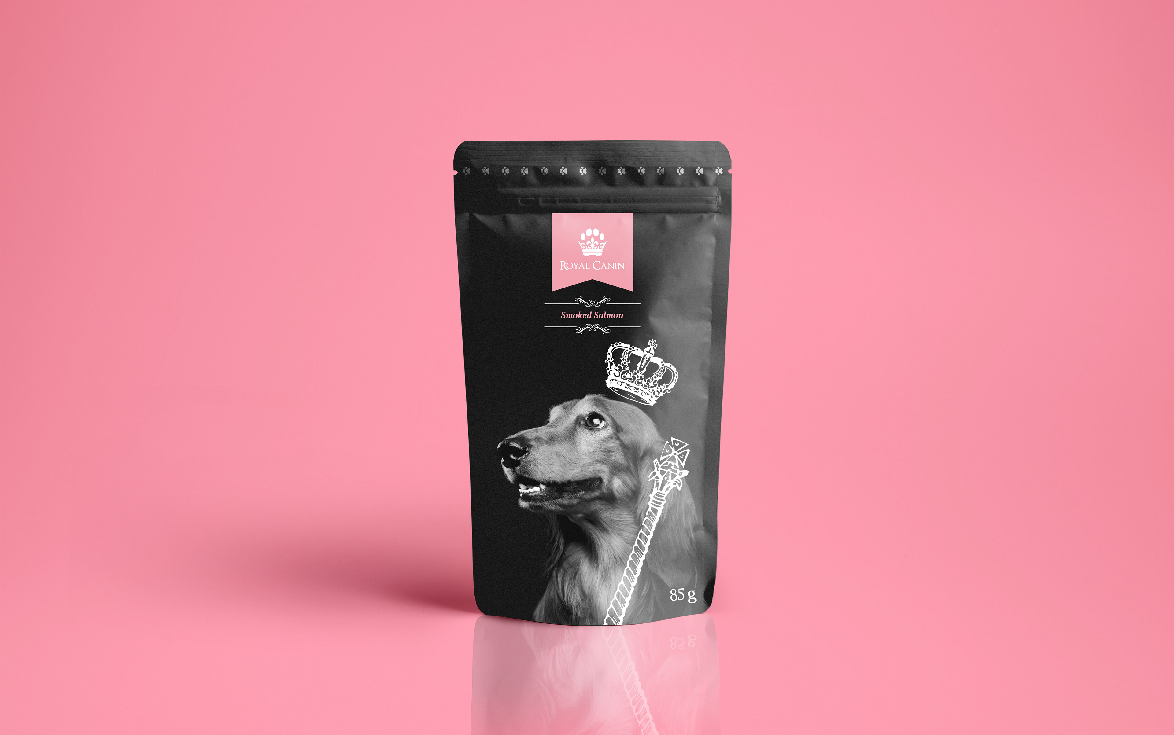

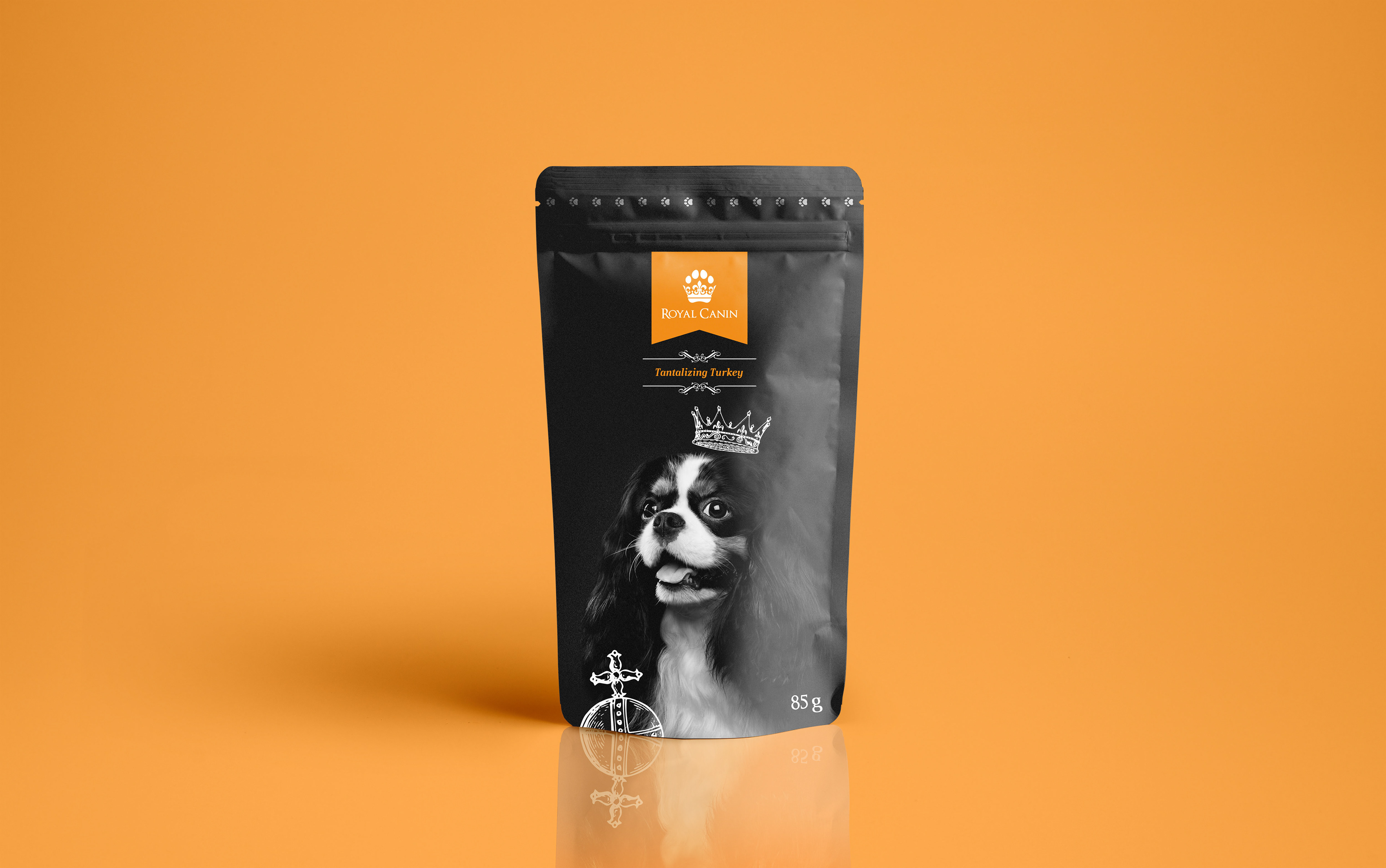
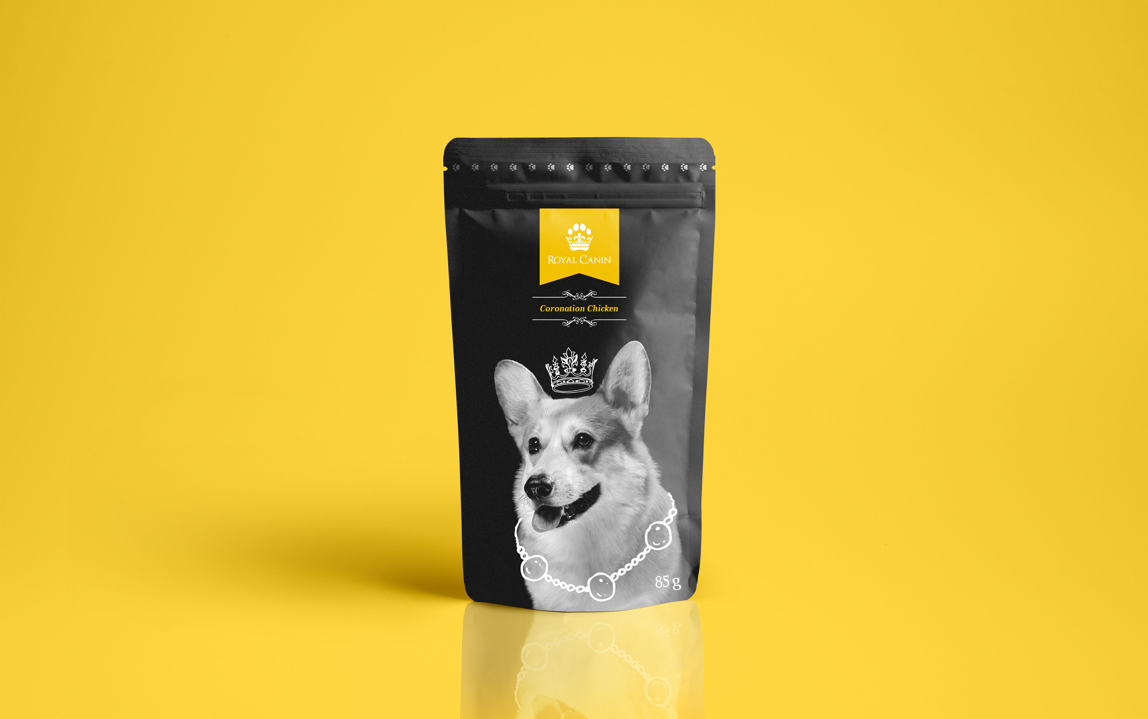
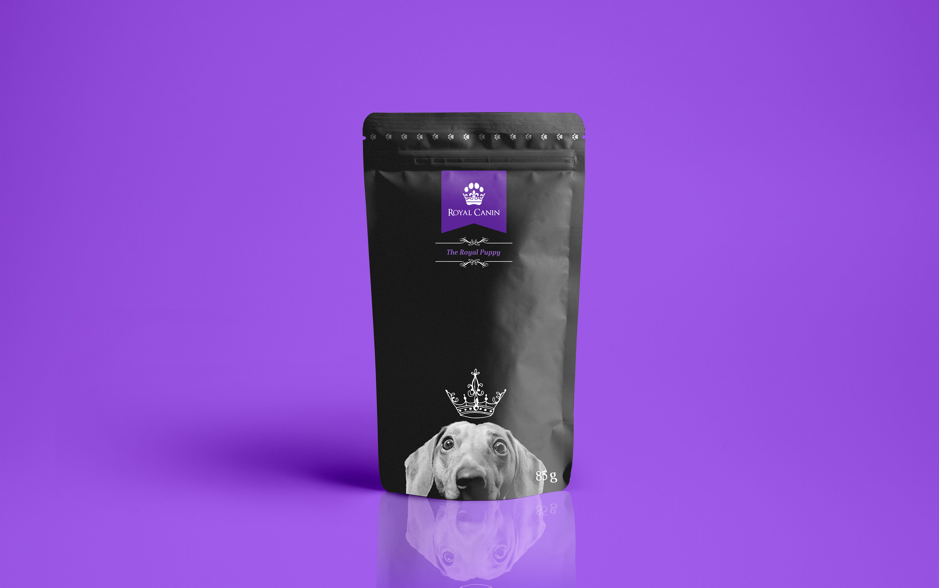
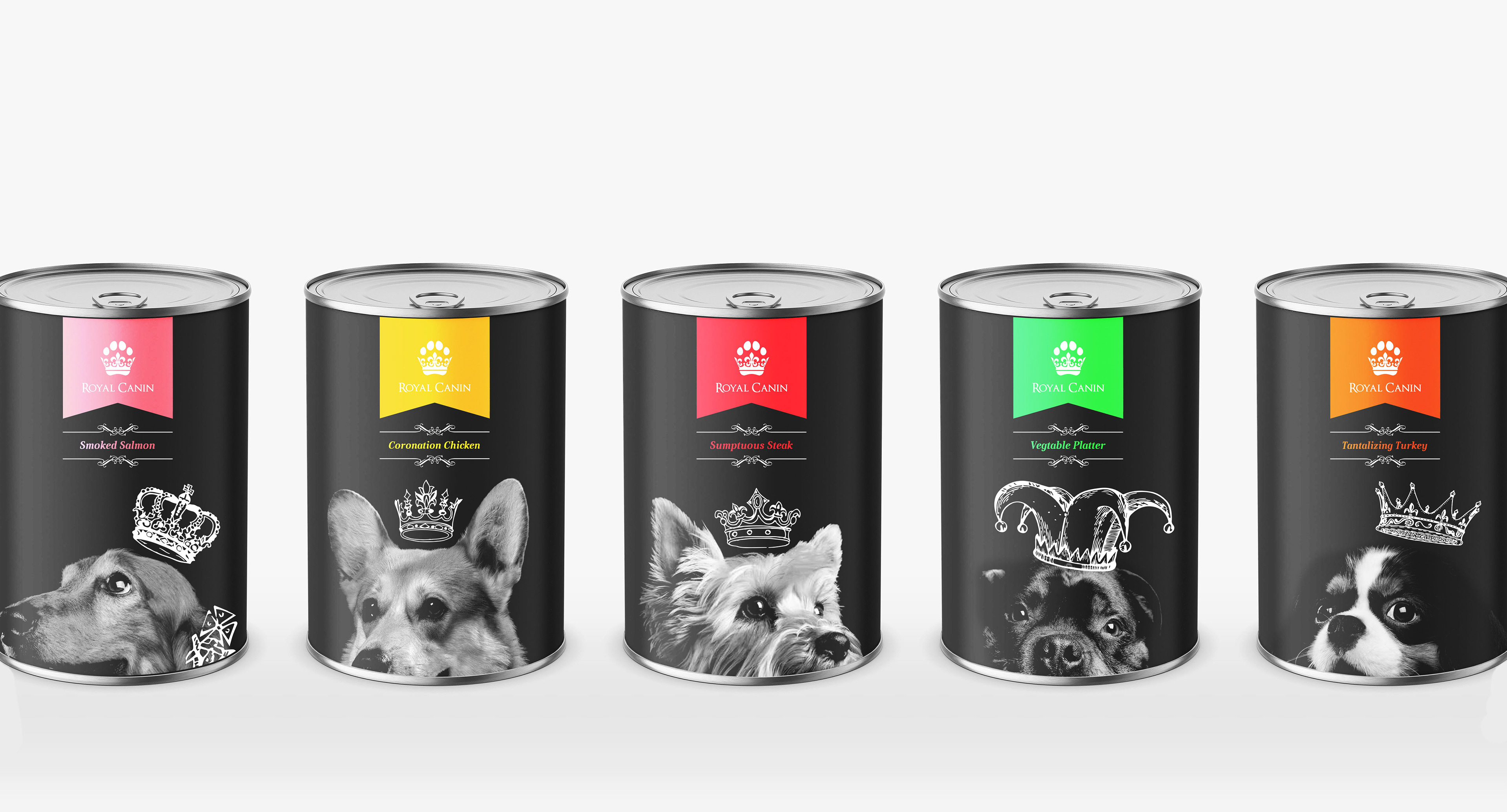
The packaging was completed in monochrome colours to create a sense of quality associated with the brand. The black and white imagery makes colour co-ordinating the different types of dog and cat food clear and simple, so consumers know exactly what they're buying for their animals. With each packet featuring a different colour to represent a different type of food. Each packaging design features an image of a different bread of dog, making differentiation between the different types of dog food even clearer while adding a stronger sense of personality within the brand. Featuring iconic dogs related to royalty, such as Corgis and King Charles Spaniels.

Brand Extensions
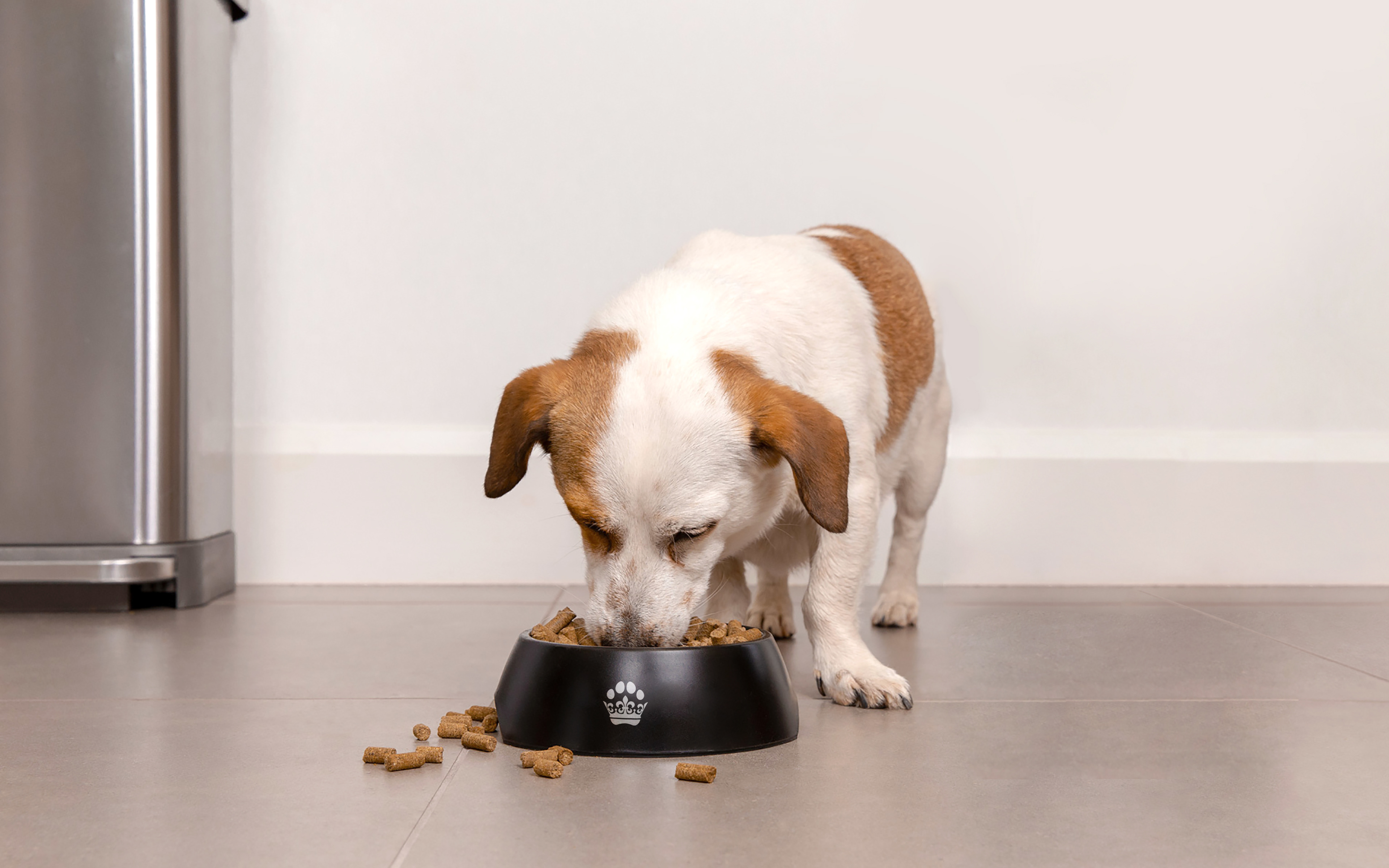
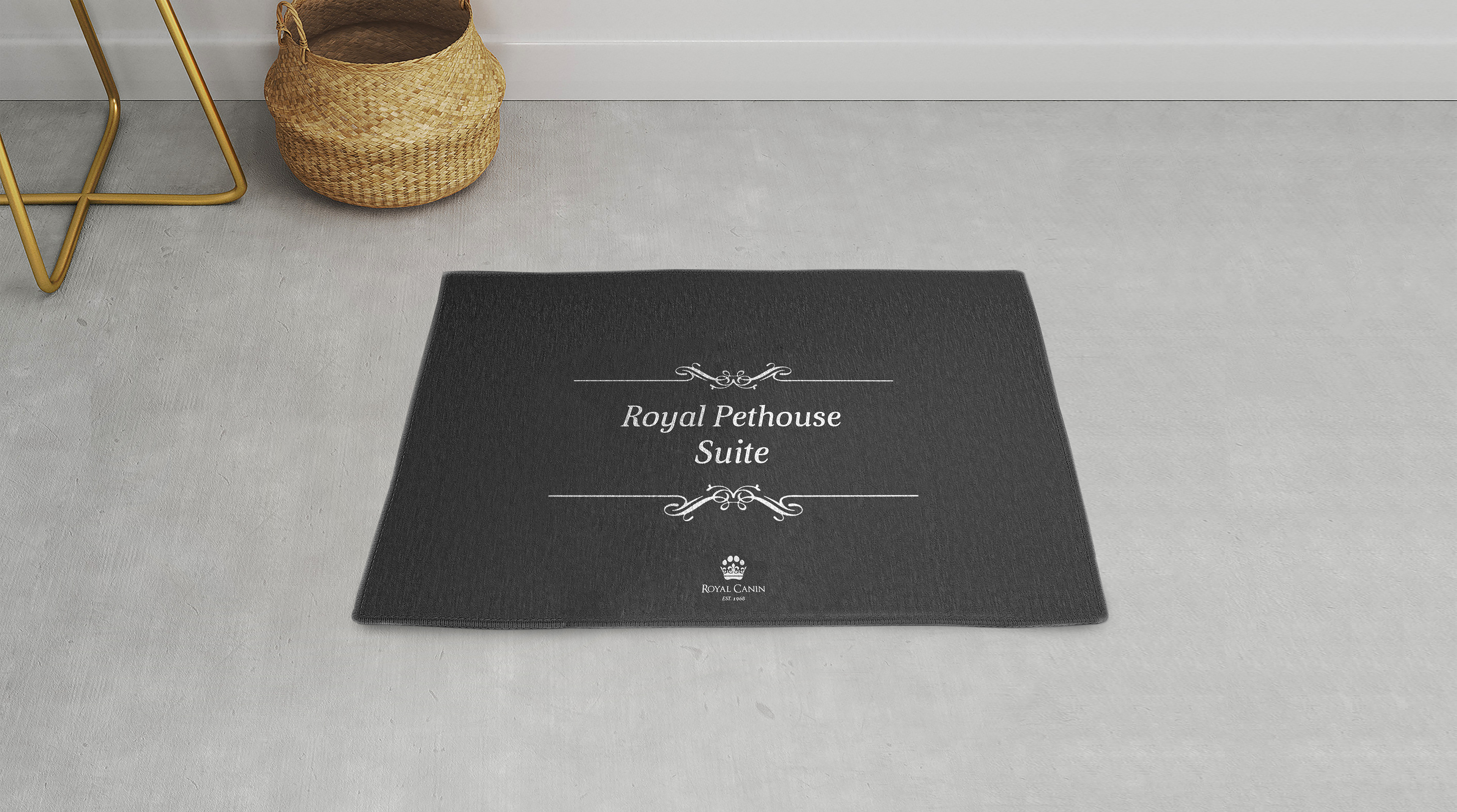
People care so much about their pets, so naturally they want the best for their animals, so creating a personal brand to relate to the consumer was vital. As a result, creating a unique personality within the brand was important to make it stand apart from its competitors, and give the consumer a brand which they can trust. With a brand identity that spreads out from the packaging, through into external elements such as food bowls and mats designed with a royal feel and quality finish.
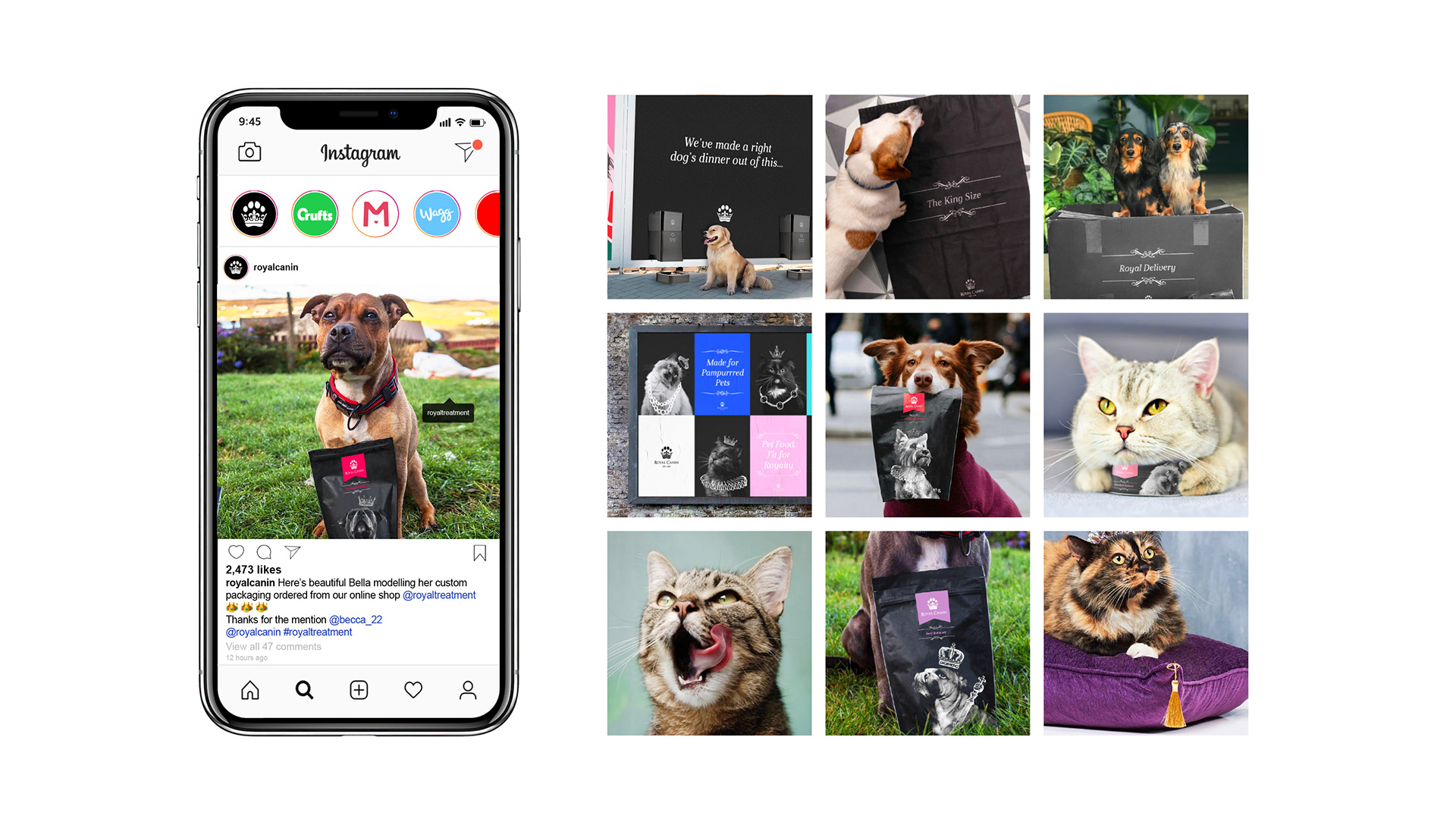
Brand Promotion & Interaction
Promotional designs were create not just for the pet owners to appreciate, be advertising on a dogs level too! By doing this, adding an element of fun and originally to the brand while at the sometime showing that the brand cares about its real customers.

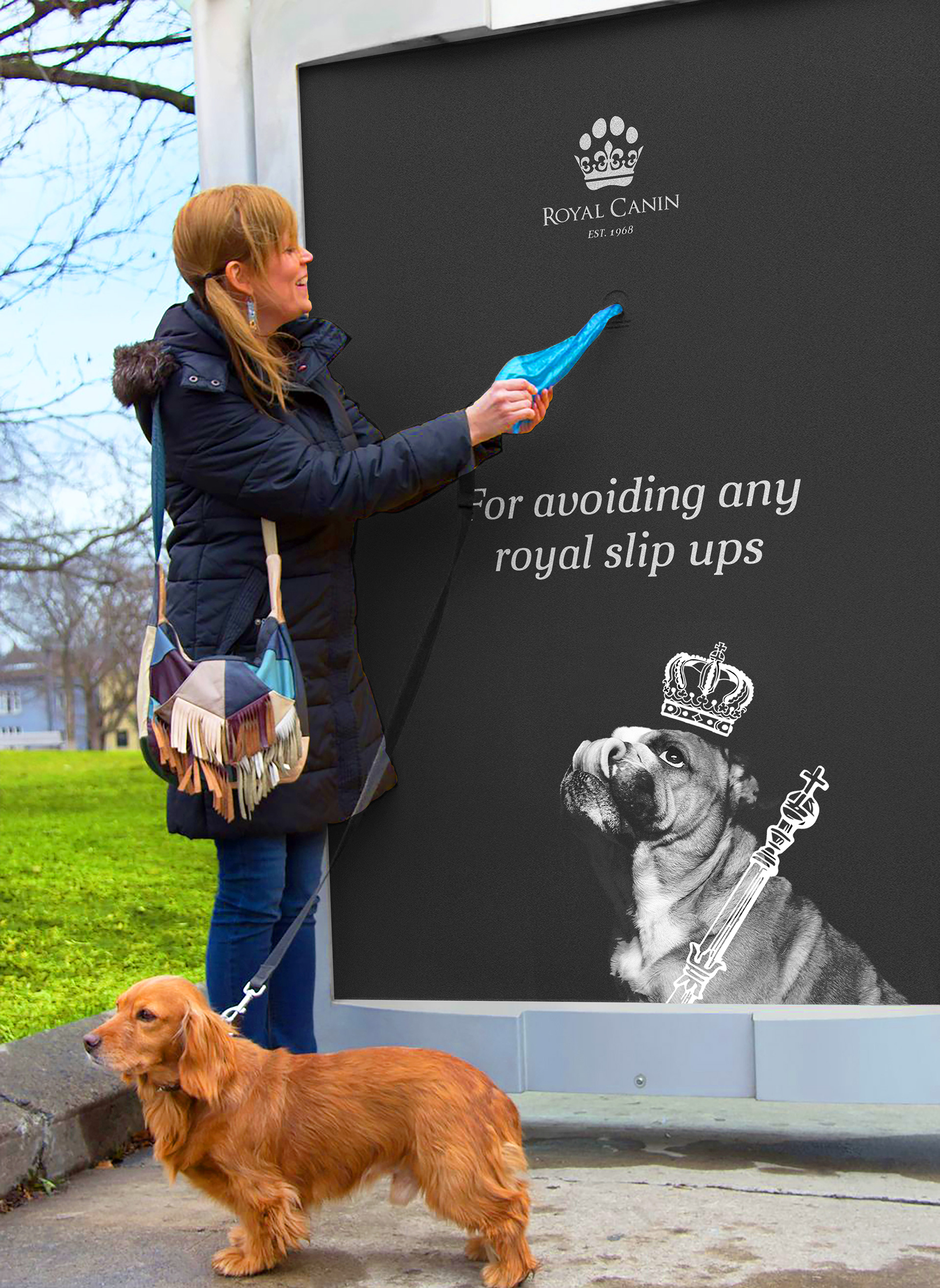
By creating interactive advertising deigns to assist pet owners and the actual pets themselves, the brand establishes itself as one that cares about its consumers and goes the extra miles to provide these royal services.

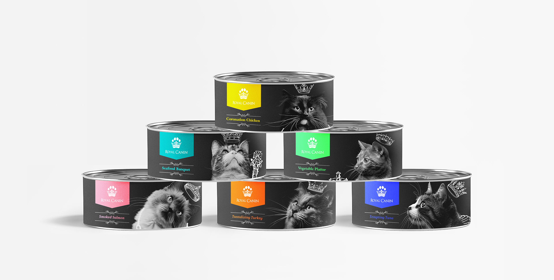
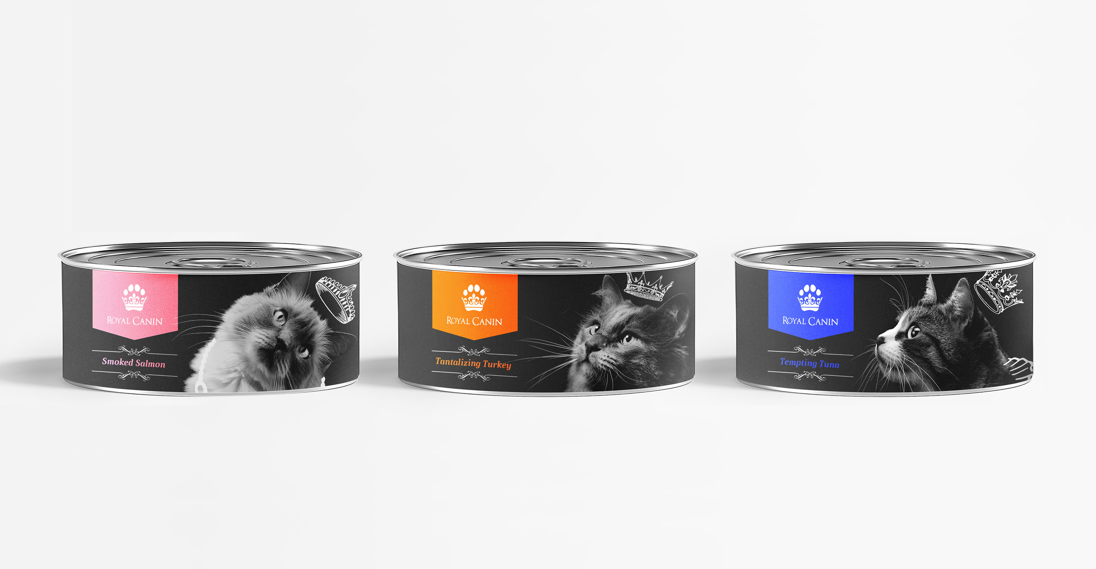
Cat Food Packaging
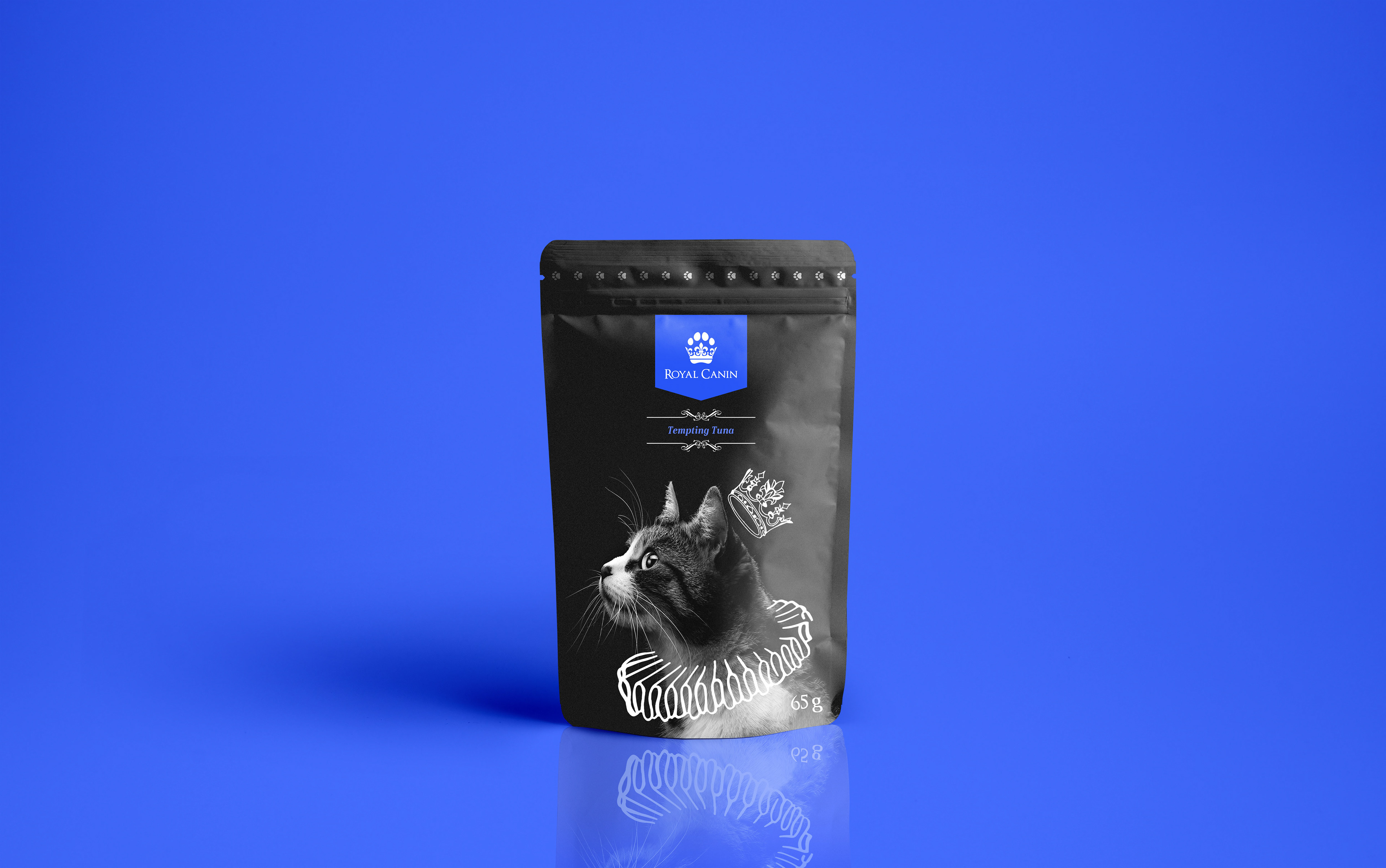
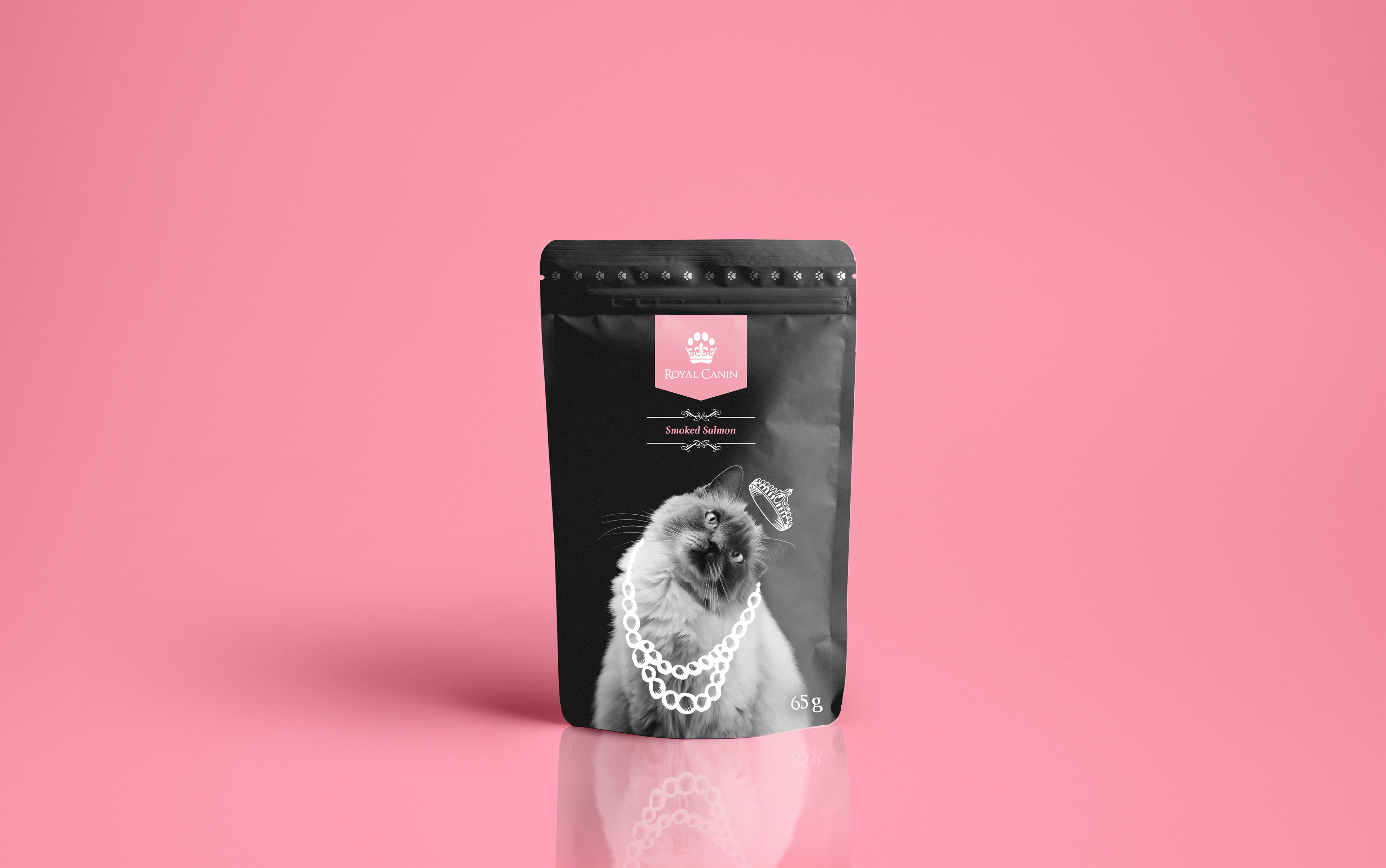
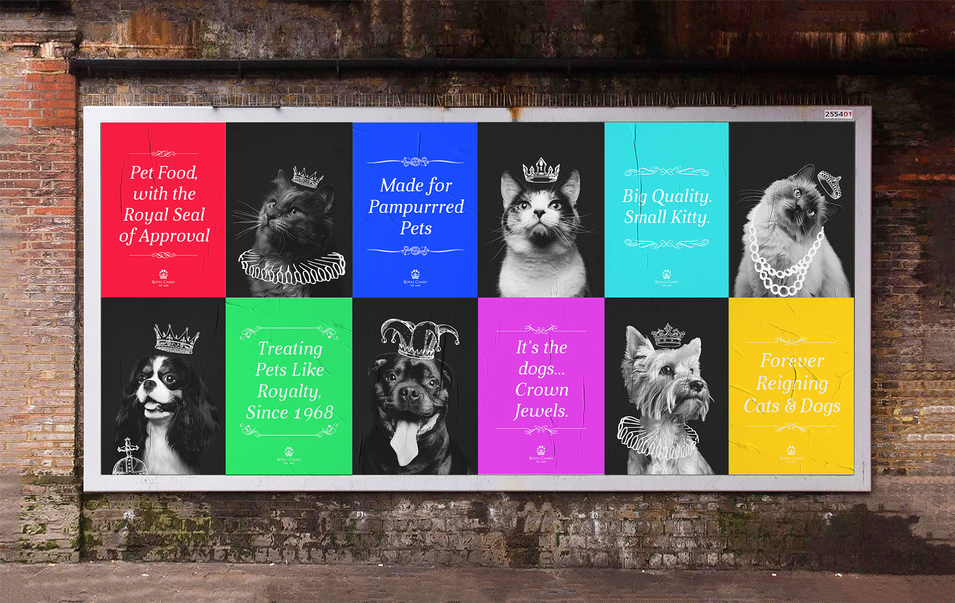
As the majority of pet food brands simply feature a happy looking dog or cat on the label, the inclusion of portrait imagery of animals with their heads held high and angled to create a humour sense of the animals posing to have their portraits taken. Drawing on elements such as crowns and necklaces to visually communicate how us pet owners all see our pets, as little royal additions to the family.
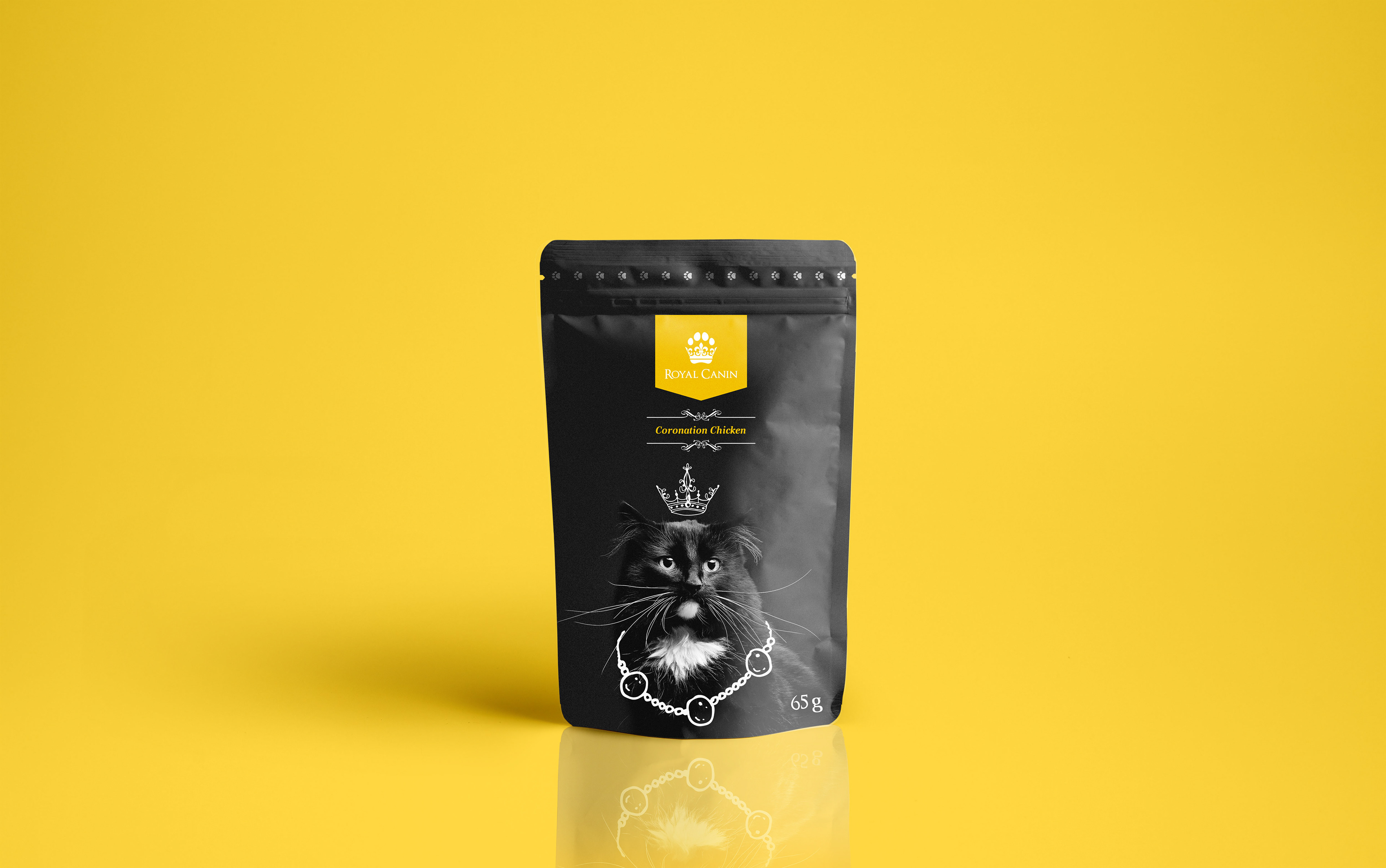
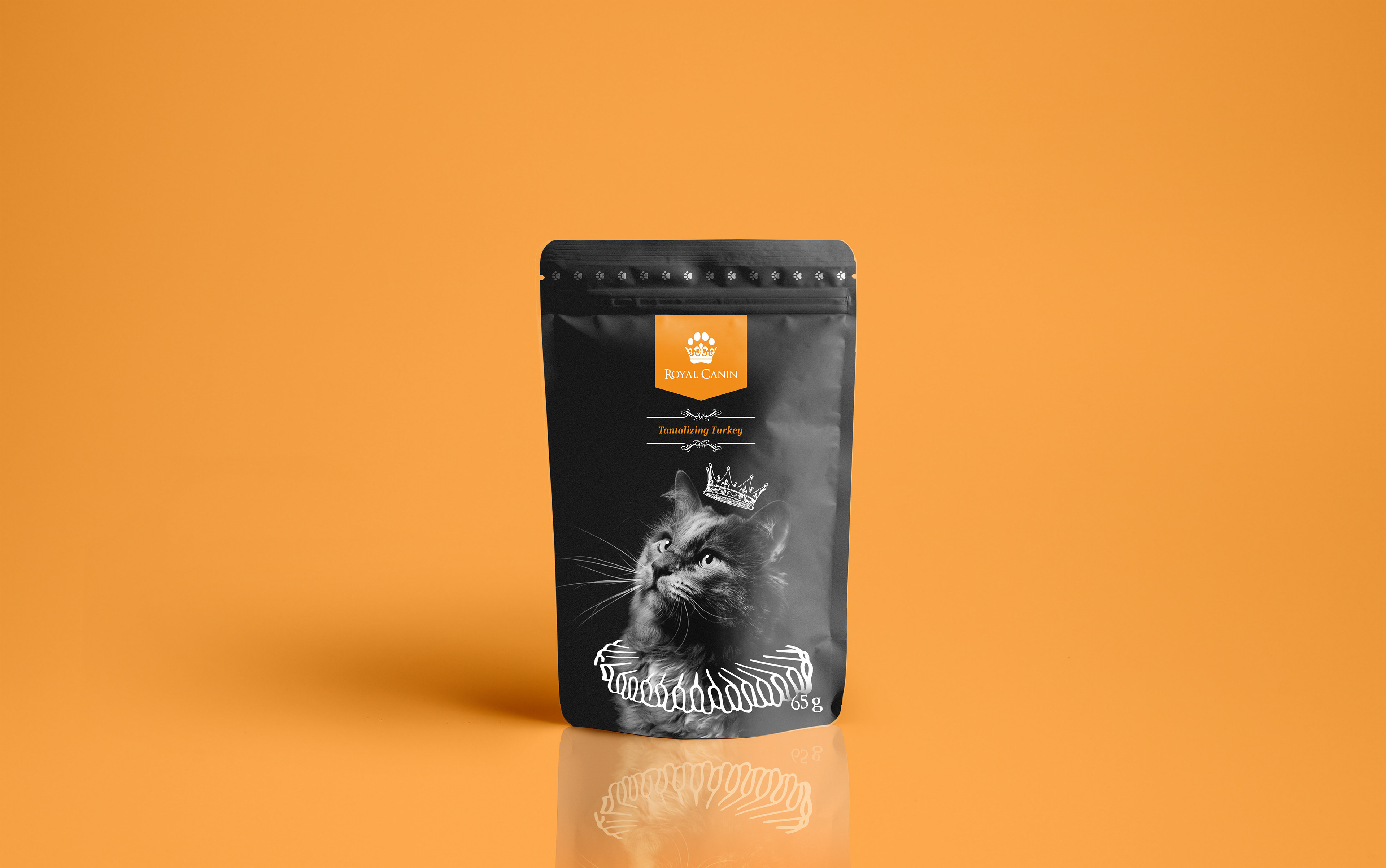
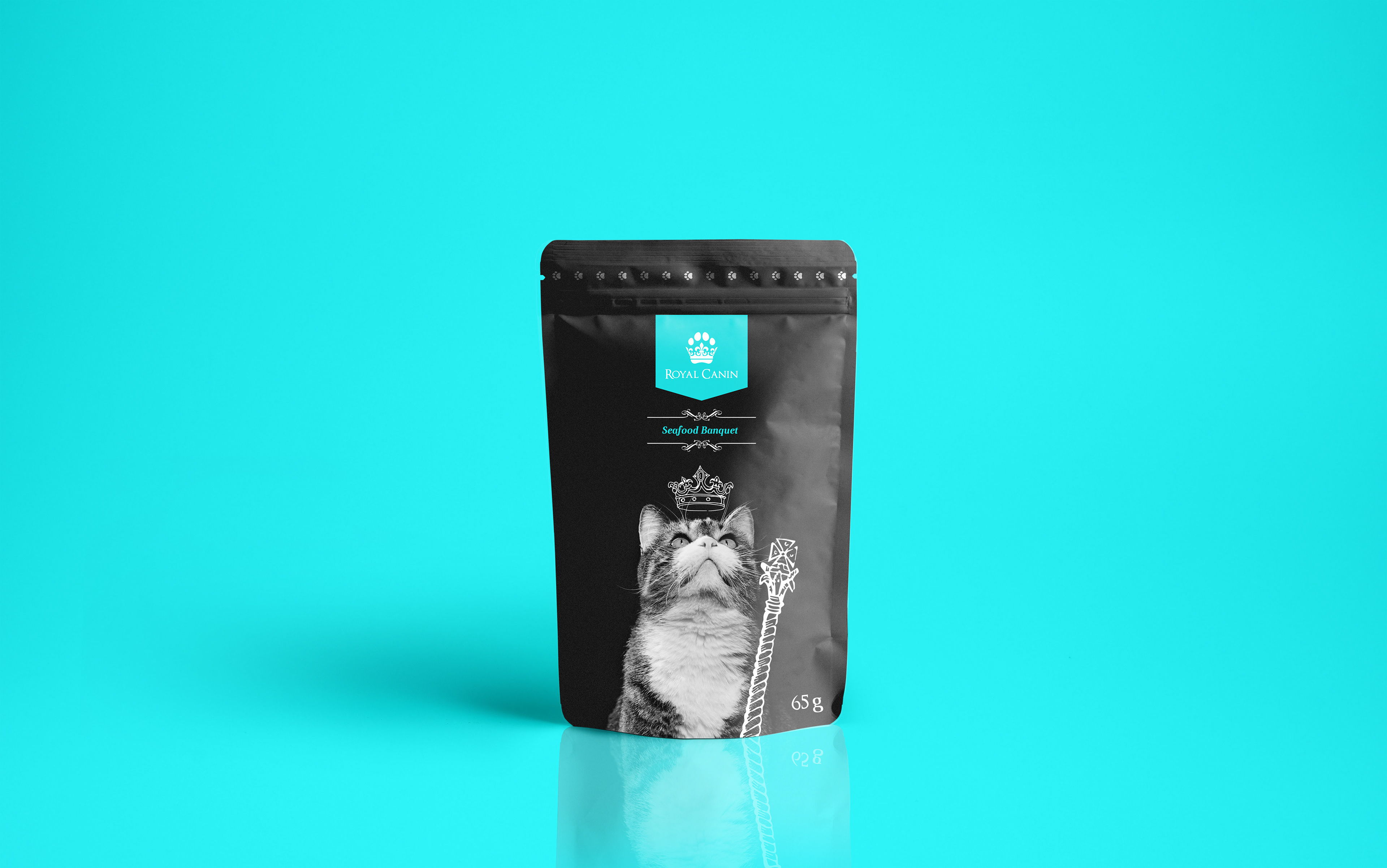
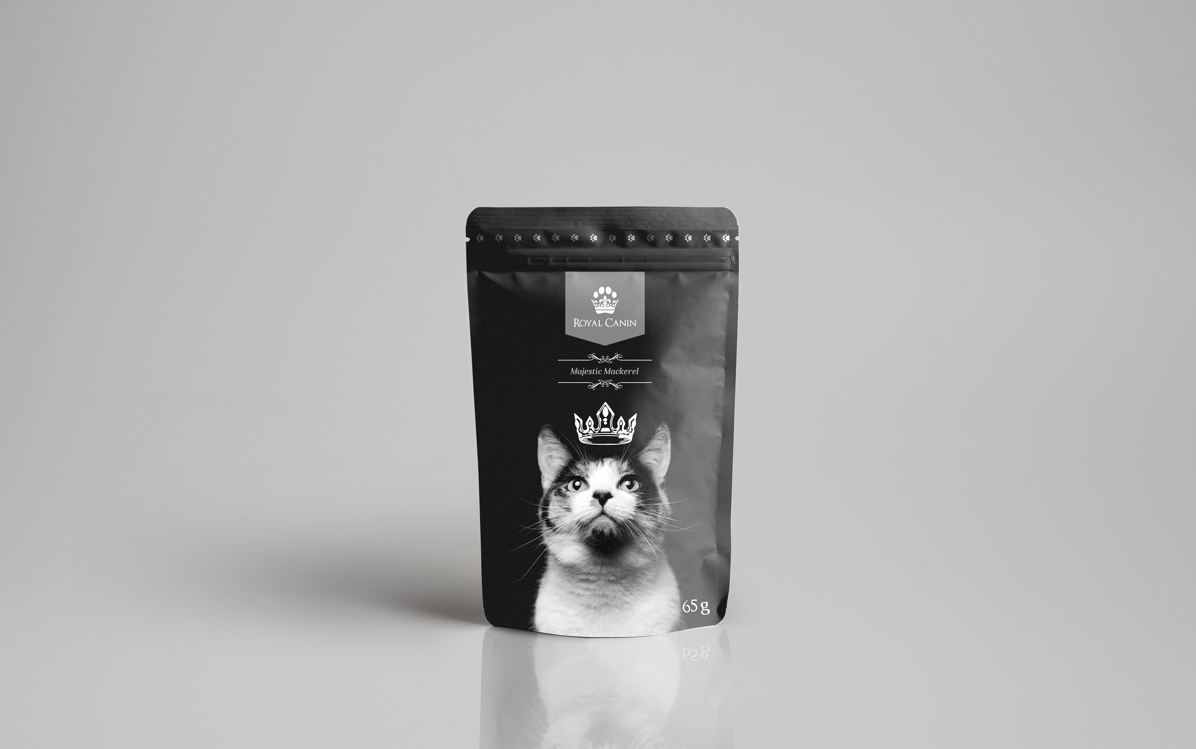
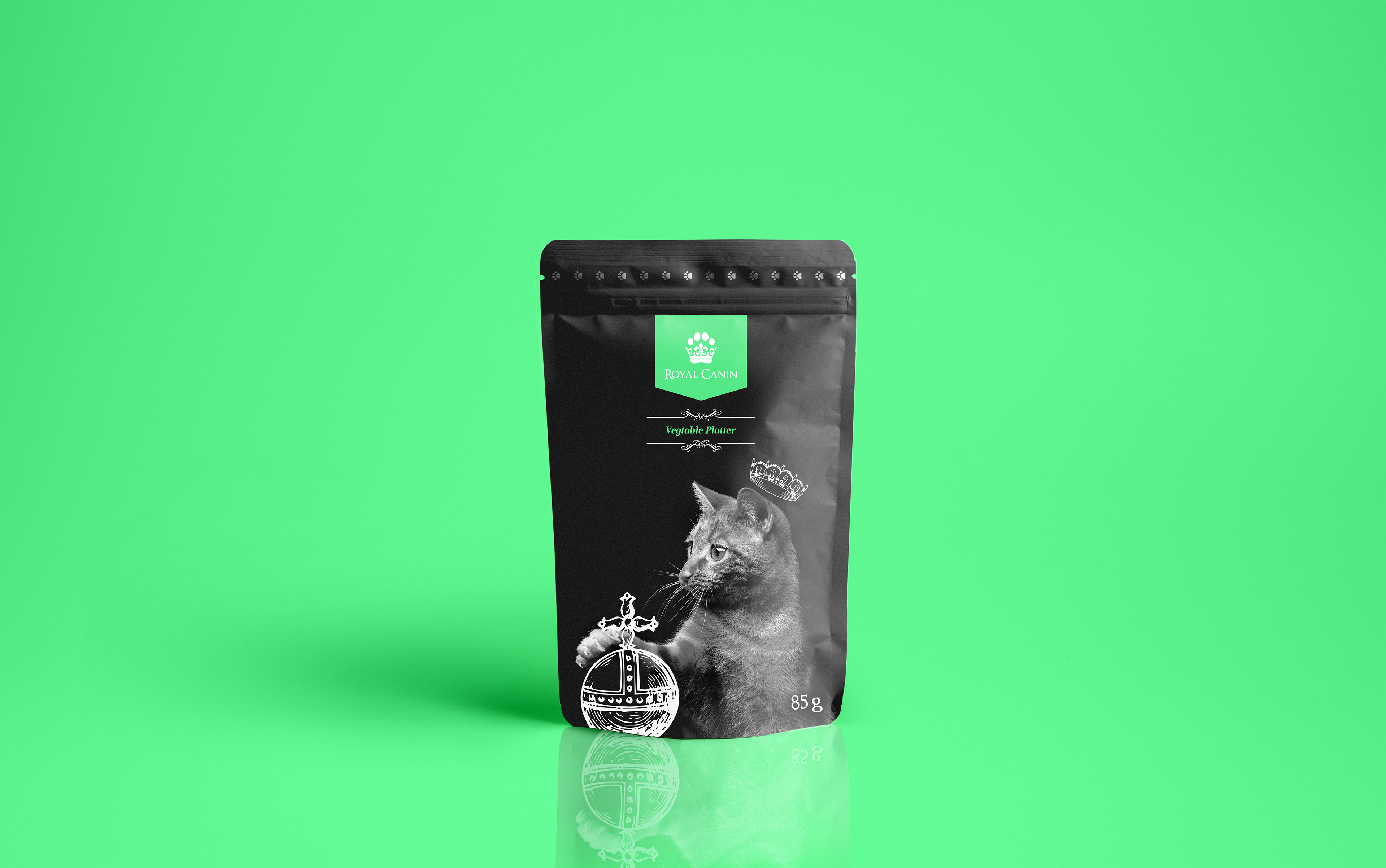
The different colours representing the different types of food sit on medieval flag shapes, used by royalty in the past with the Royal Canin logo on it, incorporated as pose to the regular methods of a normal shape to add more personality to the brand. With different flag designs to differentiate between dog and cat food. Completed with the name of the type of food matching the colour of the flags.

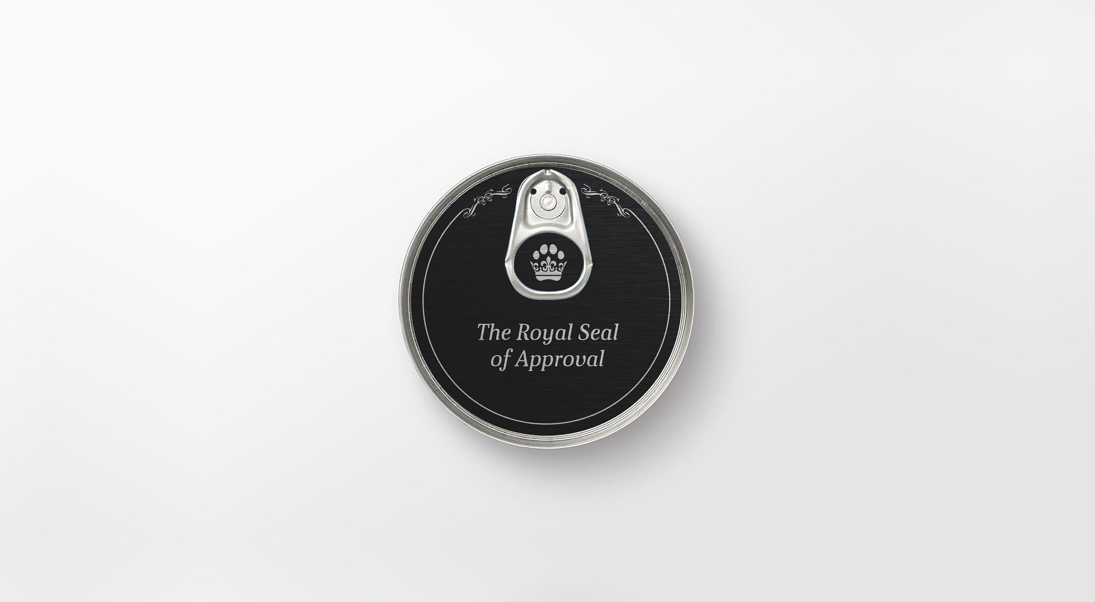
The tin food designs use the material to its benefit, be using foiled printing to add a shine to the different colour labels on each tin. To add an extra aspect of quality to each tin, pushing the element of royalty from the brands identity into the physicality of the packaging.